Interiors
Interior: A Victorian home with global flair

Interior: A Victorian home with global flair
Interiors
Interior: A Victorian home with global flair
I won’t lie: It can get pretty disgusting around here – the dog-drooling, kids-stomping-mud-through-the-house kind of gross. That’s why, in those delicious spells of silence when the last of our three children (Harper, 11, Oliver, 8, and Jessie, 6) has finally drifted off to sleep and our Newfoundlander, Chewbacca, thumps his giant head on the ground and settles in for the evening, my husband, Paul Kilback, and I sit together and sip in the serenity of
neutral tones. We bathe our battered minds in the organic textures of wood, weave, glass and mirror – a salve for the unspeakable noise of video games, kids screaming and the vacuuming of dog hair that will, as surely as the sun rises, begin again the next day.

Living room
Calming neutrals are layered for visual interest in the living room. This is a grown-up space where kids are welcome to enjoy the fire or play a game of dominoes, but nothing rough enough to disrupt Sunday morning’s paper and coffee.
Dining room
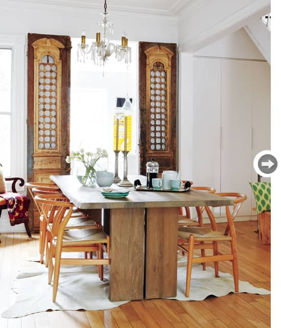
It's the mix of the precious and the indestructable - rustic woods with a stunning crystal chandelier - that gives the dining room it's depth.
The large wooden dining table easily accommodates the family of five.
Dining table
The house isn’t huge – just under 2,000 square feet packed into three tall, skinny floors in a downtown Toronto Victorian. When we first purchased the house eight years ago, it was move-in-ready. The big work had been done; we just needed to make it pretty and functional. One of the biggest problems was storage: It was standard issue for an 1880s family home (read: none). My goal was to create a place for everything in a space that felt youthful and modern yet true to the home’s heritage. Oh, and did I mention this all had to be done on a budget?
The elaborate Egyptian doors may seem out of place in a Victorian home, but their patina and history speak to the home's heritage.
Egyptian doors
The makeover started with a pair of tummy-turning-beautiful Egyptian doors that I used to frame the doorway to the kitchen. They offer a bit of history and a whole lot of drama, setting the mood for the dining and living rooms beyond. Although Egyptian doors in a Victorian might sound strange, they speak to the other global influences throughout the house, such as Moroccan pouffes and African decor, and are the perfect hit of hip to keep the space from feeling stuffy.
Fireplace
The bookcases flanking the fireplaces were lovingly built by homeowner Paul Kilbacks's father and brother. Adding inexpensive dental moulding to the top makes them seem like they were always part of the house.
A modern glass railing stands in direct contrast, visually expanding the main floor and allowing loads of natural light to flow through. White walls, blonde floors and natural materials were added to create a calm canvas that’s restful on the eyes.
Spare room
On the second floor, I transformed a spare room into a multi-purpose space but was faced with the challenge of making it suitable for both office work and kids at play. To achieve this, I selected durable textiles, such as the grey menswear fabric on the sofa and the saddlecoloured leather ottoman, to withstand 20,000 double-chocolate licks and still look respectable for my client meetings. A shelving unit outfitted with bins for each client helps maintain order and tidiness.
This space does double duty as a home office and a family room. Graphic prints keep the look fun and fresh, while durable fabrics meet the familys needs, standing up to an array of goldfish crackers and yogurt tubes that invariably smeared into their surfaces. Loads of stylish shelving keep everyone organized.
Kid's bedroom
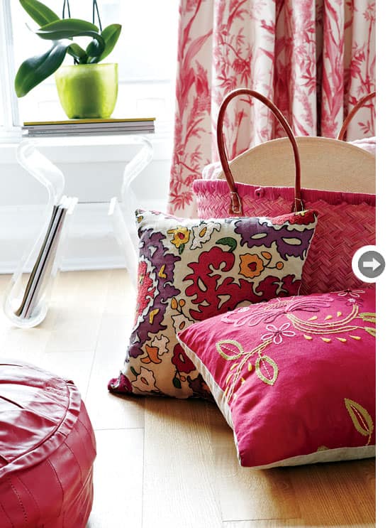
A playful mix of pattern in an array of pinks remains fresh against a crisp white backdrop in six-year-old Jessie's room. Decorating with hand-knit dresses (Grandma's handiwork) and Jessie's favourite books makes the room feel special.
To keep the look fresh rather than fussy in a traditional home, I chose to bring in colour through accessories, which can be easily swapped out with the season or my mood. Blasts of colour in the kids’ rooms are youthful but sophisticated enough to grow with them.
Bold colours
Colour rules the master bedroom, but only because the oiled white oak floors are the perfect foil for a splashy show of fuchsia and orange.
Master bedroom
The pink in the master bedroom is more fun pattern play than saccharine sweet (and frankly, I think, shows the master is really man enough to handle a few girlie flourishes in the stylish boudoir).
The result is a mix of Victorian architecture with far-flung furnishings that adds up to a modern global aesthetic – the perfect tone for a young family in an old house.

Living room
Calming neutrals are layered for visual interest in the living room. This is a grown-up space where kids are welcome to enjoy the fire or play a game of dominoes, but nothing rough enough to disrupt Sunday morning’s paper and coffee.

Dining room
It's the mix of the precious and the indestructable - rustic woods with a stunning crystal chandelier - that gives the dining room it's depth.

The large wooden dining table easily accommodates the family of five.
Dining table
The house isn’t huge – just under 2,000 square feet packed into three tall, skinny floors in a downtown Toronto Victorian. When we first purchased the house eight years ago, it was move-in-ready. The big work had been done; we just needed to make it pretty and functional. One of the biggest problems was storage: It was standard issue for an 1880s family home (read: none). My goal was to create a place for everything in a space that felt youthful and modern yet true to the home’s heritage. Oh, and did I mention this all had to be done on a budget?

The elaborate Egyptian doors may seem out of place in a Victorian home, but their patina and history speak to the home's heritage.
Egyptian doors
The makeover started with a pair of tummy-turning-beautiful Egyptian doors that I used to frame the doorway to the kitchen. They offer a bit of history and a whole lot of drama, setting the mood for the dining and living rooms beyond. Although Egyptian doors in a Victorian might sound strange, they speak to the other global influences throughout the house, such as Moroccan pouffes and African decor, and are the perfect hit of hip to keep the space from feeling stuffy.

Fireplace
The bookcases flanking the fireplaces were lovingly built by homeowner Paul Kilbacks's father and brother. Adding inexpensive dental moulding to the top makes them seem like they were always part of the house.
A modern glass railing stands in direct contrast, visually expanding the main floor and allowing loads of natural light to flow through. White walls, blonde floors and natural materials were added to create a calm canvas that’s restful on the eyes.

Spare room
On the second floor, I transformed a spare room into a multi-purpose space but was faced with the challenge of making it suitable for both office work and kids at play. To achieve this, I selected durable textiles, such as the grey menswear fabric on the sofa and the saddlecoloured leather ottoman, to withstand 20,000 double-chocolate licks and still look respectable for my client meetings. A shelving unit outfitted with bins for each client helps maintain order and tidiness.
This space does double duty as a home office and a family room. Graphic prints keep the look fun and fresh, while durable fabrics meet the familys needs, standing up to an array of goldfish crackers and yogurt tubes that invariably smeared into their surfaces. Loads of stylish shelving keep everyone organized.

Kid's bedroom
A playful mix of pattern in an array of pinks remains fresh against a crisp white backdrop in six-year-old Jessie's room. Decorating with hand-knit dresses (Grandma's handiwork) and Jessie's favourite books makes the room feel special.
To keep the look fresh rather than fussy in a traditional home, I chose to bring in colour through accessories, which can be easily swapped out with the season or my mood. Blasts of colour in the kids’ rooms are youthful but sophisticated enough to grow with them.

Bold colours
Colour rules the master bedroom, but only because the oiled white oak floors are the perfect foil for a splashy show of fuchsia and orange.

Master bedroom
The pink in the master bedroom is more fun pattern play than saccharine sweet (and frankly, I think, shows the master is really man enough to handle a few girlie flourishes in the stylish boudoir).
The result is a mix of Victorian architecture with far-flung furnishings that adds up to a modern global aesthetic – the perfect tone for a young family in an old house.


Comments