House Tours
Interior: Beige and white simplicity

Images: Tracey Ayton
House Tours
Interior: Beige and white simplicity
When this Vancouver new-build's white and beige colour palette gets paired with an array of textures and patterns, the scheme reads interesting and inviting.
2012 isn't just a banner year for Monika Hibbs - the stylish visionary behind the popular lifestyle blog The Doctor's Closet - it was more like a flashing marquee. Monika, a former doctor (hence the blog's name), and her husband, Troy, an entrepreneur, decided to build their dream home that summer. Just one month later, Monika learned she was pregnant with their first child. And then, to top off a roller coaster of a year, the couple moved into the house just two days shy of Christmas Day. "It was definitely crazy but so very exciting, too," says Monika.
When it came to decorating their 4,000-square-foot four-bedroom abode in Langley, B.C., Monika struggled to narrow down her choices. With a blog that covers fashion, beauty, decor and the like, her daily exposure to trends didn't make the decision-making process easy. "So I stuck to a beige and white scheme to make it simple. Our motto was, ‘If in doubt, pick white.'"
Design by Stephanie Jean Design
Hallway
Monika and her husband, Troy, decided on wainscotting in the front hallway to increase the architectural character of the new-build home. "We really invested in the details, from the moulding and panelling to the millwork," she says.

Kitchen design
Initially, Monika wanted a marble backsplash in a herringbone pattern for the kitchen. But in the end, she chose a more budget-friendly subway tile. "It's our first home, so we did have to keep costs in mind," she says. "this is the next best thing, and it's also a classic."

White kitchen decor
The Carrara-marble-topped countertop compliments the simple and chic white kitchen.

Dining area
In the dining room, oversized pendant lights were substantial enough for Troy and pretty enough for Monika. The dining table's weathered wood reflects the coffee table in the adjacent living room, while a white built-in cabinet at the end of the space seems to disappear into the wall.

Living room
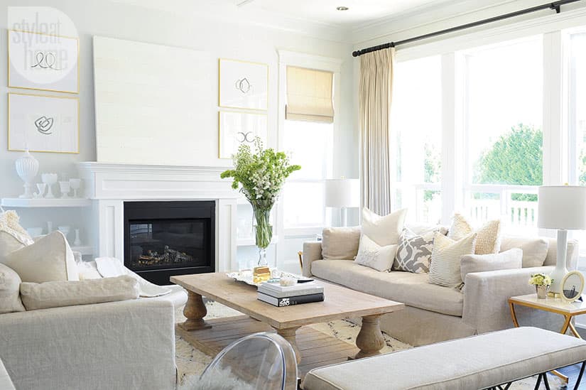
Symmetry reigns supreme in the living room, where sofas flank a gas fireplace. "Having two couches keeps the room open," says Monika. "We liked this idea much more than bringing in a sectional and some chairs." The bench offers additional seating for entertaining.

Table books
Monika stacked some coffee table books in the living room as decorative accents.

Gold étagère
The gold étagère open shelves create a revolving display space for everything from personal photos to favourite books. Pink ombré drapes make a statement.

Office gallery wall
In Monika's office, a gallery wall represents the work of some of her fellow lifestyle bloggers. "I love art with sayings - it can be changed with the season or my mood," she says.

Office lounge area
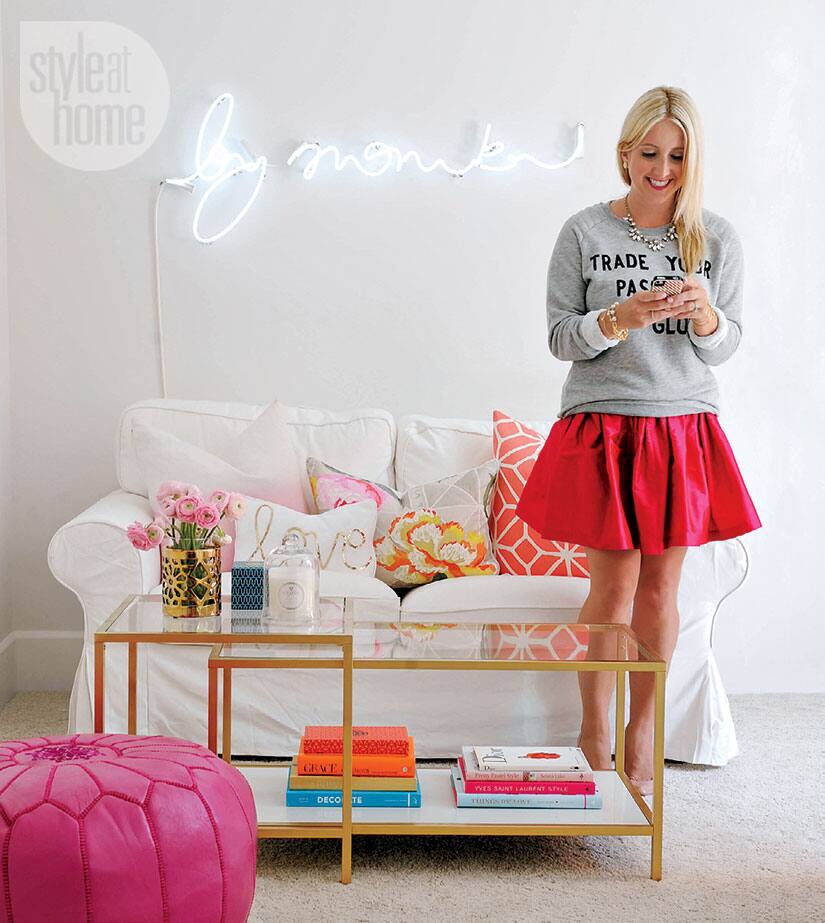
The upstairs home office is the most playful room in the house. "I wanted a pretty place where I could be inspired," explains Monika. The neon "by monika" sign, custom made by a local company, is the perfect visual expression of her lifestyle brand.

Desk area
Monika puts her office to good use, working on her blog and online store, where she sells her jewellery line, Bfrend, and other cute goodies. The white desk and Ghost-style office chair are in keeping with the room's airy, feminine feel.

Office accessories
White accents fill the office space. "I spend about three to five hours here each day, so it's important for me to have a place to escape and buckle down," she says. With all the white in the rest of the house, why the splashes of hot pink here? "Funny you should ask,"she says. "I call it my favourite undercover colour, because it does pop up a lot in my work."

Bedroom
Monika and Troy agreed on a master bedroom that would be simple, gender-neutral and bright. "For both of us, this look epitomizes comfort," she says. A patterned toss cushion in the middle of the bed pulls together the room's varying warm and cool shades of white.


Comments