House Tours
A 1920s Toronto home gets a cool modern makeover

Image: Donna Griffith / Styling: Morgan Lindsay
House Tours
A 1920s Toronto home gets a cool modern makeover
Designer Jordy Fagan reimagines a cramped fixer-upper as an airy open space fit for a family... eventually.
“I thought I could handle the makeover on my own.” Famous last words when spoken by homeowners with little or no reno experience, not to mention full-time jobs. Wanting a forever home where they could raise a family, this young couple sold their condo and purchased a 3,000-square-foot four-bedroom house – a 1920s fixer-upper that needed a serious overhaul – in Toronto’s Humewood neighbourhood.
“I planned to consult with a designer but oversee it all myself and then call in a professional to help with just the finishing touches,” says one of the homeowners. But that professional – designer Jordy Fagan of Cabin Co. Design – got the call sooner than planned. “The owners quickly realized how much is involved in renovating and furnishing an entire home,” says Jordy, “and that’s when I stepped in.”
Before she could deliver the cozy and youthful – but not too trendy – aesthetic the couple sought, however, the whole house required a reboot. It hadn’t been renovated since the ’70s and harboured the usual suspects: closed-off rooms, cheap fixtures and odd paint colours.
Yet it was not without its charms. “It had great bones, original stained glass windows and an amazing staircase,” says Jordy. “But I knew the couple planned to have kids one day, and with all its small rooms, this home just wasn’t conducive to how young families live today. I wanted an open concept plan that still felt warm and cozy.”
To achieve that openness, Jordy had the first floor gutted and knocked down almost all the walls to create one great room with a living room, dining room and kitchen.
A palette of deep warm greys and blues in a white envelope unifies the plan, while traditional details like Shaker-style cabinetry, open shelving, and plush and tufted furnishings keep it homey. Muted patterns and textures – in such pieces as the dining chair seat cushions, kitchen stools and porcelain backsplash – add interest, and geometric light fixtures and brass accents infuse a youthfulness befitting the young couple.
That aesthetic continues upstairs, where the owners were happy to lose one of their four bedrooms to create a master suite. The one caveat? They would have to remove a fireplace to accommodate the new floor plan – something most homeowners are reluctant to do. But these ones were game. After all, they got to keep the original stained glass windows that flanked it, and a custom king headboard fit perfectly in between.
The other two bedrooms? Well, those stayed intact for future family members. For now, these homeowners are happy hosting friends or enjoying some one-on-one time. But one day, the chitter-chatter of their wicked dinner parties may give way to the pitter-patter of little feet. And when that day comes, they can rest assured that at least their home is ready.

“A closet used to extend above the staircase, closing it in,” says designer Jordy Fagan of the entryway in this Toronto home. “I removed it to open up the space and showcase the original millwork.” Jody delineated the dining area of this open-concept Toronto home with elegant drapery and a striking light fixture. The humble wooden table and white chairs balance the formal features, while seat cushions covered in washable cotton fabric keep things spill-friendly.

Jordy fashioned this corner of the kitchen into a mini workspace. “It’s a sunny spot to work or pay bills,” she says. “Plus, it’s counter height, so it doubles as a handy buffet surface when the couple entertains.”

“I wouldn’t have thought of things like installing soft-touch drawers or placing the microwave below the counter to keep the work surfaces clutter-free,” says one of the homeowners. “But Jordy knew the importance of kitchen functionality. Entertaining here is almost intuitive.”

Jordy turned the young couple’s kitchen wish list into reality. “It has the usual covetables: a big island, hardwood floors, a table for entertaining and ample storage solutions, such as ceiling-height cabinetry,” she says.

The mostly white space gets its impact from the brass accents and contrasting hits of grey.

At first glance, it’s hard to tell the built-ins flanking the fireplace aren’t the same depth, but an HVAC unit running between the fireplace and the window prevented symmetry here.

Savvy Jordy had a solution: She used the same cabinetry bases, making one more shallow than the other to accommodate the HVAC, and spaced the floating shelves equally apart to achieve a deceptively balanced look.

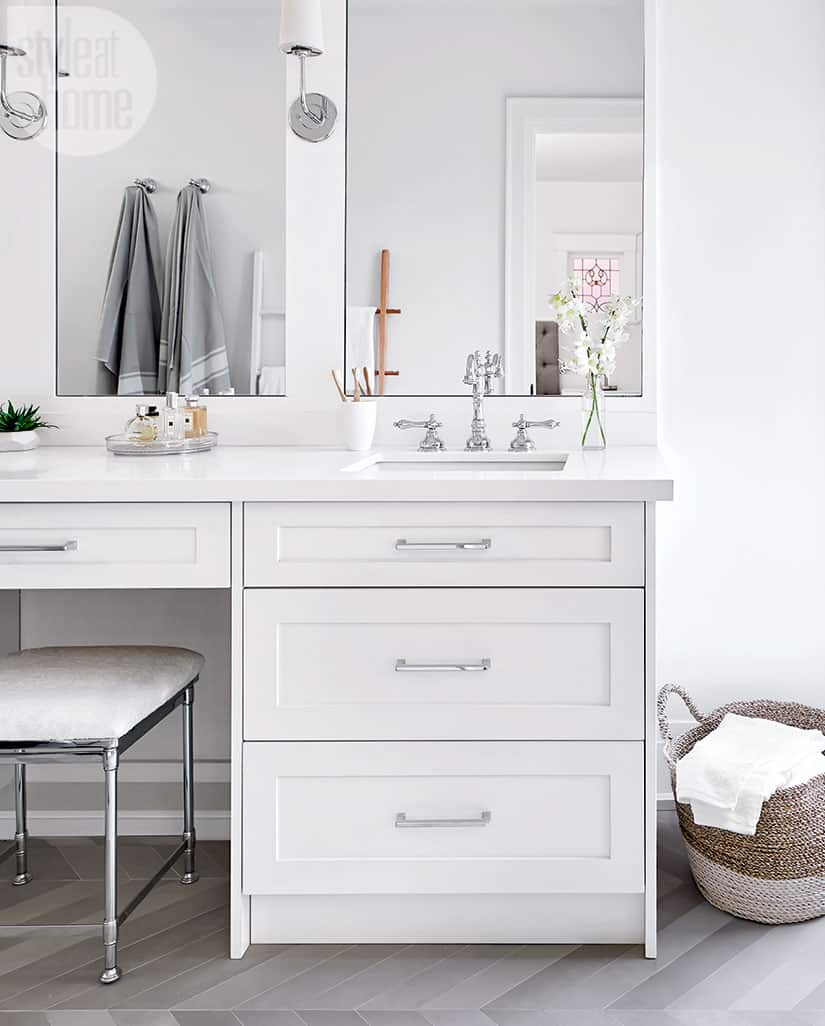
“The ensuite’s marble look is really porcelain,” says Jordy. “It’s budget-friendly and a lot easier to clean and maintain.” Budgeting also determined the faucets they chose. “While brass was on the owners’ wish list, we kept that to the main floor and opted for chrome in this private space, as it is far less expensive.”

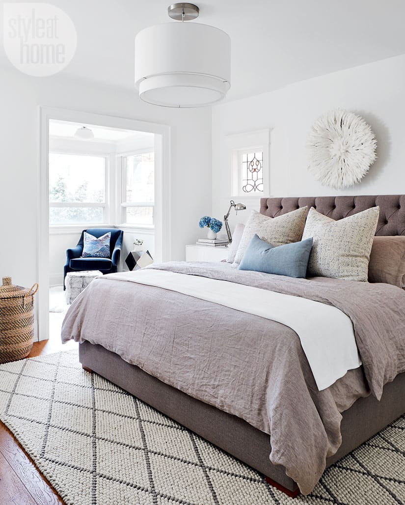
To enliven the neutral master bedroom, Jordy added crisp blue accents and layers of texture with a woven rug, a juju hat and raw linens.

Combined with the upholstered custom bed frame and plush toss cushions, the textiles make for a cozy space.


Comments