Small Spaces
A glam Vancouver condo fit for an Old Hollywood starlet

Image: Tracey Ayton
Small Spaces
A glam Vancouver condo fit for an Old Hollywood starlet
Paging Grace Kelly! Jolts of juicy hues and metallic hits exude grandeur in a sophisticated Hollywood glam pied-a-terre.
Designers are used to egregious style flaws, like cheap linoleum put down over pristine hardwood floors. “What were they thinking?” we can hear them whisper under their breath. For Chrissy Cottrell of Chrissy & Co., one such gaffe is particularly memorable.
The Vancouver designer was asked to revamp a 1,700-square-foot Yaletown condo as a pied-à-terre for a jet-setting couple and their four kids, ages six to 16.
Chrissy had expected the 32nd-floor suite to be bad, but not this bad. The maze-like layout revealed a closed-off den, a kitchen that could only be accessed through a small door and a dining room “so small it couldn’t even fit a reasonably sized table.” But the worst offence was the wall in the entryway that obstructed the dazzling view, which stretches from False Creek to English Bay.
The designer’s treatment for the chopped-up space? Swift and merciless style surgery. “There was no facelift option. Everything in the 1990s condo had to go,” she says of the year-long renovation that was completed while the homeowners were abroad (talk about trusting your designer).
“Because of the exceptional view, it only made sense to tear down most of the walls to achieve that panorama,” says Chrissy. Other casualties of the overhaul included dark dated floors and puffy patterned burgundy valances that trailed the window tops like overfed caterpillars.
For the overhaul, Chrissy channelled a glam 1950s Hollywood aesthetic. Think lavish rooms laden with panelling, velvet, brass and the low-slung, sculptural seating that typifies Hollywood Regency decor. One could imagine screen siren Grace Kelly sauntering through in a waist-cinching chiffon gown.
Other prevailing tastemakers of the era also figured into the scheme: “I have these fantastic vintage designer books,” says Chrissy. “One had a famous Dior illustration of a tiger’s paw and a woman’s hand rendered in burnt amber that [my client] really liked. She also loves Hermès, so it felt natural to incorporate orange into the design.”
Chrissy used the beguiling warm citrus hue as a focal point on one of the condo’s central walls, which dovetails into a daring black kitchen boasting a sultry elegance impossible to achieve with white. Meanwhile, glossy black interior doors and trim used throughout the condo lend the space cohesion and contrast the white backdrop.
The overall effect of the dwelling’s decor is at once dramatic and chic yet totally livable. The design shows just how much power colour can offer a space if a client is gutsy enough to embrace it. Chrissy was thrilled these “adventurous homeowners” didn’t need convincing; in fact, they trusted the designer so much, they didn’t even see the final result until a year after its completion. Today, the space has great flow thanks largely to those vibrant colours – which weren’t easy to pull together. “The trick is to have a timeless template,” says Chrissy. “You’ll notice the foundational elements, such as the white oak herringbone floors and most of the walls, are neutral.”
“When I was a young designer, I was intimidated by colour,” adds Chrissy. “Grey on grey is simple and safe, but layering colour takes confidence and skill. It has to be done in an elegant way – otherwise, it can look like a box of crayons threw up all over your house.” And that in and of itself would constitute an egregious style flaw.

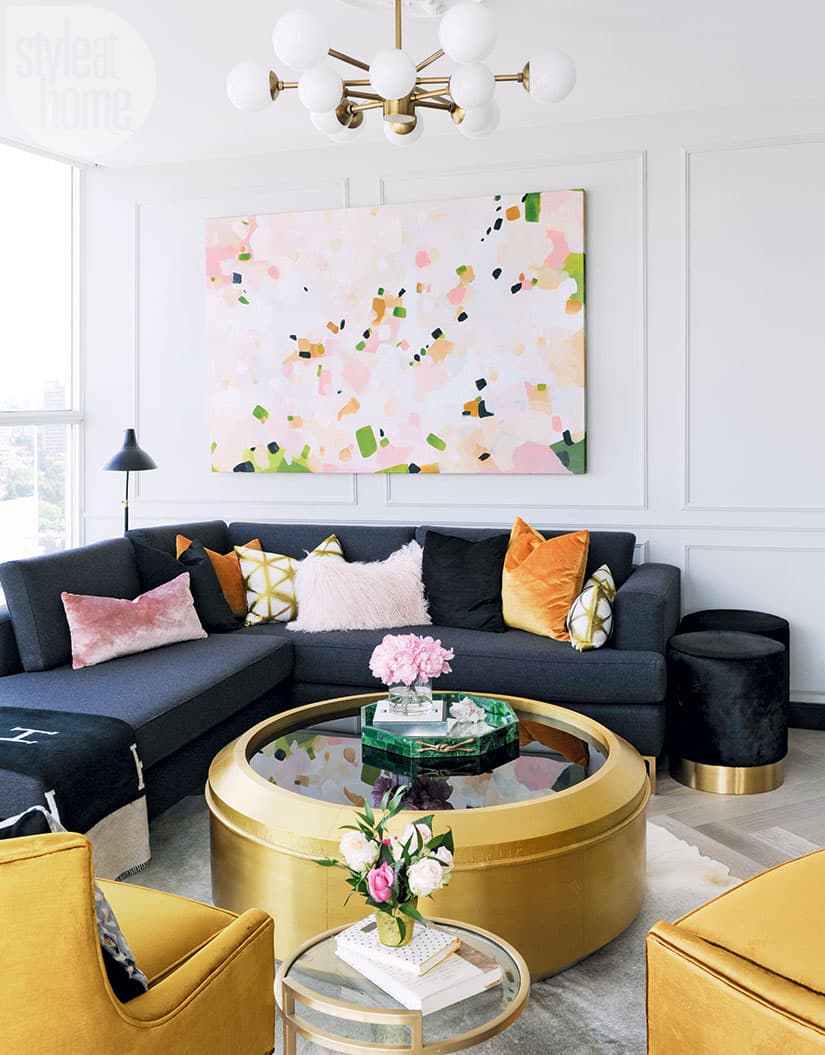
An uplifting spot for enjoying cocktails and gazing at the view, the living room show-cases a chic mix of orange, pink, black and gold. Designer Chrissy Cottrell had to search for the drum-shaped table, which has a black-glass mirrored top. “It’s very difficult to find a large round coffee table,” she says, noting that a square one wouldn’t have suited the space’s curves.

From the tangerine-toned velvet chairs (which have a stunning lustre when seen up close) to the ample brass accents, the Hollywood Regency look employed here is so inviting. “All those curves in the furniture allow for better traffic flow and lend an air of elegance,” says Chrissy. “Boxy chairs would have enclosed the space.” The ornate ceiling medallion adds interest up high and juxtaposes the Mid-Century-style light fixture.

“Wall panelling provides grace and elegance in a space,” says Chrissy. The thin stately mouldings also accentuate the nine-foot-high ceiling. A Mid-Century Modern Saarinen dining table and walnut and leather chairs are classic throwbacks that suit the condo’s vintage vibe.

The feature wall colour was inspired by a black and orange 1949 Dior perfume advertisement showing an illustration of a woman’s hand resting in a tiger’s paw. Both Chrissy and her client loved the ad’s mix of whimsy and opulence, so referencing it in the design was a no-brainer.

“I wanted the kitchen to be an elegant contrast to the otherwise bright common area,” says Chrissy. “The dark marble countertop and black cabinets are sexy, sophisticated and eye-catching without competing with the rest of the design.”

“There’s a reason kings and queens lived surrounded by beautiful jewel tones,” says Chrissy, who looks perfectly at home in the space she designed. Her toy poodle, Buttons, agrees.

The master bedroom’s large print – an 18th-century painting of Marie Antoinette by the Swedish painter Adolf Ulrik Wertmüller – may reference a period hundreds of years earlier than the condo’s mostly 1950s-inspired pieces, but it prevents the space from feeling too matchy-matchy.

Luxurious and youthful, the master bedroom features a button-tufted velvet headboard and a brass art Deco pendant light, which has coordinating sconces for dramatic impact. The play of pattern on the lumbar cushions and drapery offers sweet eye candy.


Comments