Accessories & Furnishings
sister act: see the before...

Accessories & Furnishings
sister act: see the before...
While Marlie's condo looks fresh and feminine and full of light now, it didn't exactly read that way before I got my hands on it.
1 Home office
 Before the
home office nook was drab and lonely with a shelving unit that blended right into the red floor and a serious amount of wasted floor space...
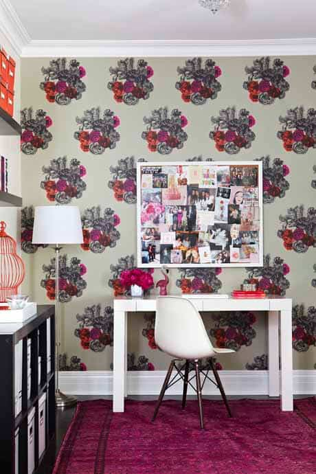
 A dramatic wall-treatment from
Cole & Son's Fornasetti collection made what once was an awkward nook into an eye-catching feature. Storage from
IKEA is now off to the side to let the
wallpaper pattern shine. The stunning second life rug from
ELTE doesn't hurt either...
2 Dining room
 Before the dining area's wood tones clashed with the red-hued flooring and seemed so heavy and traditional, while the track lighting seemed modern and out of place.
 Painting the walls a fresh warm white, putting down new espresso bamboo flooring from
The Home Depot and using less bulky furniture makes the condo feel more open and feminine. Replacing the track lighting with a crystal chandelier reinforced the glamorous vibe we were going after.
3 Bedroom
 Before the large bedroom was a little too bore-bore and seemed so empty, despite fitting in a king bed and two well-sized
nightside tables.
 After, a luxe-looking
tufted headboard from The Home Depot, glamorous mirrored nightside tables from
Worlds Away and a melange of citrus and ivory linens from
Au Lit Fine Linens make the bedroom an inviting sanctuary.
Which room makeover do you like best?
 Before the
home office nook was drab and lonely with a shelving unit that blended right into the red floor and a serious amount of wasted floor space...
 A dramatic wall-treatment from
Cole & Son's Fornasetti collection made what once was an awkward nook into an eye-catching feature. Storage from
IKEA is now off to the side to let the
wallpaper pattern shine. The stunning second life rug from
ELTE doesn't hurt either...
2 Dining room
 Before the dining area's wood tones clashed with the red-hued flooring and seemed so heavy and traditional, while the track lighting seemed modern and out of place.
 Painting the walls a fresh warm white, putting down new espresso bamboo flooring from
The Home Depot and using less bulky furniture makes the condo feel more open and feminine. Replacing the track lighting with a crystal chandelier reinforced the glamorous vibe we were going after.
3 Bedroom
 Before the large bedroom was a little too bore-bore and seemed so empty, despite fitting in a king bed and two well-sized
nightside tables.
 After, a luxe-looking
tufted headboard from The Home Depot, glamorous mirrored nightside tables from
Worlds Away and a melange of citrus and ivory linens from
Au Lit Fine Linens make the bedroom an inviting sanctuary.
Which room makeover do you like best?


Comments