Colour
2011 Farrow & Ball paint colours

2011 Farrow & Ball paint colours
Colour
2011 Farrow & Ball paint colours
The start of a new year is always an exciting time in the design world as all the new trends are revealed for the upcoming months. We want to know all the latest colours, shapes and styles, not to mention what's hot for paint hues.
British paint experts Farrow & Ball are introducing nine new colours for 2011, available in February. Ranging from neutrals to moody greys to a bold orange, these paint colours have all the quality that we've come to expect from Farrow & Ball.
 Cabbage White No.269
Although this room is colourful eye candy, we're drawn to the beautiful white on the doors. Called Cabbage White after the butterfly with the same name, this clean hue would look fabulous in any size of space, from a great room to a powder room.
Mizzle No.266
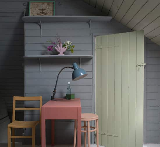
We love this shade featured on the wall for several reasons -- it's a great neutral that you can use to update a room without having to change all your furniture to match it, and it gets its name from the West Country description for the combination of mist and drizzle.
Brassica No. 271
This pretty purple would look great in any room and contrasts nicely with whites and soft greys. Try using in a foyer for a beautiful entrance to your home.
Plummett No.272
We love the sophisticated, moody look of this hue, which would add a great to deal of drama to any bedroom. Plummett was named after the lead weight used to sink a fishing line. Dove Tale
No.267
This neutral is sure to be a hot colour for 2011. Use on an entire room or on a feature like a door, as Farrow & Ball has done here. Farrow & Ball loves how this colour can look grey and at other times appear more stony.
Manor House Gray No.265
This is a true grey, and its name reflects the quintessentially English manor houses of the 18th century. Paired with the right colours, however (think Pantone's colour for 2011, ' Honeysuckle'), Manor House Gray can be very modern.
Oxford Stone No.264
Shown here in the cloth beneath the teapot, Oxford Stone was named after the colour of the stone often used in Oxfordshire village houses. Use this neutral to warm an interior.
Charlotte's Locks No.268
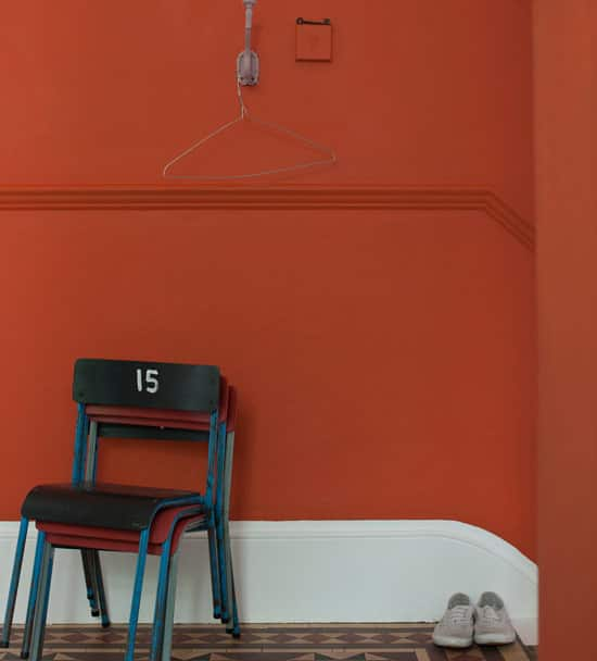
By far the boldest colour of the bunch, Charlotte's Locks is not for the faint of heart. If you're adventurous enough, use this burnt orange on every wall. For a more subtle effect, use for a paint project like a mirror frame or side table revamp.
Calluna No.270
A paler version of Brassica, Calluna was named after the Scottish heather. Calluna maintains a contemporary look, but with a little bit of black it can also appear quite vintage.
British paint experts Farrow & Ball are introducing nine new colours for 2011, available in February. Ranging from neutrals to moody greys to a bold orange, these paint colours have all the quality that we've come to expect from Farrow & Ball.
 Cabbage White No.269
Although this room is colourful eye candy, we're drawn to the beautiful white on the doors. Called Cabbage White after the butterfly with the same name, this clean hue would look fabulous in any size of space, from a great room to a powder room.

Mizzle No.266
We love this shade featured on the wall for several reasons -- it's a great neutral that you can use to update a room without having to change all your furniture to match it, and it gets its name from the West Country description for the combination of mist and drizzle.

Brassica No. 271
This pretty purple would look great in any room and contrasts nicely with whites and soft greys. Try using in a foyer for a beautiful entrance to your home.

Plummett No.272
We love the sophisticated, moody look of this hue, which would add a great to deal of drama to any bedroom. Plummett was named after the lead weight used to sink a fishing line.
 Dove Tale
No.267
This neutral is sure to be a hot colour for 2011. Use on an entire room or on a feature like a door, as Farrow & Ball has done here. Farrow & Ball loves how this colour can look grey and at other times appear more stony.

Manor House Gray No.265
This is a true grey, and its name reflects the quintessentially English manor houses of the 18th century. Paired with the right colours, however (think Pantone's colour for 2011, ' Honeysuckle'), Manor House Gray can be very modern.

Oxford Stone No.264
Shown here in the cloth beneath the teapot, Oxford Stone was named after the colour of the stone often used in Oxfordshire village houses. Use this neutral to warm an interior.

Charlotte's Locks No.268
By far the boldest colour of the bunch, Charlotte's Locks is not for the faint of heart. If you're adventurous enough, use this burnt orange on every wall. For a more subtle effect, use for a paint project like a mirror frame or side table revamp.

Calluna No.270
A paler version of Brassica, Calluna was named after the Scottish heather. Calluna maintains a contemporary look, but with a little bit of black it can also appear quite vintage.


Comments