
Colour
Trending Paint Colours That Look Good In Every Room

Photo by Behr
Colour
Trending Paint Colours That Look Good In Every Room
What’s your type? Whether you’re drawn to the brooding moody, quietly confident or sunshiny happy, you’ll find the perfect match in this year’s colour trends.
Purple reign

Photo by Dulux / Purple Basil—DLX1046-7, Dulux
This year, purple has emerged as an overarching trend among top paint companies. These dramatic hues range from cool, bluer purples (which read almost as deep, purply-black neutrals) to plums with a warm, velvety undertone to lighter ethereal shades that evoke a late-fall garden. The plethora of purples harmonizes with an array of palettes and pairs well with worn leather and natural wood. Add accents of aged brass and copper for a warm glow.
How to use purple...

Photo by Benjamin Moore / Cinnamon Slate—2113-40, Benjamin Moore
In the bedroom
Purple creates a sense of sanctuary softened by warmth and comfort. It effortlessly complements patterned textiles and natural wood. For balance, pair it with cooler neutrals like grey or beige (for harmony, make sure to match the undertone of your purple to the undertone of your neutral). Combine it with wallpaper for a room that radiates moody character and a dreamlike space.
In the Living Room
While purple could beautifully colour an accent wall, its true magic unfolds when it wraps an entire room in its embrace. For those with colour confidence, colour-drenching a living room with the right purple on all four walls, trim and even the ceiling will result in a bold, elegant interior. Dusky grey and gold accents add depth.
On Kitchen & Bathroom Cabinets
We love the drama of a bathroom vanity dressed in a cloak of this royal hue. The gleam of polished chrome or nickel hardware, or the more subtle glow of brushed brass fixtures, lifts purple beautifully. Kitchen cabinetry painted in purple and paired with a signature marble like Calacatta Viola can create an unforgettable impression, turning a builder-basic kitchen into an absolute gem.
For Outdoor Accents

Photo by Sico / Starry Night—6044-83, Sico
Purple elevates exterior elements and lets you announce your style to all who pass by. Accents that pop with purple include the front door, shutters and planters. Amplify purple’s impact by opting for a glossy finish. Sensational!
In the red

Photo by Behr / Rumors—MQ1-15, Behr
With red making a striking return in decorating accents over the past year, it’s no surprise it’s now taking centre stage with Behr’s Colour of the Year (Rumors MQ1-15). But this is no ordinary red. Think ruby red, but gone to the dark side: alluring and a little reminiscent of rich red wine, this colour would be striking as an accent in a room based on neutrals or it could make a bold statement as the main attraction on all four walls.
Pair Behr's Rumors with:
Sage advice
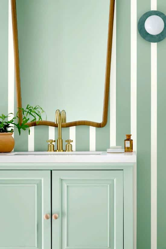
Photo by Sherwin-Williams / Quietude—SW 6212, Sherwin-Williams
Welcome back, sage. While it never really went away, sage is definitely on its way back. This iteration from Sherwin-Williams is aptly named. Quietude is a soft sage green with a distinct blue undertone. It’s light, serene and soothing, which sounds perfect for just about any setting.
Pair Sherwin-Williams' Quietude with:
Here comes the sun

Photo by Farrow & Ball / India Yellow 66, Farrow & Ball
Yellow is the ultimate happy hue. Charged with sunshine, this colour is having a comeback moment. Whether it’s on the bold spectrum (like sunflower and saffron) or more earthy (think light ochre and faded wheat), if you want to energize your interior or bring warmth, this is your hue. For the colour shy, a warning: yellow can be a tad overwhelming, so be cautious. Yellow’s complement is cooling blue, but it also shines bright when contrasted with a creamy white or bold black.
Pair Farrow & Ball's India Yellow with:
Recommended

Recommended

5 paint colours that will lighten and brighten any room
Comments