Design Lesson
Design lesson: Sarah Richardson's chic living space

Design lesson: Sarah Richardson's chic living space
Design Lesson
Design lesson: Sarah Richardson's chic living space
This colourful, elegant space is proof positive that a home can be family friendly without being kid dominated. But when
designer Sarah Richardson first met the homeowners in the living room of their west end Toronto home, the open-concept first floor suffered from a tight layout and an overload of clutter. It had great potential, but bulky, mismatched furniture with awkward proportions made the space feel small and cramped. It was unwelcoming and underused, save for the homeowners’ young son, whose toys had virtually taken over. They told Sarah they wanted their space back (but, of course, were willing to share).
So Sarah and her team from HGTV Canada’s Sarah 101 went to work tweaking the layout, adding smaller, clean-lined furniture to create a more functional, comfortable space.

Inspiration
"Fabric forms the all-important backdrop for any space." Sarah Richardson, Designer.
1 Include one-of-a-kind art
Since one of the homeowners of this Toronto home is a photography enthusiast, designer Sarah Richardson had one of his photos mounted to a sheet of plexiglas and framed in a light box to give the living area a bold, take-notice focal point. Now instead of just having art for art’s sake, the homeowners have invested in a piece with sentimental value that far outweighs its cost.
2 Mix & match
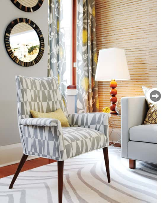
Sarah unified two different accent chairs in the living area by re-covering them in the same fabric. The swanky geometric print suits the chairs’ Mid-Century Modern style. Sarah’s other major tip for mixing fabrics: “Find contrast when you reupholster. For instance, put greys on wood frames (cool versus warm) or solid beige on a slat-back chair (simple versus busy).”
3 Add vintage pedigree
When Sarah stumbled upon a vintage Paul McCobb chair for an unbelievably low price, she grabbed it without a moment’s hesitation. “Vintage furniture is usually rock solid, and this style of chair can work in any room,” says Sarah. The leggy streamlined profile blends well with the contemporary and modern pieces in this space.
4 Think inside the box
To dress the tight window alcoves, certain sacrifices had to be made. Sarah hung the drapes on rods mounted to the alcoves’ side walls. She accounted for the lack of decorative finials by choosing a Lucite rod, which adds a little sparkle and glamour to the room’s largely wood and metal finishes and provides a visual link to the living room’s glass stair railing.
5 Remember: Thin is in
Make the most of a small space with slimmed-down furniture. “Small-scale pieces accentuate a room’s width, so trade oversized furniture for slim and trim,” says Sarah. In the living room, a bulky sofa was replaced with one boasting a svelte silhouette, while traditional seating in the dining room was exchanged for a compact space-saving banquette.
6 Turn two into one
Finding a rug to fit the long, narrow living area proved tricky for Sarah and her team. Her solution? Sew two rugs together. “The rug’s pattern helps to distract from the fact that the stripes don’t line up perfectly,” she says. With the cost of the sewing at about $200, the total cost of this project was still cheaper than if she’d had the rug custom-made.
7 Consider the kids
“Kids and style aren’t mutually exclusive,” says Sarah. She chose a round coffee table so there are no sharp edges that can cause bumps and bruises. Storage cubes provide easy-access hideaways for toys (especially useful when unexpected guests arrive), and washable fabrics mean there’s no cause for panic when inevitable spills occur.
8 Go with the flow
“The furniture layout needed to accommodate traffic flow and capitalize on all usable areas,” says Sarah, so she defined the entrance with a credenza, which offers ample storage, and created an extra sitting area next to the stairs (shown opposite) to maximize seating while maintaining an open flow of traffic to the kitchen.
9 Choose the right accent
Accent walls add interest to rooms that lack a focal point. Sarah turned the main wall in the open space into a massive feature wall by covering it with a textural grasscloth wallpaper. “A feature wall holds the focus of a room,” she says. A pair of graphic geometric shelves define the dining room; in the living room, artwork does the same.
10 Go full circle
“Repetition is one of the best ways to unify a space,” says Sarah. But don’t just repeat colours and patterns – repeat shapes, too. The mirrors and ball lamp in the living room and the table and pendant light in the dining room are all round items. “Many of the big pieces in the room were square, so it was necessary to soften the space with round elements,” she says.
Check out the top 10 ways to use colour and texture in your home for more expert design tips.
So Sarah and her team from HGTV Canada’s Sarah 101 went to work tweaking the layout, adding smaller, clean-lined furniture to create a more functional, comfortable space.

Inspiration
"Fabric forms the all-important backdrop for any space." Sarah Richardson, Designer.

1 Include one-of-a-kind art
Since one of the homeowners of this Toronto home is a photography enthusiast, designer Sarah Richardson had one of his photos mounted to a sheet of plexiglas and framed in a light box to give the living area a bold, take-notice focal point. Now instead of just having art for art’s sake, the homeowners have invested in a piece with sentimental value that far outweighs its cost.
2 Mix & match
Sarah unified two different accent chairs in the living area by re-covering them in the same fabric. The swanky geometric print suits the chairs’ Mid-Century Modern style. Sarah’s other major tip for mixing fabrics: “Find contrast when you reupholster. For instance, put greys on wood frames (cool versus warm) or solid beige on a slat-back chair (simple versus busy).”

3 Add vintage pedigree
When Sarah stumbled upon a vintage Paul McCobb chair for an unbelievably low price, she grabbed it without a moment’s hesitation. “Vintage furniture is usually rock solid, and this style of chair can work in any room,” says Sarah. The leggy streamlined profile blends well with the contemporary and modern pieces in this space.

4 Think inside the box
To dress the tight window alcoves, certain sacrifices had to be made. Sarah hung the drapes on rods mounted to the alcoves’ side walls. She accounted for the lack of decorative finials by choosing a Lucite rod, which adds a little sparkle and glamour to the room’s largely wood and metal finishes and provides a visual link to the living room’s glass stair railing.
5 Remember: Thin is in
Make the most of a small space with slimmed-down furniture. “Small-scale pieces accentuate a room’s width, so trade oversized furniture for slim and trim,” says Sarah. In the living room, a bulky sofa was replaced with one boasting a svelte silhouette, while traditional seating in the dining room was exchanged for a compact space-saving banquette.

6 Turn two into one
Finding a rug to fit the long, narrow living area proved tricky for Sarah and her team. Her solution? Sew two rugs together. “The rug’s pattern helps to distract from the fact that the stripes don’t line up perfectly,” she says. With the cost of the sewing at about $200, the total cost of this project was still cheaper than if she’d had the rug custom-made.
7 Consider the kids
“Kids and style aren’t mutually exclusive,” says Sarah. She chose a round coffee table so there are no sharp edges that can cause bumps and bruises. Storage cubes provide easy-access hideaways for toys (especially useful when unexpected guests arrive), and washable fabrics mean there’s no cause for panic when inevitable spills occur.

8 Go with the flow
“The furniture layout needed to accommodate traffic flow and capitalize on all usable areas,” says Sarah, so she defined the entrance with a credenza, which offers ample storage, and created an extra sitting area next to the stairs (shown opposite) to maximize seating while maintaining an open flow of traffic to the kitchen.

9 Choose the right accent
Accent walls add interest to rooms that lack a focal point. Sarah turned the main wall in the open space into a massive feature wall by covering it with a textural grasscloth wallpaper. “A feature wall holds the focus of a room,” she says. A pair of graphic geometric shelves define the dining room; in the living room, artwork does the same.
10 Go full circle
“Repetition is one of the best ways to unify a space,” says Sarah. But don’t just repeat colours and patterns – repeat shapes, too. The mirrors and ball lamp in the living room and the table and pendant light in the dining room are all round items. “Many of the big pieces in the room were square, so it was necessary to soften the space with round elements,” she says.
Check out the top 10 ways to use colour and texture in your home for more expert design tips.


Comments