Interiors
Interior: Home for a rest

Interior: Home for a rest
Interiors
Interior: Home for a rest
Here’s a 21st-century design myth that needs busting:
neutrals are bland, safe choices for timid decorators. Admittedly, it’s easy to see how our overdose on taupe in the neutralized ’90s gave subdued hues a bad rep. But this decade’s swing to bold, beautiful colour and pattern doesn’t mean neutrals aren’t all that, too, as this condo in Toronto’s Roncesvalles Village neighbourhood proves.
Designer Stephanie Lees of Studio EyeSpy helped the homeowner, a globetrotting businesswoman, redo her 950-square-foot abode top to bottom. “The joke was that the only thing we kept were two toilets,” says Stephanie. The new design addressed functional issues, such as a poorly planned kitchen with no counter space, as well as aesthetics. “Every square inch of surface and most of the furniture is new,” she says.

A peaceful space
White linen drapes softly filter light through the wall of windows in the living room. A luxuriously large grey sofa and sleek white Barcelona chairs form a contemporary-style conversation area around the wenge-wood-clad fireplace. A concrete surround reinforces the use of grey throughout this Toronto condo.
A bright pop of colour
In the living room, colour warms up and enlivens the neutral scheme, as evidenced by the punch of red from the one-of-a-kind antique sign the homeowner bought in China, which hangs over a console she brought back from Calgary.
A smoky bedroom
The raspberry pink upholstered bed (a request from the homeowner) is an island of colour in the smoky grey master bedroom.
Glass collection
The homeowner’s art glass collection displayed on a floating shelf brings a jolt of colour to the subdued master bedroom.
A cozy den
The den’s daybed was re-covered in grey linen – a perfect backdrop for toss cushions in a mix of textiles, including Kuba cloth the owner purchased when she lived in the Democratic Republic of Congo. A dream kitchen
Not only do the undercounter fridge and freezer units maximize counter space (the owner requested a long run of counter to use as a servery), but they also keep the room uncluttered, which is important, since the kitchen is visible from the living room. Quartz composite countertops were a more durable choice than natural stone.
A place to entertain
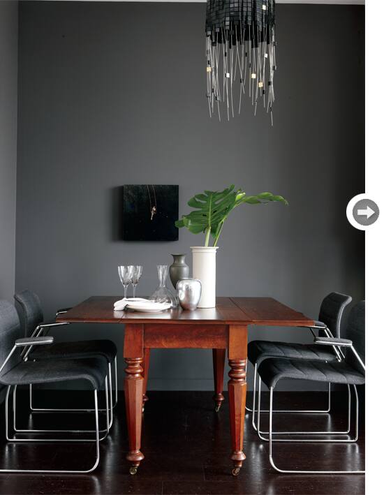
Designer Stephanie Lees had all three walls in the dining alcove painted the same colour that was strategically used on the walls throughout the condo. The homeowner’s antique table contrasts effectively with retro ’70s office chairs. The stunning chandelier is like a sculpture, says Stephanie.
Chic dinnerware
A bit of sparkle from glass and silver items enlivens the moody grey dining room. The rich tones of the owner’s wooden table (which Stephanie had refinished) warms up the shades of grey.
Designer Stephanie Lees of Studio EyeSpy helped the homeowner, a globetrotting businesswoman, redo her 950-square-foot abode top to bottom. “The joke was that the only thing we kept were two toilets,” says Stephanie. The new design addressed functional issues, such as a poorly planned kitchen with no counter space, as well as aesthetics. “Every square inch of surface and most of the furniture is new,” she says.

A peaceful space
White linen drapes softly filter light through the wall of windows in the living room. A luxuriously large grey sofa and sleek white Barcelona chairs form a contemporary-style conversation area around the wenge-wood-clad fireplace. A concrete surround reinforces the use of grey throughout this Toronto condo.

A bright pop of colour
In the living room, colour warms up and enlivens the neutral scheme, as evidenced by the punch of red from the one-of-a-kind antique sign the homeowner bought in China, which hangs over a console she brought back from Calgary.

A smoky bedroom
The raspberry pink upholstered bed (a request from the homeowner) is an island of colour in the smoky grey master bedroom.

Glass collection
The homeowner’s art glass collection displayed on a floating shelf brings a jolt of colour to the subdued master bedroom.

A cozy den
The den’s daybed was re-covered in grey linen – a perfect backdrop for toss cushions in a mix of textiles, including Kuba cloth the owner purchased when she lived in the Democratic Republic of Congo.
 A dream kitchen
Not only do the undercounter fridge and freezer units maximize counter space (the owner requested a long run of counter to use as a servery), but they also keep the room uncluttered, which is important, since the kitchen is visible from the living room. Quartz composite countertops were a more durable choice than natural stone.

A place to entertain
Designer Stephanie Lees had all three walls in the dining alcove painted the same colour that was strategically used on the walls throughout the condo. The homeowner’s antique table contrasts effectively with retro ’70s office chairs. The stunning chandelier is like a sculpture, says Stephanie.

Chic dinnerware
A bit of sparkle from glass and silver items enlivens the moody grey dining room. The rich tones of the owner’s wooden table (which Stephanie had refinished) warms up the shades of grey.


Comments