Interiors
Interiors: Contemporary classic

Interiors: Contemporary classic
Interiors
Interiors: Contemporary classic
Traditional doesn't mean time warp. That's easy to see from a peek inside the Ottawa home of Irene Langlois. The designer's signature style is rooted in tradition (fine architectural details and sophisticated furnishings), but her secret to keeping classic contemporary is to enliven timeless elements with a judicious but confident application of the day's top trends.

White front hall
To make a white room less boring, Irene’s favourite trick is to incorporate contrast. She’s done plenty of that in the predominantly white front hall, from the zebra-print rug and bench to the black handrailing, front door and occasional chair.
Traditional wingchair
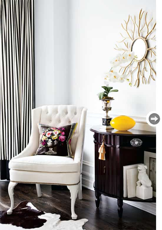
This traditional wing chair once sported red paisley fabric and mahogany legs, but now boasts microfibre fabric, white lacquered legs and nailhead detailing carried up the arms and around the back.
Living room
An eclectic wall decor display is united by framing (either black, gold or a combo of the two) and creates a focal point on the light grey wall in the living room. Decorating with yellow – a colour Irene is using quite a bit right now – loosens up the classic black-and-white decor. As for the 20-year-old William Birch sofa: Irene muses that she’ll reupholster it again one day and maybe lose the skirt to show off its tapered legs.
The secretary
The secretary (moved from the living room) is “a little unexpected and dramatic,” says Irene; it’s a feature that showcases her traditional-meets-contemporary style right at the front door. “I put the leather-and-chrome stool underneath it for a bit of an eclectic feel. Mixing periods and styles makes it interesting,” says Irene.
The dining room
The dining table is an antique that Irene loves for its classic lines. She gave it a coat of black lacquer and topped it with a mirror to take it from fine to fabulous.
Dining room artwork
“Panelling takes a room to the next level, adding lots of visual interest,” says Irene of the dining room. It can even make a small space look bigger, she says. The vignette of artwork, a gilt-framed mirror and an empty frame was actually intentional. “I’ve had that mirror for many years. It was hanging on the wall in the living room, so it was a little more traditional,” says Irene. “By bringing the mirror into the dining room and leaning it on the floor, it feels less formal, but still elegant and dramatic, which I like.” Call it evolution!
Family room
Irene took advantage of the almost 10-foot-high ceilings in the family room to add architectural interest with a coffered ceiling. Its strong grid pattern is contrasted by the circular forms on the mirror and on the mantel. “It wasn’t planned,” says Irene. “Just a happy amalgamation of geometry.” She furnished the room for the whole family to enjoy (although she and her husband’s three children have since flown the nest). It had to be comfortable and practical, hence the plush sofa, distressed leather armchairs and tufted black ottoman.
Contemporary kitchen
Irene loves to update a traditional interior with contemporary lighting options. The pendants and wall sconces aren’t afterthoughts – they’re intentional design details, she says. High-gloss dark floors are a glamorous contrast for the light cabinetry and finishes. Creamy travertine marble countertops were installed years ago, so in order to introduce the cooler grey colours she was using elsewhere in the house, Irene tiled the wall above the downdraft cooktop in statuario marble tiles. “There’s a little bit of the cream that runs through them, so they blend well together,” she says.
Kitchen accent colours
“Pale blue is such a pretty, fresh shade,” says Irene of decorating with blue
that she’s applied throughout the kitchen. As for the antique silver teapot, she uses it every single day. Now that’s functional style!
Master bedroom
Irene went for drama in the dream master bedroom with a tall tufted headboard in a dark rich chocolate velvet, along with bold striped throw pillows and a matching bedskirt. Pale blue-grey walls and overscale damask patterned drapes soften the “masculine” feel and add to the luxury, as do the plush creamy white carpet, bevelled floor mirror and stunning chandelier.
Master ensuite
Porcelain tile with black marble inserts and border fashion a classic pattern underfoot in the master bathroom decor. The room is big enough for a free-standing vanity table and a transparent armchair. “This chair was a wonderful way to bring a modern element to a very traditional-looking table,” says Irene. The accent table next to the shower was a find at a big-box retailer. “It’s been in many, many different spots throughout my house, and it currently works really well in that nook,” she says. “It’s in your sightline as you enter into the bathroom so it’s a nice little vignette.”
For more gorgeous home interiors, check out our interior design guide.

White front hall
To make a white room less boring, Irene’s favourite trick is to incorporate contrast. She’s done plenty of that in the predominantly white front hall, from the zebra-print rug and bench to the black handrailing, front door and occasional chair.

Traditional wingchair
This traditional wing chair once sported red paisley fabric and mahogany legs, but now boasts microfibre fabric, white lacquered legs and nailhead detailing carried up the arms and around the back.

Living room
An eclectic wall decor display is united by framing (either black, gold or a combo of the two) and creates a focal point on the light grey wall in the living room. Decorating with yellow – a colour Irene is using quite a bit right now – loosens up the classic black-and-white decor. As for the 20-year-old William Birch sofa: Irene muses that she’ll reupholster it again one day and maybe lose the skirt to show off its tapered legs.

The secretary
The secretary (moved from the living room) is “a little unexpected and dramatic,” says Irene; it’s a feature that showcases her traditional-meets-contemporary style right at the front door. “I put the leather-and-chrome stool underneath it for a bit of an eclectic feel. Mixing periods and styles makes it interesting,” says Irene.

The dining room
The dining table is an antique that Irene loves for its classic lines. She gave it a coat of black lacquer and topped it with a mirror to take it from fine to fabulous.

Dining room artwork
“Panelling takes a room to the next level, adding lots of visual interest,” says Irene of the dining room. It can even make a small space look bigger, she says. The vignette of artwork, a gilt-framed mirror and an empty frame was actually intentional. “I’ve had that mirror for many years. It was hanging on the wall in the living room, so it was a little more traditional,” says Irene. “By bringing the mirror into the dining room and leaning it on the floor, it feels less formal, but still elegant and dramatic, which I like.” Call it evolution!

Family room
Irene took advantage of the almost 10-foot-high ceilings in the family room to add architectural interest with a coffered ceiling. Its strong grid pattern is contrasted by the circular forms on the mirror and on the mantel. “It wasn’t planned,” says Irene. “Just a happy amalgamation of geometry.” She furnished the room for the whole family to enjoy (although she and her husband’s three children have since flown the nest). It had to be comfortable and practical, hence the plush sofa, distressed leather armchairs and tufted black ottoman.

Contemporary kitchen
Irene loves to update a traditional interior with contemporary lighting options. The pendants and wall sconces aren’t afterthoughts – they’re intentional design details, she says. High-gloss dark floors are a glamorous contrast for the light cabinetry and finishes. Creamy travertine marble countertops were installed years ago, so in order to introduce the cooler grey colours she was using elsewhere in the house, Irene tiled the wall above the downdraft cooktop in statuario marble tiles. “There’s a little bit of the cream that runs through them, so they blend well together,” she says.

Kitchen accent colours
“Pale blue is such a pretty, fresh shade,” says Irene of decorating with blue
that she’s applied throughout the kitchen. As for the antique silver teapot, she uses it every single day. Now that’s functional style!

Master bedroom
Irene went for drama in the dream master bedroom with a tall tufted headboard in a dark rich chocolate velvet, along with bold striped throw pillows and a matching bedskirt. Pale blue-grey walls and overscale damask patterned drapes soften the “masculine” feel and add to the luxury, as do the plush creamy white carpet, bevelled floor mirror and stunning chandelier.

Master ensuite
Porcelain tile with black marble inserts and border fashion a classic pattern underfoot in the master bathroom decor. The room is big enough for a free-standing vanity table and a transparent armchair. “This chair was a wonderful way to bring a modern element to a very traditional-looking table,” says Irene. The accent table next to the shower was a find at a big-box retailer. “It’s been in many, many different spots throughout my house, and it currently works really well in that nook,” she says. “It’s in your sightline as you enter into the bathroom so it’s a nice little vignette.”
For more gorgeous home interiors, check out our interior design guide.


Comments