Interiors
Restaurant interior: Frankies Diner

Restaurant interior: Frankies Diner
Interiors
Restaurant interior: Frankies Diner
A landmark on Toronto’s Queen Street West for more than 35 years, Frankies Diner stood out from the area’s trendy surroundings with its “mishmash of dated furniture mixed with sports paraphernalia,” says designer
Montana Burnett, a regular on Food Network Canada’s Restaurant Takeover, of the diner before its television makeover.
Her goal? A hip, family-friendly space that could seamlessly transition from daytime diner to nighttime bar, while staying true to its rustic roots. “The redesign timeline, from inception to execution, was very short,” says Montana, “so there were a lot of coffees, sleepless nights and quick decisions.” But she couldn’t be happier with the results: “I don’t want to toot my own horn, but after the big reveal, I wanted to move in!”

The art of arrangement
Frankies diner’s new modern design still pays homage to its decades-long past with framed black and white photos of Queen Street that date back to the 1930s. “I found some in the basement, which inspired me to look for more at the city archives. I blew them up and lined the entire length of one wall with them,” says Montana. “The rustic nature of the photos was the inspiration for the character of the restaurant’s redesign.”
Wood, white and blue
“To achieve a rustic aesthetic, I spaced two-by-fours few inches apart on the backs of the banquettes and whitewashed them,” says designer Montana Burnett. “I cushioned only the seats but did so in a lustrous blue colour that amplifies the space.”
Day to night decor
By day, Frankies Diner serves up decadent specialty burgers and other indulgences, but at night the restaurant becomes a place to share a few pints or a bottle of wine and let the evening unfold. “I love the bar top more than anything,” says Montana. The marble countertop was a huge splurge, but together with the retro glass pendant lights and shiny subway tiles, it adds “glamour that both stands out from the rest of the space and helps with the transition from day to night, diner to bar.”
Stylish tabletops
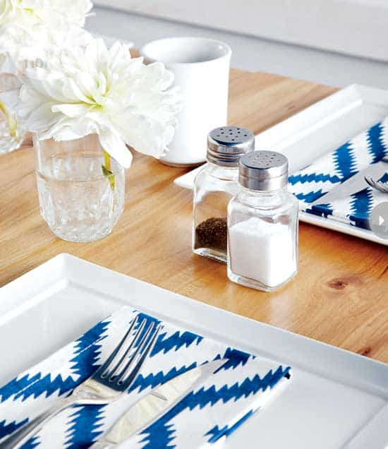
Rustic three-inch-thick hemlock tabletops with subtle graining serve as the perfect stage for simple place settings. The white dishware and tabletop accessories were kept plain, with the single pop of interest coming from the lively pattern on the napkins. A small dose of this print was enough to make an impact.
Bold blue ceiling
Montana paired the glamour of the Statuario marble countertops and glossy white subway tiles with the charm of the wooden tables and rough-hewn banquettes. The unexpected juxtaposition adds interest, as does the boldly painted blue ceiling. “Its height was so generous, it could be darkened without depressing the space,” says Montana.
Blue and white accessories
Clean white dishware with a subtle deep-blue rim feels fresh, fits with the colour scheme and lets the food presentation really shine.
Fresh flowers
Fresh white flowers make mealtime more inviting – they should be as much a table staple as salt and pepper shakers.
Her goal? A hip, family-friendly space that could seamlessly transition from daytime diner to nighttime bar, while staying true to its rustic roots. “The redesign timeline, from inception to execution, was very short,” says Montana, “so there were a lot of coffees, sleepless nights and quick decisions.” But she couldn’t be happier with the results: “I don’t want to toot my own horn, but after the big reveal, I wanted to move in!”

The art of arrangement
Frankies diner’s new modern design still pays homage to its decades-long past with framed black and white photos of Queen Street that date back to the 1930s. “I found some in the basement, which inspired me to look for more at the city archives. I blew them up and lined the entire length of one wall with them,” says Montana. “The rustic nature of the photos was the inspiration for the character of the restaurant’s redesign.”

Wood, white and blue
“To achieve a rustic aesthetic, I spaced two-by-fours few inches apart on the backs of the banquettes and whitewashed them,” says designer Montana Burnett. “I cushioned only the seats but did so in a lustrous blue colour that amplifies the space.”

Day to night decor
By day, Frankies Diner serves up decadent specialty burgers and other indulgences, but at night the restaurant becomes a place to share a few pints or a bottle of wine and let the evening unfold. “I love the bar top more than anything,” says Montana. The marble countertop was a huge splurge, but together with the retro glass pendant lights and shiny subway tiles, it adds “glamour that both stands out from the rest of the space and helps with the transition from day to night, diner to bar.”

Stylish tabletops
Rustic three-inch-thick hemlock tabletops with subtle graining serve as the perfect stage for simple place settings. The white dishware and tabletop accessories were kept plain, with the single pop of interest coming from the lively pattern on the napkins. A small dose of this print was enough to make an impact.

Bold blue ceiling
Montana paired the glamour of the Statuario marble countertops and glossy white subway tiles with the charm of the wooden tables and rough-hewn banquettes. The unexpected juxtaposition adds interest, as does the boldly painted blue ceiling. “Its height was so generous, it could be darkened without depressing the space,” says Montana.

Blue and white accessories
Clean white dishware with a subtle deep-blue rim feels fresh, fits with the colour scheme and lets the food presentation really shine.

Fresh flowers
Fresh white flowers make mealtime more inviting – they should be as much a table staple as salt and pepper shakers.


Comments