Before and After
Before and After: Enlarging the Kitchen, Improving Flow and Increasing Storage

Before and After
Before and After: Enlarging the Kitchen, Improving Flow and Increasing Storage
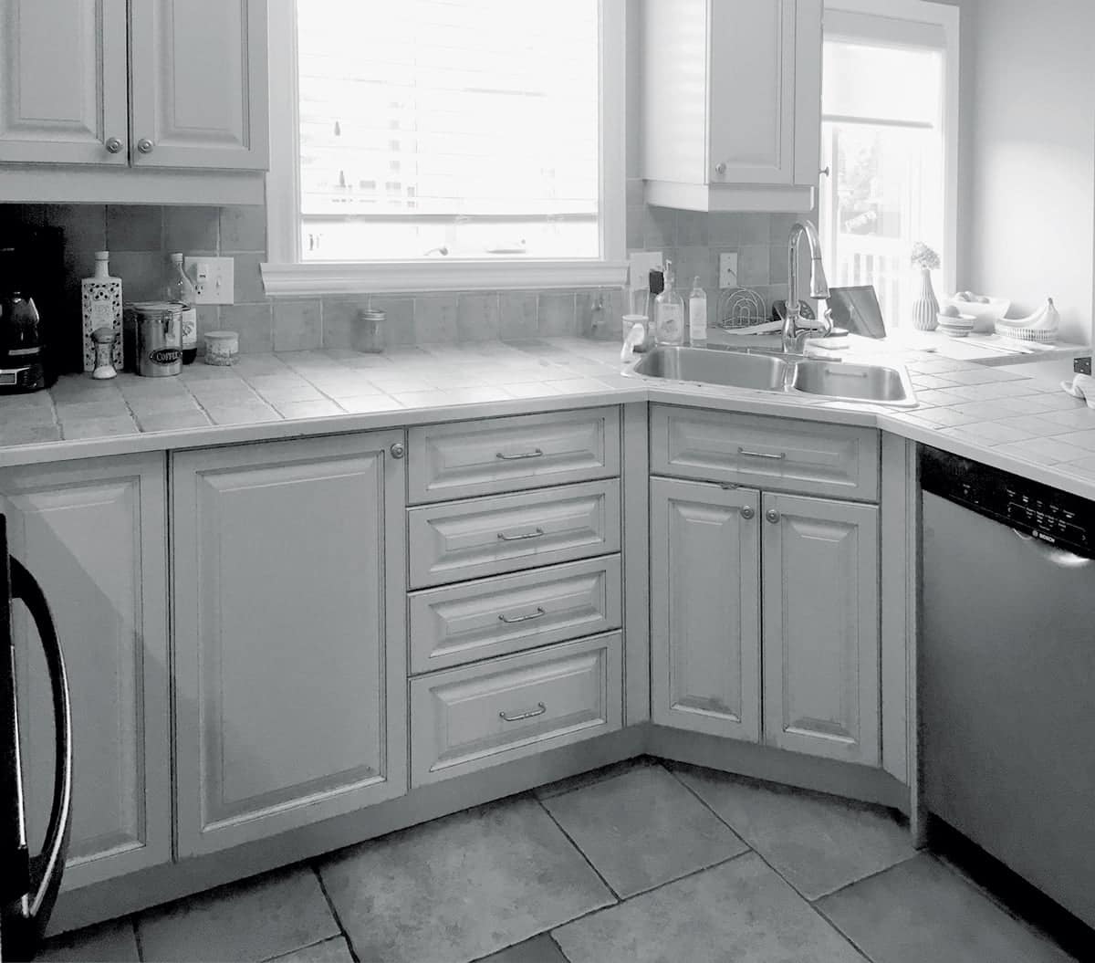
Tired of its lack of space and dated look, the owners of this kitchen had been planning a reno for ages. They found it especially annoying that only two of the four family members could be in the room at once. For solutions, they turned to designer Isabelle Filion.
Isabelle focused on enlarging the room, improving flow and increasing storage. Top requests included a longer counter and getting rid of the peninsula that closed off the space. Isabelle complied by extending the wall on the left by two feet toward the dining room. She also removed all the angles in the room to make it feel bigger and make the cabinets more accessible. “Before, we could never be all together in the kitchen,” says the chef of the family. “Now I can cook while one of the children makes their lunch. No one is in the way. There’s room for everyone.”
Decisions, Decisions
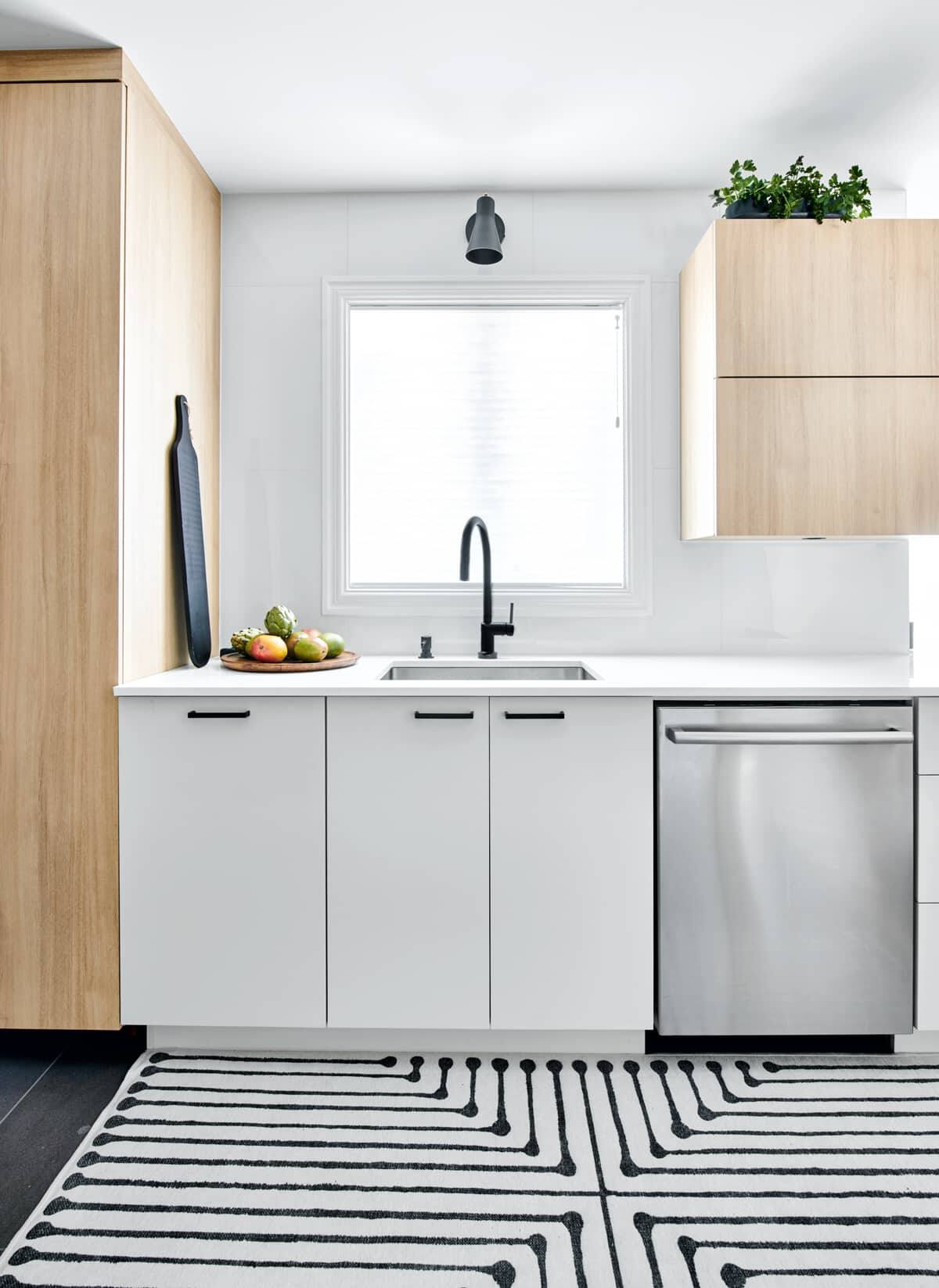
“Choosing the materials was the hardest part,” says designer Isabelle Filion. “We didn’t want to make any mistakes because who wants to renovate every five years? We wanted the colours and materials we chose to be timeless.” They opted for a mix of pale wood and white with black accents. The upper cabinetry is laminate, which withstands heat and humidity; durable MDF is on the lowers. The owners wanted a countertop that would withstand hot cookware. Lapitec, a sintered stone slab made from natural minerals, has a clean look, plus it’s resistant to scratches, heat, stains and bacteria. The glossy finish amps up the light and looks sleek.
Clean Sweep
Photography by Bruno Petrozza
The sink area is highly efficient. On the left is a large pantry and a refuse and recycling pullout; on the right, the dishwasher. A touchless faucet is ideal when cooking; it has a light that turns blue or red to indicate water temperature. Glossy white tile on the backsplash is practical and bright. For mood and task lighting, a black sconce echoes the cabinetry hardware. The space-sapping peninsula was traded for a countertop extension that’s perfect as an office area or a place for a child to draw. A comfy stool with retro lines makes a statement.
Form Follows Function
Photography by Bruno Petrozza
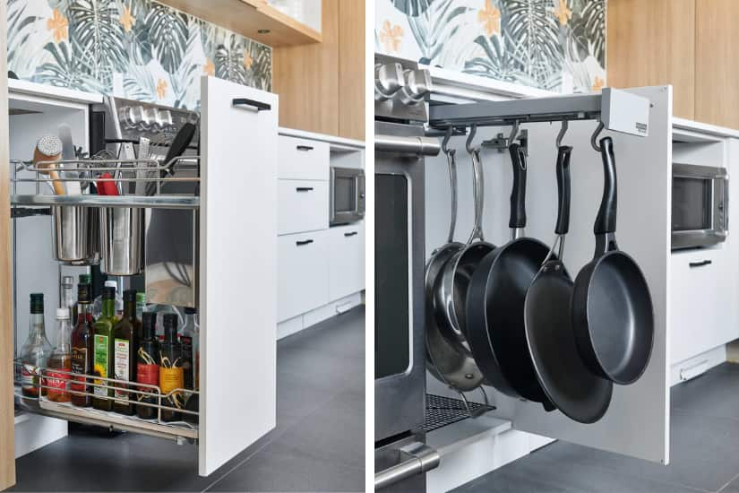
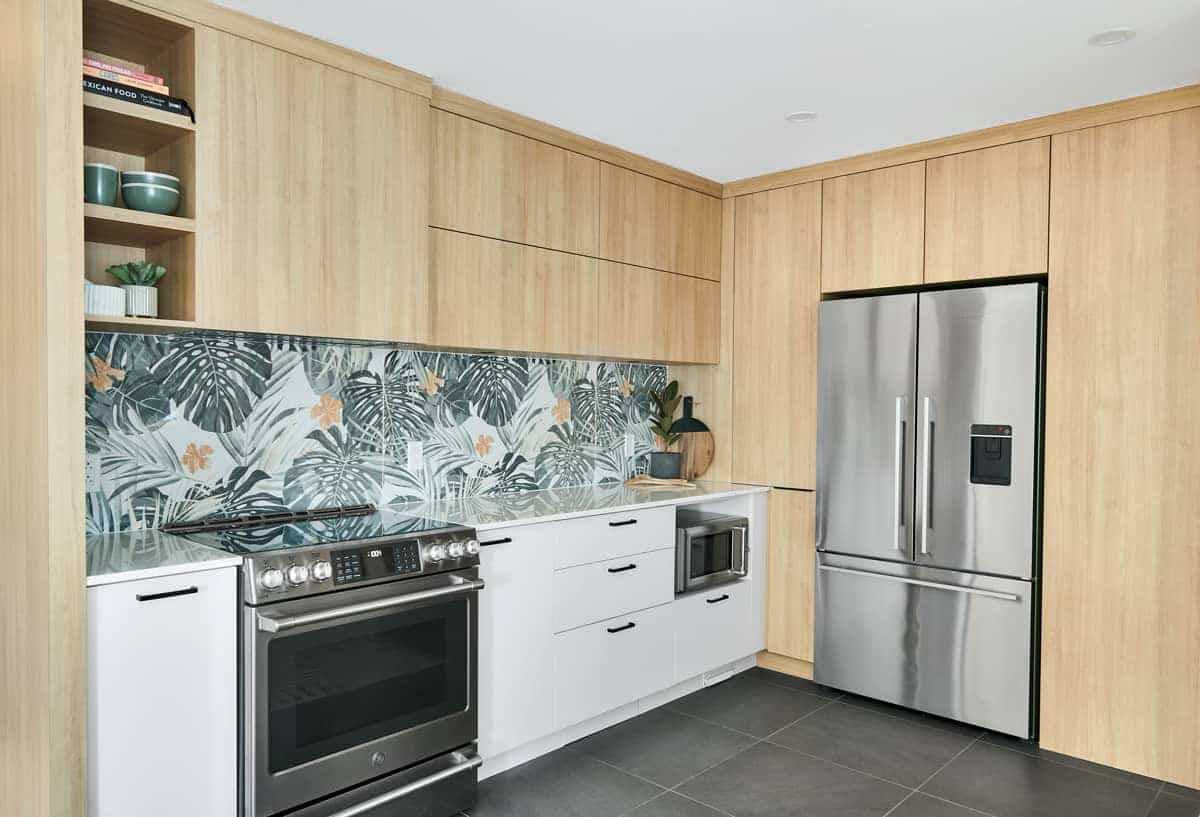
Isabelle installed the upper cabinets at 24 inches high to create more space between the counter and cabinets, which gave the tall cook in the family a bit of breathing room when working. She took them to ceiling height to maximize storage, while also prioritizing smart storage in the lower cabinets. The food prep zone stashes all the cook’s tools within reach. To the left of the range, a sliding drawer holds utensils and oils. To the right is a pullout for pans and cutting boards.
Photography by Bruno Petrozza
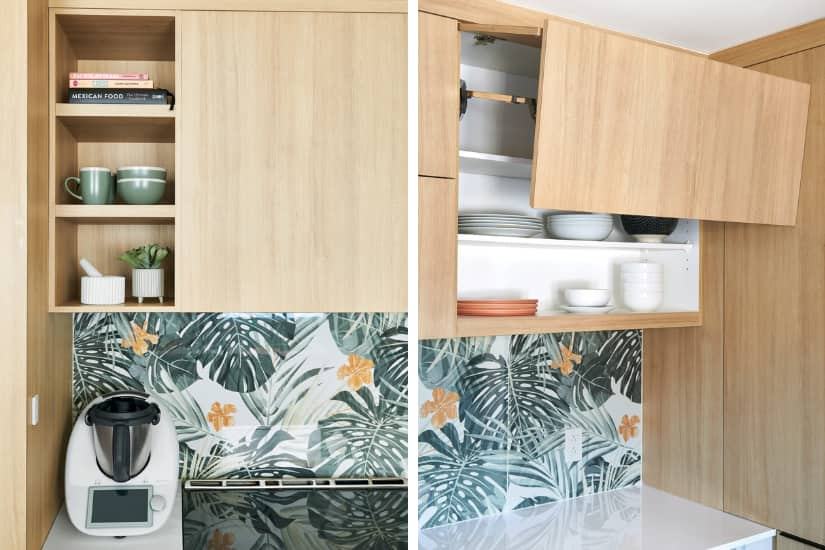
Beside that, drawers store more kitchen tools, while the mixing bowl, colander and tableware are in the upper cabinets. On the counter, a Thermomix takes pride of place, since the chef uses it daily. At the back corner between the microwave and fridge, all the available space behind the wall was carved out for more storage, including a small cabinet for breakfast items.
“We loved Isabelle’s idea of building the fridge into the former pantry, which gave us more work surface.” – homeowner
The Back Story
Photography by Bruno Petrozza
A difficult pick was the backsplash material. After several tries and much debate, the owners settled on a bold choice: a tile that looks like wallpaper, in a pattern that captures their personalities and looks good under daylight or artificial light at night. “We realize that it might not pass the test of time, but since it’s just the backsplash, it’s an easier fix down the line,” says one owner.

Dining In
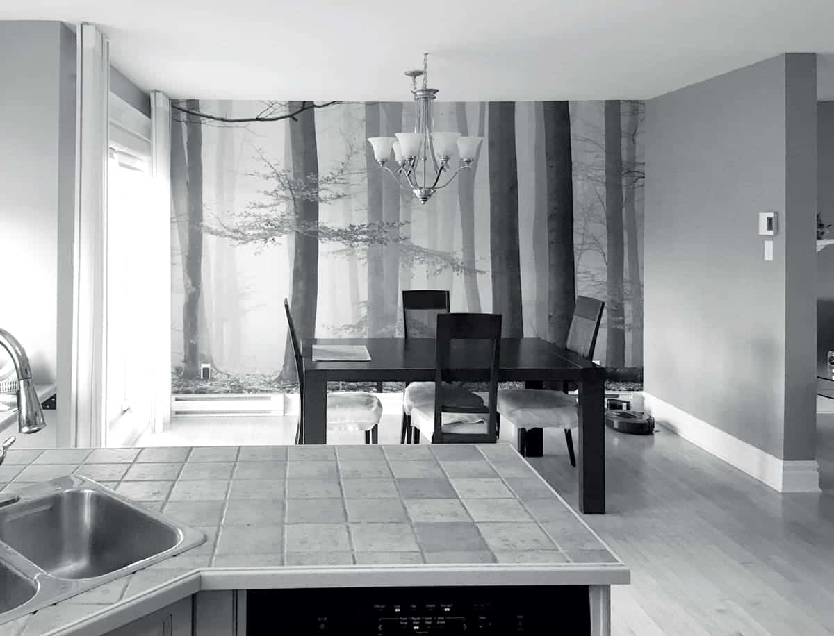
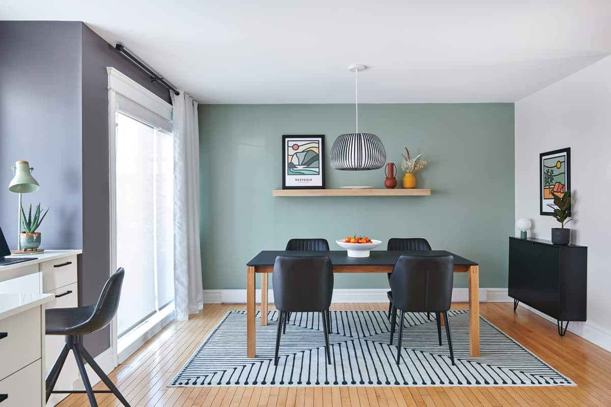
“We weren’t planning to, but since we were already renovating the kitchen, we took the opportunity to freshen up the dining room, too,” says one owner. Isabelle suggested adding a graphic rug to define the space, and a more minimalist look for the table. “We wanted to buy Canadian and we had some success at Maison Corbeil,” says one owner. “Since they build to order, we had more colours and materials to choose from.”
Photography by Bruno Petrozza
They opted for a contemporary table with a smoked glass top and wooden legs; its colours complement the new palette in the kitchen. Black upholstered chairs mimic the bar stool’s curved backrest. The PVC and velvet pendant creates a compelling diffused-light effect. For storage in the small space, a locally made modern console is ideal for storing liquor. On the far wall, a shelf in the same material as the kitchen cabinets connects the spaces and a creates a focal point with decorative items.
All the details
LIVING ROOM DESIGN, Isabelle Filion, Ambiance Factory. UPPER CABINETRY, Karisma Collection, Tafisa. LOWER CABINETRY, Velour Touch Collection in Linen, Pürdeco. COUNTERTOP, Lapitec in polished Bianco Aurora Lux, New Age Granite & Marble. Odin Smart Touch FAUCET; Solna SOAP DISPENSER; Brizo. Quatrus R15 sink, Blanco. FLOOR TILES, Silver Stone in Graphite; BACKSPLASH tiles (sink wall), Basic White; Céragrès. Backsplash tiles (oven wall), Casablanca Wallpaper pattern, La Tuilerie. SCONCE, Luminaire Authentik. SKILLET DRAWER, Home Depot. Custom KNIFE DRAWER, Isabelle Filion, Ambiance Factory. Jonathan Adler’s Inkdrop RUNNER, Ruggable. Eger STOOL, Mobilia.
DINING ROOM Mobican’s Vinci TABLE, Maison Corbeil. Loren CHAIRS, Must Société. Uplight Group’s Ova SUSPENSION, LightForm. Slim CONSOLE, Nexera. Jonathan Adler’s Inkdrop RUG, Ruggable. DRAPERY, Bouclair. POSTER ARTWORKS, Osgoodee Company. Tala’s Alumina TABLE LAMP, Goodee. PAINT, Ground Pepper 6182-63 (window wall), Dried Mushrooms 6185-21 (behind console), Sico; Flora AF-470 (green), Benjamin Moore.
Eye-Catching Colour Combinations For Your Home


Comments