Interiors
Interior: Relaxed elegance

Interior: Relaxed elegance
Interiors
Interior: Relaxed elegance
The architecture is Victorian, the art is mostly modern and the furnishings span four centuries: In this late-19th century Hamilton, Ont., home, it all adds up to timeless style, a trademark of designer and stylist Susan Burns, whose common sense approach to decorating her home resulted in an interior that’s far from common.
Susan’s sage design philosophy – work with the space and go at your own pace – makes decorating sound doable. “You don’t have to do everything at once,” she says. “Live with it for a while, because then you really know what you want.”
When she moved here in 2010, Susan did just that. In the bathroom, for instance, the previous owners had installed upholstered wall panels – the fabric wouldn’t have been her first choice, but it was pretty, and the panels kept out drafts, so Susan kept them.
As for working with the space, that was initially challenging. “I’m always lecturing my clients about editing, yet I was fighting it,” says Susan, who was frustrated with trying to fit all her prized possessions, including big French Country antiques, into the narrow, vertical rooms of the 1,600-square-foot Victorian.

Art display
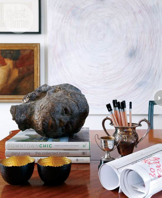
Throughout this Hamilton, Ont., home, artwork is displayed thoughtfully: “Groups of three always work,” says homeowner and designer Susan Burns of the mix of modern and vintage frames and pieces. The plaster bust was bought at an auction in New York. “It was meant to have a stand but once I laid it down on a stack of books, I kind of liked it like that,” says Susan.
Modern element
Susan traded two antique French chairs for these blue mid-century ones from her mother, which serve as a pop of colour and a modern element. The hits of blue are repeated in toss cushions in the library and a throw in the master bedroom. “Continued colour connects the spaces,” she says.
Effective arrangements
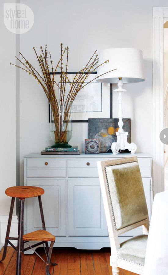
“If you have too many little things, they begin to disappear,” says Susan, discussing effective arrangements. “Wipe the slate clean, start with something large [like this candlestick that’s been made into a table lamp] and add to it. You can come up with a nice little collection that will work – you just need a bit of courage.”
“You don’t have to do everything at once. Live with it for a while because then you really know what you want.”
Dining room
In the dining room, the traditional French dining chairs with nailheads and fluted legs could read as fussy, but Susan kept them casual by leaving them in their original upholstery and tearing the fabric from the chair backs to expose the underposting.
An arresting arrangement
In the archway that divides the living and dining rooms, an arresting arrangement invites investigation: a modern abstract canvas, a small, ornately framed antique painting and a bronze sculpture.
Home library
Susan transformed the home’s former dining room into a library that she and her niece, who lived with Susan while attending college, used for work and study. When entertaining, Susan opens up the console and puts candles in the ornate hanging candelabra.
Chalkboard panel
Emma the cockapoo poses patiently in the kitchen in front of an oversized chalkboard panel.
Eclectic selection of artwork
Susan finds unusual places like the kitchen to put her eclectic art collection, providing a wink of whimsy to anyone who spots them.
Rustic baker's rack
The rustic baker's rack works here in the dining room because it doesn’t block the exposed brick wall behind it.
Apothecary bottles
On a small window ledge in the bathroom, antique-style apothecary bottles enhance the room’s old-world charm.
Bathroom design
Susan had mirrors fitted to both sides of an antique window that screens the bathtub from the toilet and sink.
Bedroom decor
In the bedroom, Susan’s strategy was to start with white bedding and then layer colours on top so the look could be easily changed;
Susan’s sage design philosophy – work with the space and go at your own pace – makes decorating sound doable. “You don’t have to do everything at once,” she says. “Live with it for a while, because then you really know what you want.”
When she moved here in 2010, Susan did just that. In the bathroom, for instance, the previous owners had installed upholstered wall panels – the fabric wouldn’t have been her first choice, but it was pretty, and the panels kept out drafts, so Susan kept them.
As for working with the space, that was initially challenging. “I’m always lecturing my clients about editing, yet I was fighting it,” says Susan, who was frustrated with trying to fit all her prized possessions, including big French Country antiques, into the narrow, vertical rooms of the 1,600-square-foot Victorian.

Art display
Throughout this Hamilton, Ont., home, artwork is displayed thoughtfully: “Groups of three always work,” says homeowner and designer Susan Burns of the mix of modern and vintage frames and pieces. The plaster bust was bought at an auction in New York. “It was meant to have a stand but once I laid it down on a stack of books, I kind of liked it like that,” says Susan.

Modern element
Susan traded two antique French chairs for these blue mid-century ones from her mother, which serve as a pop of colour and a modern element. The hits of blue are repeated in toss cushions in the library and a throw in the master bedroom. “Continued colour connects the spaces,” she says.

Effective arrangements
“If you have too many little things, they begin to disappear,” says Susan, discussing effective arrangements. “Wipe the slate clean, start with something large [like this candlestick that’s been made into a table lamp] and add to it. You can come up with a nice little collection that will work – you just need a bit of courage.”

“You don’t have to do everything at once. Live with it for a while because then you really know what you want.”
Dining room
In the dining room, the traditional French dining chairs with nailheads and fluted legs could read as fussy, but Susan kept them casual by leaving them in their original upholstery and tearing the fabric from the chair backs to expose the underposting.

An arresting arrangement
In the archway that divides the living and dining rooms, an arresting arrangement invites investigation: a modern abstract canvas, a small, ornately framed antique painting and a bronze sculpture.

Home library
Susan transformed the home’s former dining room into a library that she and her niece, who lived with Susan while attending college, used for work and study. When entertaining, Susan opens up the console and puts candles in the ornate hanging candelabra.

Chalkboard panel
Emma the cockapoo poses patiently in the kitchen in front of an oversized chalkboard panel.

Eclectic selection of artwork
Susan finds unusual places like the kitchen to put her eclectic art collection, providing a wink of whimsy to anyone who spots them.

A versatile piece
Susan loves the versatility of the baker’s rack that she found at the Christie Antiques Show. “I always tell my clients that if they see a piece like this that they really like, they should buy it because it’s so versatile that it could also go in a bathroom or a pantry,” she says.

Rustic baker's rack
The rustic baker's rack works here in the dining room because it doesn’t block the exposed brick wall behind it.

Apothecary bottles
On a small window ledge in the bathroom, antique-style apothecary bottles enhance the room’s old-world charm.

Bathroom design
Susan had mirrors fitted to both sides of an antique window that screens the bathtub from the toilet and sink.

Bedroom decor
In the bedroom, Susan’s strategy was to start with white bedding and then layer colours on top so the look could be easily changed;


Comments