House Tours
Interior: Scandinavian style on a budget

A Scandi-style dining room featuring Danish Wishbone chairs and DIY pieces.
House Tours
Interior: Scandinavian style on a budget
Style at Home style and food editor Tara Ballantyne creates a budget-friendly look that’s all her own.
Ever notice how you can do something for years, then all of a sudden – eureka! – it truly becomes your own? That’s what happened to Style at Home style and food editor Tara Ballantyne following a two-year stint in Norway. “I’d been drawn to Scandinavian design for years,” she says, “but it took actually living in Oslo for it to really become part of my style.” And by the time Tara returned home to Waterloo, Ont., it all clicked: She saw all the ways that Canadian and Scandinavian design approaches actually overlap. In both countries, interior design alludes to landscapes that are rich in lakes, forests, rivers and mountains. And in both places, coziness – especially during the winter – is key. “There are differences,” says Tara.
“Canadian design tends to be fuller and draw on deeper hues for comfort, while Scandinavian design is cleaner and relies on lighter tones to combat darkness when the sun goes down so early.” But bringing together these two styles in her own home wasn’t Tara’s only goal: She wanted the entire home makeover of her rickety 900-square-foot 1980s duplex for under $10,000 – including the construction of a new kitchen!

Living room feature
Tara’s style is modern and clean, but it’s also delightfully clever. Who else would see ugly bright purple lockers from the YMCA as a potential feature in a pale, spare living room? “Under the purple paint was more paint – in yellow!” she says. “I spent all my free time sanding them.” She had seen a similar pre-sanded set in London, England, for $6,000. “But I wanted the look, not the expense.”

Living room
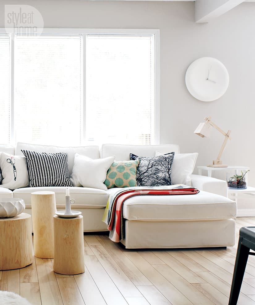
A plush sectional, unique home accessories and an oversized clock set the tone for this white-on-white living room. The tree stump tables were created from a fallen electrical pole that Tara literally pulled over on the side of the road to ask some city electricians for. They bring more warm wood (and inventive furniture options) into the room.

Accessories
Throughout the house, natural wood elements, such as these cutting boards, lend warmth but are light enough to keep rooms feeling bright.
A white decor theme allows you to group together objects of every type to create instant vignettes.

Kitchen area
“Basically, I paid for this room with cases of beer,” Tara says with a laugh, thankful for her best friends who helped her with the kitchen design. One installed the floors; another, the plumbing; and a third, the ceiling lights. To further save money, Tara chose IKEA’s most basic line of kitchen cabinets. And the subway tiles were only 49 cents each – a deal she scored at the Home Depot.

Dining room
Tara painted her grandmother’s dresser to use as a sideboard in the dining room. The Danish Wishbone dining chairs were a splurge, but Tara compensated for the spend by updating other inexpensive pieces with a coat of paint. The candlestick was an ugly acid green before Tara painted it a soothing grey, and the oak pedestal table also got a brand new white coat.

Home office
Sitting in her home office, Tara points out that one wall is covered with magnetic panels to hold her ever-changing tear sheets and inspirations. The sofa was a gift, and the piggy bank is evidence of Tara’s love for including at least one fun, funny or quirky element when decorating a room.

Functional nook
The house lacked closet space in the front entrance, so Tara took advantage of the landing (as you enter the main floor from the entryway) and created a functional nook with a wall-mounted organizer with small cubbies and paired it with a stepstool and a simple, oversized mirror. “It’s small but sets the tone for the rest of the space, and it lets you drop your keys, check your outfit, hang your scarf and so on,” she says.

Bedroom
“I’m not a fan of carpet,” says Tara. “I ripped it up immediately when I saw the plywood subfloor, which looks soothing and natural instead of the tan pile carpet that was there before.” The bed was built from wooden pallets. “I like it because it’s low and streamlined. But best of all, it was super-inexpensive to make,” she says.


Comments