House Tours
Revamped eclectic Victorian becomes a polished family home

Image: Stacey Brandford | Designer: Jennifer Ferreira | Stylists: Ann Marie Favot and Stacy Begg
House Tours
Revamped eclectic Victorian becomes a polished family home
Designer Jennifer Ferreira helps a Toronto couple reach a design verdict that's both practical and polished.
Contemporary artwork and kids' colouring books; a travertine dining table and a teepee fort – these anomalous pairings are the norm at Courtney Toomath-West and Ken West's Toronto house. "This is a family home," says Courtney. "Our daughters can play, and my husband and I can retreat to formal rooms, all in one fairly small space."
Courtney and Ken, both lawyers, bought the 1,800-square-foot rowhouse in 2008 before their girls Honor, now 6, and Caroline, 4 were born. "Ken and I had been living in a condo, but when we began to think about having kids, we yearned for the character of an older home," says Courtney. This Victorian, in the city's Little Italy neighbourhood, fit the bill. "I fell for its original plaster mouldings as well as its high arches and ceilings," she says. "It hadn't been updated in decades, but it was well loved, and I wanted to preserve its charm."
When the couple moved in, they replaced the existing light oak floors, which were in bad shape, with darker oak and, keeping their art collection in mind, painted the walls gallery-like neutral shades. “Initially, that was enough to make it ours,” says Courtney. “But when I was pregnant, my nesting instincts kicked in and prompted major renovations.” Before Honor was born the bathroom was updated, and before Caroline arrived the kitchen was expanded (by removing a wall between it and the den) and fitted with new cabinetry and appliances. Structurally the house was done, but decor-wise it still felt unfinished. “I needed help pulling everything together,” says Courtney. “I mentioned this to a friend who knew the perfect person for the job.”
That person was designer Jennifer Ferreira. “When I first saw Courtney and Ken’s house, it simply needed finessing,” she says. “I wanted to complement its architectural details, inject a tailored look and create a comfortable family space.” Jennifer incorporated a few new and custom-made pieces into the decor, but says the transformation really started with the window coverings. “Drapes make a house feel like a home,” she says. “I added them to all the principal rooms, hanging them above the window frames to create a sense of grandeur.” Fabric was also a key element in updating the bedrooms. “I designed upholstered headboards in classic pretty shapes for the master bedroom and girls’ room,” says Jennifer. Even the doors got a makeover. “I replaced most of the existing crystal doorknobs with brass ones. It’s a small touch that adds warmth.”
The living room saw the biggest transformation. When the couple thought their fireplace dreams had been dashed – a wood-burning one violated bylaws, and a gas one required costly renovations – Jennifer suggested ethanol. “It burns clean, so you don’t need a chimney or vent, and it gives off a surprising amount of heat,” she says. Framed with new built-in bookcases and carefully duplicated plaster mouldings, it suits the space and is a favourite spot for relaxing. “Ken and I sit in here once our daughters have gone to bed,” says Courtney. “We call it our ‘grown-up space,’ and that, I can attest, is something every family home should have.”

"The entryway feels grand for a 16-foot-wide house," says designer Jennifer Ferreira. The oversized mirror creates the illusion of space, and the large pendant light complements the black trim on the sisal runner.

Black drapery rods fitted with brass finials and drapes with a band of grey ribbon lend a sense of elegance and formality to the living room.

Jennifer updated the living room’s outdated armchairs with sophisticated zebra-print fabric.


The grey lower cabinets add contrast to the mostly white kitchen, which is outfitted with Caesarstone countertops and stainless steel appliances.

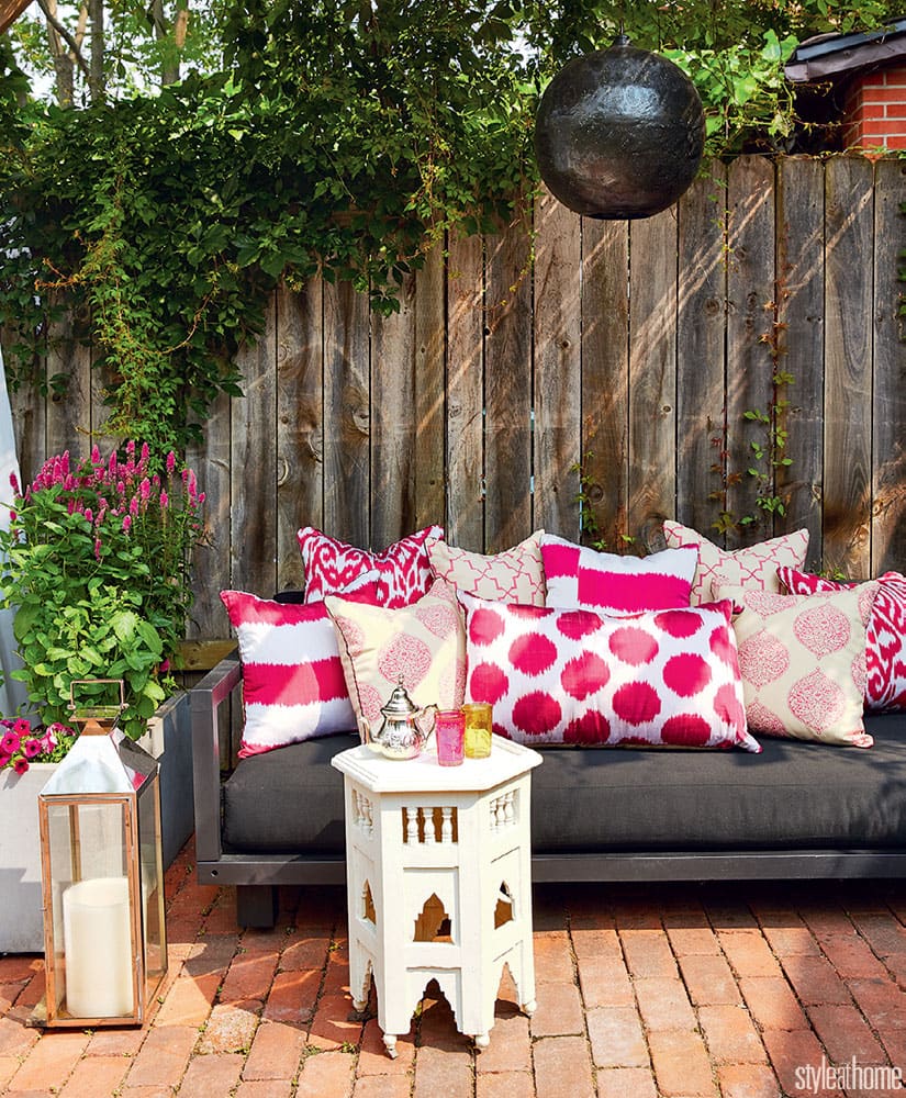
“The Wests honeymooned in Morocco, so I channelled that look on their patio,” says Jennifer. “The pendant light, side table and toss cushions resemble items found in a souk.”

“The master bedroom doesn’t get a lot of light, so I wanted to brighten
it up,” says Jennifer. An airy wall colour, natural linen headboard and ikat- print bench do the trick.

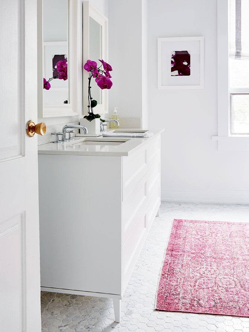
I painted the bathroom walls white and replaced a dark wooden vanity with a white one for a more tailored look,” says Jennifer. A pink over-dyed rug lends a layer of softness and a pop of colour.

In daughters Honor and Caroline’s bedroom, the drapes match the pink linen headboards. “The fabrics can easily be changed if they ever tire of them,” says Jennifer. Courtney added the princess sign for a little sparkle.


Comments