Bathroom
The Safety Dance: A Bathroom Balanced by Classic and Trendy Design Elements

Producer: Stacy Begg | Photography: Stacey Brandford
Bathroom
The Safety Dance: A Bathroom Balanced by Classic and Trendy Design Elements
A master bathroom overhaul is a lesson in the push and pull of trends versus classics.
When homeowner Karen Williams and designer Stacy Begg were selecting hardware for Karen’s master bathroom reno earlier this year, Stacy lobbied for fashion-forward black, while Karen had her eye on perennially classic chrome. “Black feels fresh and youthful,” Stacy proposed. “I’m a very safe person. I don’t like going too far outside the box,” Karen replied. When Stacy suggested a mix of the two finishes – chrome taps and faucets paired with black pulls, lighting and towel bars – they knew they’d hit the jackpot. “It’s a little bit edgy, but still safe. And it looks really great,” says Karen. Compromises like this define the project, laying the groundwork for a design that will age well but also make room for stylish flourishes.
The pair’s overhaul of Karen’s dated builder-grade master bath – in the 19-year-old suburban home outside Whitby, Ont., she shares with husband Eric and sons Tyler, 10, and Ryan, 6 – saw a tiny enclosed shower stall and monolithic built-in corner tub jettisoned in favour of a larger barely- there glass shower stall and handsome free-standing bath. “I wanted a bigger, more seamless shower, so you could take in the whole bathroom in one look,” Karen says.

Photography: Stacey Brandford
The vanity fell into the budget’s splurge column, and the investment was well worth it. The well-made, pre-assembled unit “fit like a glove” into homeowner Karen Williams’s existing vanity nook, it came with the marble countertop and the two sinks and mirrors, and is kitted out inside with features like a hair dryer drawer. Ample storage space allows the busy bathroom to stay more organized and subsequently feel calmer. “This vanity has lots of drawers, which makes it easier to find stuff,” says Stacy. Two sinks were essential so Karen and her husband, Eric, can use the space at the same time.

Photography: Stacey Brandford
Much of the budget was smartly spent on fixtures and finishes with timeless good looks to ensure the approximately eight-foot-by-12-foot space will weather the trends and years. “We plan to live in this house for a very long time,” Karen says. The floor is clad in porcelain tile that boasts the luxe look of Statuario marble. The brand new bathtub is sculptural but sleek. And the new Shaker-style vanity is clean-lined and quiet. “We knew the room would be very white, so we decided to add some understated texture – like the hexagonal tiles in the shower – to give the space a bit of a lift,” Karen says.
Then, using a few clever manoeuvres, Stacy pushed the design away from the tried and true to imbue the bathroom with a playful personality. Wallpaper patterned with spindly arrows (used on a single feature wall to create a focal point and to keep costs down) calls to mind a child’s room in a Wes Anderson film. A vibrant vintage wool rug (found for only a few hundred dollars) amps up the palette. A breezy mirror framed in raffia suggests a tropical resort. The spunky accents set the space apart from all the other white bathrooms out there.
And so, nine months later, Karen is still singing its praises. “It’s such a breath of fresh air,” she admits happily. “It’s clean, calm and super relaxing. It’s everything I imagined it would be.”

Photography: Stacey Brandford
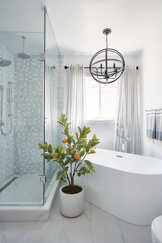
Opening up the old drywalled shower stall was one of the costliest parts of the reno, but it gave the bathroom a dramatic new lease on life. Glass walls let the airy enlarged unit fill with light from the window and the new decorative chandelier and details like a pair of rain-hat shower heads and a linear floor drain instill a luxe modern look.

Photography: Stacey Brandford
The use of large marble-look porcelain tiles was a chic budget-friendly choice. Karen recommends bringing tile samples home before committing. “Try them in your space and study them in different lights,” she says. “You can change your accessories, but tiling is labour intensive and can be expensive. Make sure you’re in love with what you’re buying!”

Photography: Stacey Brandford
To give the new glass-enclosed shower stall a few extra inches, designer Stacy Begg angled the bath- tub. The free-standing tub, which replaced a clunky built-in version, is nice and deep, but looks sleek thanks to the negative space around it. “We brought in accessories like the long white drapery to soften the look. The natural elements in the room help, too,” says Stacy.

Photography: Stacey Brandford
Finally, recessing a small niche into one wall of a shower is a great way to add storage for products with little extra effort or cost.


Comments