House Tours
A blank slate turned high-contrast Vancouver penthouse

Image: Tracey Ayton | Designers: Shift Interiors and Motto Interior Design
House Tours
A blank slate turned high-contrast Vancouver penthouse
Downsizing can be daunting, but when you have the help of two dedicated designers, things start looking up.
Rarely does the term "blank slate" ring as true as when it comes to decorating a new space. But in Terence Little and Ben Clermont's case, it had a double meaning: They moved into a 1,080-square-foot new-build penthouse in central Vancouver, which, as Terence describes, "was white, white, white, everywhere looked," and they brought virtually nothing with them. Moving from a house more than twice the size, the couple purged everything but their artwork and a lone armchair, so they could start decorating from scratch.
But where does one even begin with a clean canvas like this? "With homework," advises designer Jamie Deck of Shift Interiors, who teamed up with Lindsay McLennan of Motto Interior Design to masterfully execute a design Terence and Ben would love while maximizing their limited space. "We have a pretty intense interview process," explains Jamie. "We ask our clients to do lots of colour research and to find inspiration photos." What the couple turned in revealed a proclivity for masculine interiors with simple, clean lines, Mid-Century Modern-style furnishings and bold hits of black. "We wanted the condo to look interesting, comfortable and modern, but not overly designed," says Ben. "Out top requested were to create a space that's efficient and easy to entertain in, as well as to highlight the view outside," adds Terence.
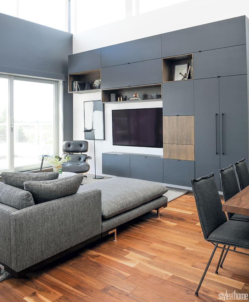
Meeting the homeowners’ requirements of having both a large sectional and a dining table that could seat eight – not to mention ample storage throughout the open-concept layout – proved to be a challenge for the designers. So they cleverly transformed the front closet into a dining nook; in the living area, they created a custom storage unit that boasts an asymmetrical mix of shelves, cabinets and drawers, as well as wooden panels (under which is a bar) to break it all up. “Those design choices were critical to the success of the results,” says Ben. And, of course, there are many double-duty furnishings, such as the kitchen stools that can be pulled into the living area for parties or the entryway benches that provide extra seating around the dining table.
Jamie’s favourite aspect of the design is the high-contrast colour scheme. “I love how black or deep grey and white creates light,” she says. “People think dark shades will make a space too dark, but if you use them in small doses, the effect is the opposite.” Also, as requested, the palette highlights the view. “When you put grey on a wall that has windows overlooking mountains and the ocean, it brings the greenery inside,” says Jamie.
Though the stunning space is now a far cry from the blank slate it once was, we’ll call it a fitting coincidence that so much of the design is hinged on slate grey.

Homeowners Terence Little and Ben Clermont love the bright and airy builder-grade kitchen. The small island boasts ample prep space and storage for avid home chef Ben’s many cookbooks.

The kitchen is sleek and streamlined but gets plenty of interest from the glass-tiled backsplash (which offers an ethereal effect) and the dishes displayed on open shelving.

“A large dining area was crucial for Terence and Ben, who love cooking and entertaining,” says designer Jamie Deck of Shift Interiors. “But in order to achieve that, we needed to borrow some space.” So Jamie and designer Lindsay McLennan of Motto Interior Design had the doors of a large closet removed and a banquette with deep storage drawers installed in its recess. The resulting nook can seat up to eight people with the benches from the entryway pulled into use. Harley the Australian Labradoodle approves of the new digs as well.

Not just a media unit, the contemporary cabinetry in the living area also displays tchotchkes, stores cleaning supplies, hides an unsightly air conditioner and boasts a fully stocked bar. The wall-mounted unit floats, so even though it’s charcoal grey and nearly 10 feet tall, it feels light and airy instead of oppressive.

The designers incorporated many Mid-Century Modern-inspired pieces like this Eames-style lounger in the living area (“It offers the best views in the condo,” says Terence, referring to not only the view of the park, but also that of Ben cooking).


Comments