House Tours
A bright and inviting home built for business and pleasure

Image: Natalie Cinelli
House Tours
A bright and inviting home built for business and pleasure
Light and fresh, the casual chic sensibility of this home pays homage to summer all year long.
This sun-filled room is where Kate and her business partner and long-time friend, Amanda Nycz, like to assemble and discuss mood boards for their various design projects. “We gravitate toward laid-back summery spaces that are far from formal,” says Kate. The key to their modern-casual style? The white envelope they begin with. “Many people think white is too stark,” says Kate, “but with ample texture, it feels cozy and inviting.”
None of that was initially in play in Kate’s two-storey 1960s-built house. When she and her husband, Chris, first saw the house in Sunnylea, a family-friendly enclave in Toronto’s west end, it was in rough shape – Kate will even go so far as to say it was disgusting. But Chris, the owner of the construction firm Milmax Builds (the name is an ode to their kids, Max and Mila, who are eight and six, respectively), knew he could revive it with an addition or two and a dose of Kate and Amanda’s signature style.
“We love the opportunity to preserve existing structures and highlight their charm,” says Amanda of the repair-over-bulldoze philosophy they took when renovating this place. Along with Milmax Builds, Kate and Amanda tackled the three-bedroom house’s lack of light, space and flow over the year-long project. “We built back, we built off the side and we built up,” says Kate. “We went from 1,800 square feet to 2,400 square feet.”
Walls were removed between the living and dining rooms, as well as between the dining room and kitchen. And the garage was bumped over to allow for a more expansive kitchen, a powder room and a mud room. On the second floor, a master bedroom, ensuite bathroom and walk-in closet were added.
Original windows near the dining table highlight the house’s roots; for cohesion, similar ones were installed in the rear of the family room (where all that decor kibitzing over coffee happens). As for the palette, there’s no showboating here: Tranquil tones of white and grey are punctuated by bursts of black for oomph. Certain ceilings are also clad in panelling, and hits of rattan, jute and sisal – style staples of every easy-living retreat – reinforce the house’s fresh cottage feel.
Another cozy element is the ceiling height. “If you build a new house you can go sky-high with them,” Kate points out, “but Amanda and I like to have varying heights, so we opted for eight-foot-high ceilings in some areas and 12-foot ones in others. It makes the house feel interesting and intimate.”
Cozy, inviting, fresh and stylish: In a family home built for business and pleasure, who could ask for anything more?

Dove grey Shaker-style cabinetry, floating shelves and a subway tile backsplash lend this kitchen its country bistro vibe. Designers Kate Krasic and Amanda Nycz couldn’t find the perfect brass cabinetry hardware, so they opted instead for black to punctuate the space.

Subway tile backsplash with contrasting grey grout adds eye-catching texture in an all-white kitchen.

“We love including artwork in a kitchen, hence the little geometric piece on the floating shelf,” says Kate, who is also a big fan of open shelving. “Gone are the days of heavy cabinetry – it’s just not as attractive.”

In the dining area, warm white tones in the wall and chairs team up with even warmer natural elements (like the bamboo pendant light and wooden table and floors) for a textural lift.

Surrounding the dining table, a bench with a comfy buffalo check throw and mismatched chairs strike a casual country look. Even better, the seating is well-suited to being pulled into the living room when needed for company.

The bright family room, added during the renovation, is the most treasured hangout space in the house. New windows blend harmoniously with the many windows that were retained during the project.

And the secret to keeping the sectional white? Slipcovers! “Amanda and I both have dogs and kids, and we don’t purchase upholstered furniture that’s not slipcovered!” says Kate. “That’s the trick.”

A nubby sisal rug anchors the coffee table and slipcovered armchairs in the beachy chic living area. “We modernized the fireplace with a gas insert and marble surround,” says Amanda. New wall panelling gives structural texture to the all-white envelope.

Slipcovered furniture and natural woven rugs make casual essentials that stand up to wear and tear.

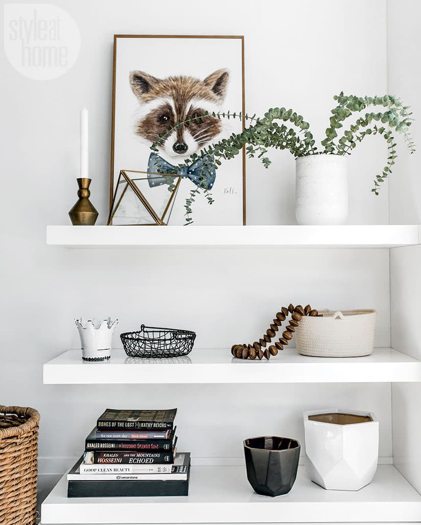
Too many tchotchkes and pieces of furniture can look messy, so the designers created a custom shelving unit, placed across from the living room sectional, to neatly display a few favourite things.

Clad in beadboard, the restful master bedroom’s cathedral ceiling imbues the space with unexpected texture and beachy-chic style. The room’s white palette, from the bedding to the light fixtures, makes it the ultimate clutter-free haven. “They say you sleep better when you have a clean room,” says Kate.


Comments