House Tours
A builder-basic home becomes a space filled with timeless elegance

Image: Stacey Brandford / Styling: Stacy Begg
House Tours
A builder-basic home becomes a space filled with timeless elegance
A scientist and a designer put their heads together to make a west Toronto new build feel like home.
Details matter,” says the homeowner. “Whether the field is science, writing or design, what distinguishes an amateur from a professional is their attention to detail.” On the same day that she and her husband bought their first home, the homeowner contacted a designer to take care of the details. “I love home decor, but I’m trained in science, not in design,” says the scientist. “I wanted to experience the mind of someone who spends hundreds of hours a week focusing on making rooms beautiful.” That “someone” was interior designer and blogger Jacquelyn Clark.
The pair connected immediately. “I love that [the homeowner] knew what she wanted, yet was open to input,” says Jacquelyn. The house was less than 10 years old, with an awkward layout spread over four floors, switching from boxy rooms to open-concept spaces. “Architecturally, this was the exact opposite of the homeowner's preference for older, more traditional homes. So, our challenge was obvious: How would we transform this builder-basic home into a place of timeless elegance?”
Since an all-traditional space can come across as more formal than inviting, Jacquelyn suggested ways to soften the look. She recommended adding layers of texture, such as velvet, silk and even a fuzzy ottoman topper, in the living room. She also noted that a blush and gold palette, though breathtaking, is on-trend, so it would be best to keep it to a whisper. “For large pieces, go traditional. For accents, go trendy,” says Jacquelyn. “That way, your home never goes out of style.” The living room’s blush-coloured chair, though, was a happy exception to the rule. “I simply fell in love with it,” says the homeowner. But the piece wasn’t available in Canada. That’s where her husband came in. “Can you believe he actually drove to Buffalo, N.Y., and brought it back? Amazing!”
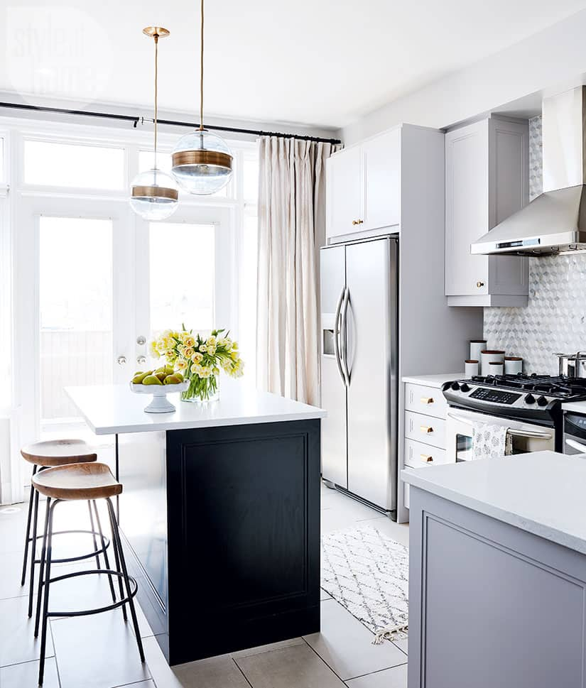
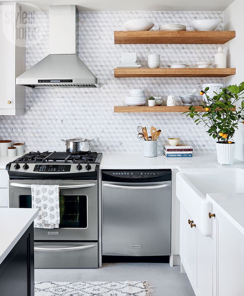
As the project unfolded, the homeowner expressed a desire for more contrast. To that end, she and Jacquelyn changed the kitchen island from cement grey to black and echoed it in the adjacent dining room with a black sideboard. A tonal backsplash in a bold geometric pattern amplified the contrast, while wooden shelves and stool seats bring warmth to the grey, blush and gold scheme. “The wood’s gold tones play into the palette without being obvious,” says Jacquelyn. For a little sparkle, a metallic gold finish was selected for the dining room chandelier. And the whole time, the homeowner felt like a key part of the design process.
“I’d never worked with a designer before,” says the homeowner. “I thought of decor as an end point. But what I learned from Jacquelyn is that home design is a process. It constantly evolves. And even though it’s creative, you need a plan. It’s methodical, too. As a scientist, I get that!“
Jacquelyn made me feel like a collaborator – I learned so much. Now that we’re done, [my husband] and I can begin to add in pieces that have a story. That’s something that’s missing, since our house is so new to us. But hey, we can’t fake time and we can’t fake life. So, we’ll just have to let it unfold – and let the design unfold with us!”

In the living room of this stunning Toronto home, gold and soft peony pink accents are combined with high-contrast colours (seen in the artwork) for a dramatic impact.

To make the most of the awkward nooks flanking the fireplace, designer Jacquelyn Clark added inexpensive beadboard and custom shelves. “Switching up the display will keep the room feeling new,” she says. Her styling tips? “Work in groupings of three, five or seven. Lean artwork. Stack boxes and books. And play with texture.”


In the dining room, a rough-hewn farm table paired with classic chairs achieves casual elegance; a bench that can slide beneath the table makes the most of the small space. Overscaled and modern, the chandelier (a total splurge!) serves as a youthful take on tradition.


Minor changes in the small kitchen garnered big results. The marble backsplash was a worthwhile splurge for the crisp visual interest it offers. Floating wooden shelves warm up the neutral, which originally had a boxy bank of ugly brown cabinets. A black-painted island and a pair of eye-catching globe-shaped pendant lights make the room look distinguished yet fun.

In a corner of the kitchen, a floating counter offers a place to do work and accommodates a small self-serve bar area.

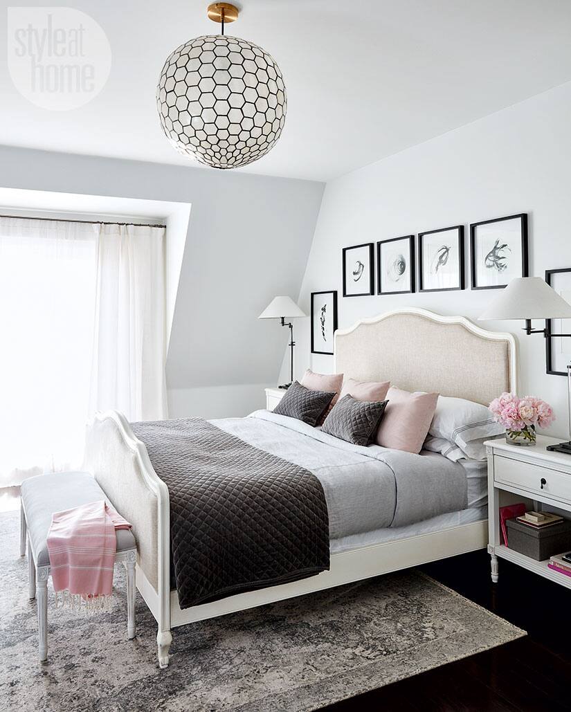
In the master bedroom, a petal pink and rich grey palette is expressed in textural velvet and silk. A parade of black and white art prints accentuates the room’s arched ceiling, while white woodwork keeps the space looking bright and clean.


The entire top floor of the house serves as the master bedroom, which includes a walk in closet that feels like a dressing room thanks to soft details, such as the tufted ottoman and linen armchair.


Comments