House Tours
A neutral home with a dynamic mix of furniture styles

Image: Tracey Ayton | Design: Karla Amadatsu
House Tours
A neutral home with a dynamic mix of furniture styles
A mix of classic and clean-lined, neutral and natural takes builder basic from plain to pleasing.
Most people would jump at the chance to have a designer transform their place, and Wendy Newson did just that – although it was into a hot tub, fully clothed. “I was at my sister’s Canada Day party in 2016, and all the kids wanted to get in the hot tub but didn’t have swimsuits,” says Wendy. “I told them to jump in with their clothes on, and my niece, designer Karla Amadatsu, said if I did the same she’d give me a free design consultation for my new house. I jumped in with my jeans and top on right then and there!”
It was a splashy beginning to a makeover that flowed from a one-hour consultation into a three-month transformation and saw a 3,000-square-foot new build in Surrey, B.C., go from basic to characterful. “My Aunt Wendy and Uncle Dave have two grown sons [one in high school; one in university], so I wanted this home to be a more grown-up space than their previous house,” says Karla.
The layout didn’t need revising, there was lots of natural light and Karla rated the kitchen cabinetry as having quality millwork. Still, there were lacklustre builder-issued light fixtures and, overall, the all-white space lacked personality. “I wanted to elevate the home, style-wise, so it didn’t feel like it was brand new,” says the designer. “My vision was to layer in warm neutral tones, add some Mid-Century Modern pieces – because my aunt and uncle love them – and upgrade the lighting.”
Karla also notes that this 2017 build, like many, was short on architectural details, so she relied on the artful placement of furnishings to create visual interest. In the living room, she placed large-scale black and white artwork and elegant floor lamps on either side of the fireplace for instant dramatic symmetry, and in the home office a gallery wall of family photos feels like it’s been curated over the years.
In every room, a dynamic mix of furniture styles feels collected rather than purchased en masse, while tactile elements – such as the solid and patterned drapery and the graphic rugs throughout – factor in softness and luxury. “With new and neutral spaces, adding a range of styles, textures and layers is key to curating both comfort and impact,” says Karla.
Wendy agrees. “Karla has made our home light, airy and uncluttered with beautiful points of interest that catch your eye,” she says. “Whenever I come home at the end of a hectic or stressful day, I feel peaceful and happy in the space. The tension melts away.” It’s a similar effect to the one produced by the hot tub that started it all, but much, much better.

A marble-topped Tulip- style table feels cool and modern in the dining room of this West Coast home, especially when paired with wooden Wishbone-style chairs. Custom linen drapes are finished with caramel-toned bands for drama and interest, and the chandelier boasts a show-stopping mix of bronze and brass.


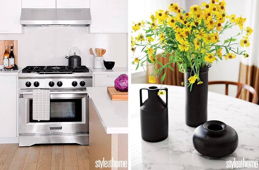
Designer Karla Amadatsu transformed the all-white kitchen with just two elements. “I switched out the builder-basic light fixtures above the island with these gorgeous black pendants and added wooden stools that have an organic Mid-Century Modern appeal,” she says.

“The entryway bench’s natural fibres and black, white and camel palette introduce the colours and textures found throughout the main floor,” says Karla. The spiffy rug is an outdoor style that’s virtually indestructible – a smart choice for a high-traffic spot.

A master class in elegant furniture arrangement, the living room also holds its own when it comes to wear and tear. “The sofa has a classic silhouette with a nod to mid-century style. I love that it can work in any space,” says Karla. “The fabric looks like a nice textured Belgian linen but it’s actually synthetic, which means it’s super-durable.”

“An upholstered headboard feels so comfortable, and I love how it adds softness, texture and a tailored feel to this bedroom, especially next to the wooden nightstands,” says Karla.

“There are awkward-looking high windows on either side of the bed,” says Karla. “I hung drapery to hide them. The closed drapes keep the focus on those gorgeous big lamps.” They sit on vintage-look campaign-style nighstands.
Karla transformed a large white wall in the office into a focal point populated by family photos. “I used an assortment of white frames to create a gallery wall with the black and white photographs,” she says. “In order to determine the layout, I played around with positions for the frames on the floor until I was pleased with the overall effect.”


Comments