House Tours
A popping palette offers a fresh look to a traditional home

Image: Ashley Gieseking
House Tours
A popping palette offers a fresh look to a traditional home
Clever doses of lively colour balance the fresh neutral interior of this 1919 home.
Working on a period house has its perks. “The windows all have their original leaded glass, framing gorgeous views of the historic park outside,” says decorator Amie Corley of the 6,000-square-foot house in St. Louis, Mo., she recently redid.
The homeowners – who share the five-bedroom abode with three children from six to 17 years old – sought a fresh contemporary update of their existing traditional look, wanting to keep things kid-friendly. They also asked for ample colour, with blue and white being a favourite combo.
To fulfill their colour requests, Amie kept the home’s architectural bones neutral: The walls and trim on the main level are coated in different finishes of the same warm-toned white paint. “We brightened the traditional architecture and then layered in hits of bold hues,” she says. Neutral furnishings, blue and white touches and lots of wood reinforce the colour-free envelope throughout the home, but each space gets its own bold colour story – a range of blues, from navy to cornflower, as well as grassy greens and blush coral tones – thanks to daring fabrics, wallpapers and accents. “The resulting rooms are light and airy, ” says Amie. And, best of all, the palettes are easy to switch up – another key to working with bright shades.

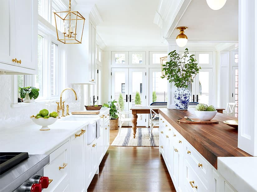
The kitchen, newly expanded to include an eat-in area, boasts nautical-chic white shaker-style cabinets with brass hardware, warm wood accents, spherical flush-mount light fixtures and subtle hits of blue. Gold-hued lantern-like pendant lights provide a focal point above the apron sink and dining table, while a navy-striped jute rug adds textural interest.

“You can’t go wrong with blue and white,” says decorator Amie Corley of the kitchen’s oversized chinoiserie vases and bistro stools. “The timeless yet fresh combo simply goes with every colour. To me, it’s a cheerful new neutral.”

Bringing the outside in, grassy green hues (on the damask drapery and velvet-upholstered chair seats) add sophistication to the dining room. The vintage wooden chair frames were updated with white lacquer to make the green pop, while the dark dining table grounds the otherwise breezy space.

An antique Oushak runner adds an old-world patina to the transitional entryway. “It weaves in welcoming peach and blush colours, which look amazing against the white walls and hardwood floor,” says Amie. A pair of spherical brass-and-crystal pendant lights infuse a dose of modern glamour.

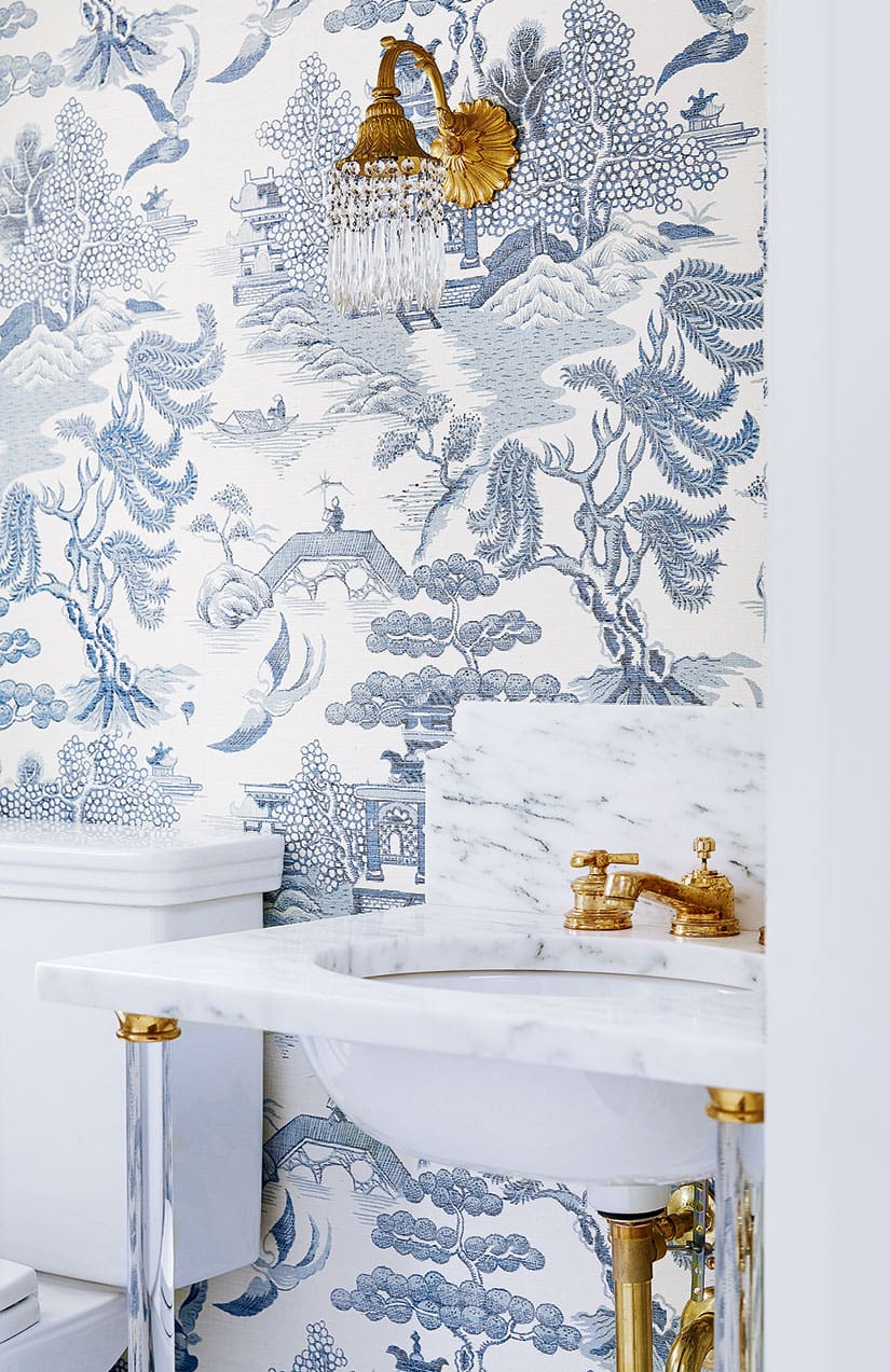
In one of the powder rooms, a Calacatta marble washstand sink with glass legs is an elegant showpiece that still keeps the chinoiserie grasscloth wallpaper at centre stage. the exposed plumbing and vintage sconce (original to the home) bring a warm brassy hue into play.

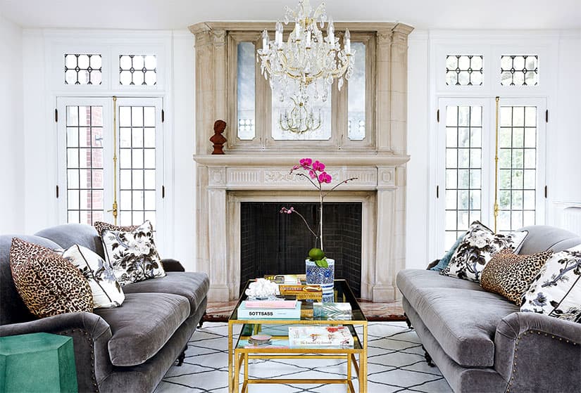
The living room features neutral furnishings like the charcoal-hued velvet sofas and creamy Berber-style rug, which echoes the leaded windows. Amie added an antique mirror to the period limestone fireplace and played up the latter’s earthy tones with leopard-print toss cushions. The emerald shagreen side table lends the space an unexpected colour punch.

Bright blue wallpaper with a playful zebra print enlivens the teenage son’s ensuite, while silver nautical-inspired sconces and a boxy walnut vanity impart a masculine vibe.

The 12-year-old daughter’s bedroom is a space that can transition into her teenage years, with cornflower blue showing up as an accent colour in the bedding, upholstery and leopard-print rug. “I like to repeat motifs,” says Amie of using the same botanical-print fabric for the bolster cushion and desk chair upholstery. “If you love pattern and colour, repetition is key.”

“Drapery that matches the wall colour creates a cozy feeling without adding pattern,” says Amie. “And the right pink can work in any room,” she adds, referencing the warm blush hue she selected here. “The key is keeping it from becoming too bubble gum or too Barbie.”

In the bathroom shared by the two daughters (ages six and 12), floral wallpaper in peony pink and cornflower blue picks up on the scheme in the attached bedroom. The narrow blue floor tiles, nickel hardware and subway tile wainscotting keep things from getting too girly.


Comments