House Tours
A rowhouse gets a fresh look and a new layout while maintaining its charm

Image: Stacey Brandford / Styling: Morgan Lindsay
House Tours
A rowhouse gets a fresh look and a new layout while maintaining its charm
Designer Maggie Burns revises the layout and lightens the palette of her rowhouse to make it feel remarkably roomier.
People love to complain about stairs. "My knees are shot – let's move to a bungalow," they grouse. But not Maggie Burns. I longed for stairs and a lawn," says the energetic 28-year-old designer and Toronto native. The sentiment is completely understandable when you consider she was living in one of those New York City apartments that are so cramped, you practically need a folding toothbrush.
That was 2015, and Maggie had just completed a one-year degree at the esteemed Parsons School of Design and was moving back to Toronto – all while simultaneously launching her own design firm, Maggie Richmond Design. One of the newly minted graduate’s earliest clients? Herself.
She had just purchased a charming century rowhouse in the hip Trinity-Bellwoods neighbourhood near Nadège, a French bakery and a favourite haunt (this girl has her priorities straight). “When I first saw the house, I fell in love with its location and its potential,” says Maggie. “But there was a lot of work to do! The home’s layout didn’t lend itself well to its narrowness.”
At only 10 feet wide and just shy of 1,200 square feet, the two-storey house was palatial by New York standards, but small if Maggie wanted to stretch out and entertain friends. Just the same, it had good bones – and, best of all, the stairs she so desired. The only problem was their location. “They were encased in drywall, so they looked heavy, and they were in the middle of the main floor, taking up almost a third of the space,” she recalls.
Plus, the stairs divided the dining and living rooms into two tiny boxes. So Maggie embarked on a six-month renovation to create a breezy open-concept space. She brightened the home and made it feel spacious with crisp white walls (in place of busy textured wallpaper) and light grey engineered wood floors (replacing dark cork).
In an ambitious effort that ended up costing nearly half her budget, Maggie tore down the staircase and replaced it with a stylishly streamlined version installed at the side of the living room. “The dramatic floating stairs became the focal point,” she says. The new steps also connect to the finished basement – previously a rental apartment that could only be accessed from an outside door.
To accommodate the change, Maggie also reconfigured the second floor, removing a third bedroom and inadvertently exposing a skylight over the stairs. "I've been told it's not a good idea in terms of resale to remove a bedroom, but I had to make way for the stairs," she says. Today, the skylight floods the main floor with light and, together with pale new floors, lends the illusion of more space, making this home an even further cry from her old cramped NYC quarters.

Though small and located at the front door, the living room feels open and airy because of the ultra-edited furniture selection. A low-slung armless sofa, portable wooden side chairs and a small angular side table keep things uncluttered and ease traffic flow.

The galley kitchen was in great shape when Maggie bought the house, so she left it intact. It came with high-end appliances and pretty crystal knobs on the doors. “I kept the original subway tile that runs along the walls, and added pendants [not shown] and pot lights for additional lighting,” she says.

Though it cost 40 percent of Maggie’s overall budget, relocating the staircase made a 100 percent improvement to her home’s layout.

Maggie nearly replaced the dark-hued front door, but decided to keep it after seeing how charming it looked in the space. Her dad created a stained glass window for the transom. “Its copper trim matches elements throughout the main floor,” she says.

A graphic punch of black in the quartet of retro Tulip chairs is emphasized by the splashy artwork. The mirror bounces light around the space and picks up the sheen in the soft grey floors.

A combined washer-dryer in the galley kitchen makes doing a quick load of laundry super convenient.

Relaxation reigns in the subdued bedroom, where a quilt and watery-hued toss cushions suggest a catnap. A glass lamp and monochromatic artwork keep the visual clutter at bay.

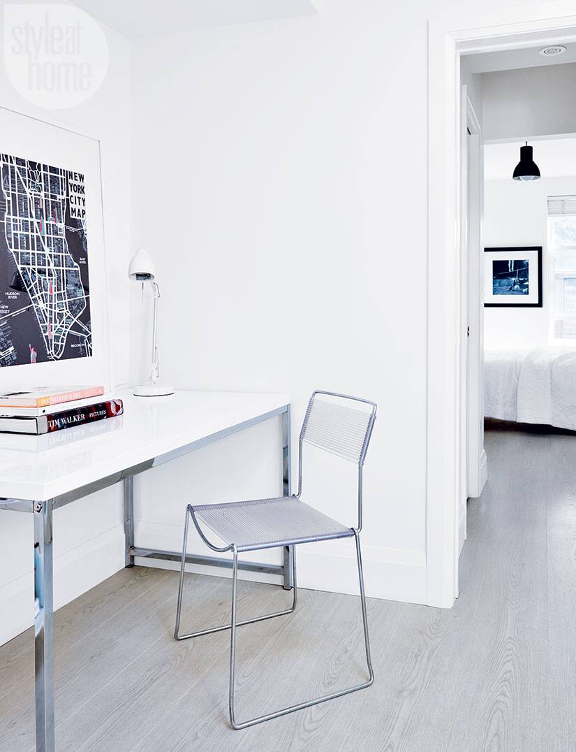
Maggie pulled together a light-filled office nook just outside her bedroom. The glossy streamlined desk, slatted rubber chair and casually leaning artwork create an understated vignette. The desk also serves as an extra drop-off spot for her laptop in the evenings – a smart reminder to maintain serene sleeping quarters and keep work separate.

A floating vanity and clean-lined mirror show off the Carrara marble floor and shower wall in the master bath. “Because I don’t have a lot of space – roughly 41 square feet – I had to be careful about the scale of each component,” says Maggie. The pared-back elements lend a serene quality. “It’s my favourite spot in the house,” she adds.
Despite all her hard work, Maggie recently sold her belove rowhouse to move in with her fiancé. And just in case you're curious, the resale value wasn't affected by the removal of a bedroom. To bring even more appeal to the home for the sale (which happened to coincide with our photo shoot), Maggie hired design firm Modern Staging Spaces to help her accessorize . Her house sold in a flash. With style like this, how could it not?


Comments