House Tours
Back to Nature

Photography: Justin Thomason
House Tours
Back to Nature
Natural textures and colours in a relaxed, laid-back style set a scene that’s as serene as a walk in the woods.
At first blush, this newly built home near Ottawa seems to have it all: high ceilings, classic architecture and open, graciously proportioned rooms awash in sunlight. But its open plan presented some challenges for the homeowners. With everything visible from everywhere else, how do you define different areas, while also creating a visually unified, cozy – not cavernous – home? And with a family that includes three active young kids, how do you keep things neat and organized?
For answers, the family turned to Sascha Lafleur of West Of Main Design. The re-do she, her team and the builder (EQ Homes) orchestrated draws inspiration from a low-key palette of natural colours and textures – not surprising for a designer who believes the best designer on Earth is nature herself. Sascha says that organic materials like wood, stone and natural fibres will always harmonize with each other, and also make us feel calmer – just as being in nature does.
The designer used organized furniture groupings to create distinct “rooms” in the open main floor, while subtle links in texture and tone give a sense of overall cohesion without being too strict about making things match perfectly. Rather than just a single species or colour of wood, for example, there’s a range of them, just as in a forest – from pale oak on the kitchen island and range hood, through the rich medium tones of the reclaimed-wood dining table, to the crisp, near-black grain of ebonized dining chairs.
Look closer and you’ll see that there’s also plenty of cleverly designed storage – so key in an open plan – tucked all through the space. Some pieces conceal, like a dining-room sideboard for table linens and overflow serving pieces; while others display, like open shelves and glass-front cupboards that act as a natural stage for collections or favourite pieces picked up on travels.
More and more, especially these days, Sascha says, “home is everything to people today. We try to create designs that are beautiful, but have a lived-in look. Everything doesn’t have to match – there’s a sense of balance, where if one piece is a bit out of order, it all still looks good.”

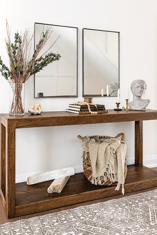
Photography: Justin Thomason | DESIGN, CONSOLE, GEODE, WOODEN BEADS, MIRRORS, CANDLESTICKS, BASKET, THROW BLANKET, RUG, BUST, West of Main. FLORAL ARRANGEMENT, Michaels. WALL PAINT, Steam AF-15, Benjamin Moore. BUILDER, eQ Homes.
A console table and twin mirrors in the hallway that links the entryway with the main living area provide a spot for a quiet vignette featuring a Roman bust, handwoven basket and chunky crystals. Bonus: the basket doubles as a stashing spot for an extra blanket.

Photography: Justin Thomason | CHANDELIER, CHAIRS, BOWL, TABLE RUNNER, RUG, SIDEBOARD, VASE, PLANTER, PRINT ON CANVAS (artist unknown), West of Main. TABLE, RH. FLORAL ARRANGEMENT, (inside bowl) Moss from Michaels.
The dining area is quite large, but instead of over-furnishing it, designer Sascha Lafleur opted instead to use a few over-sized pieces that work together to create a balanced composition. The wide sideboard acts to ground the atmospheric painting, while the ebonized chairs pick up the grain of the reclaimed-wood tabletop. The light fixture, with its tiny stars and soft linen shades, adds to the relaxed mood.

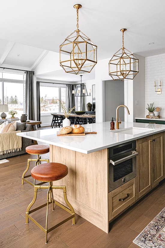
Photography: Justin Thomason | PENDANT LIGHTS, STOOLS, FRUIT TRAY, JUG VASE, FLOOR RUNNER, SCONCES, WOODEN TRAY, West of Main. TILE, Euro Tile & Stone. Eternal Calacatta Gold COUNTERTOPS, Silestone. CABIN ETRY PAINT, Essex Green HC-188, Benjamin Moore.
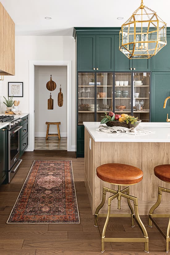
The sumptuous forest-green cabinetry makes the kitchen feel like a rich jewel, with added sparkle from brass chandeliers, the legs of the barstools, and tiny, perfect gold sconces flanking the range hood. “When it’s lit up at night, this kitchen feels incredibly romantic,” says Sascha. Double-height cabinets offer double the storage.

Photography: Justin Thomason
The oversized island countertop has room to serve guests or feed kids, while extra storage underneath, as well as a wide bank of storage drawers on the side wall, helps keep everything in its place.

Photography: Justin Thomason
Inset glass cabinets add a boutique feeling within the expanse of green cabinetry, and act as a stage to display a collection of artisanal serving ware. Touches of light wood in the range hood, island and the cabinet interiors lighten the overall look.

Photography: Justin Thomason | PRINT, THROW PILLOW, ARMCHAIR, RUG, PLANTER, West Of Main, SOFA, CONSOLE, PILLOWS, GLASS VASE, BLANKET, West of Main.
Subtle textural contrasts between pieces – such as the finely wrought metal frame of an armchair and a nubbly woven planter – keep things pleasingly informal. “With the colourful kitchen right next to it, we decided to emphasize texture rather than colour in the living room,” says Sascha.
“Floating” the sofa in the centre of the room helps organize the space into separate but conjoined living and dining areas. The chunky console behind it acts as a room divider, as well as an extra table for the dining area. Or simply pull up a chair and it serves as an ideal spot to catch up on paperwork.

Photography: Justin Thomason
The fireplace wall is a study in asymmetrical balance: one side provides shelving for display and books, while the other offers extra seating when needed. The white “brick” is actually a facing material that comes in sheets like tile, providing an easy way to add character.

Photography: Justin Thomason STOOL, PLANTER, RUG, FRAMED PRINT, West of Main.
Checkerboard pattern floors are a centuries-old classic, but Sascha opted for grey and white instead of the more traditional black and white to keep the palette soft and light. The combo of the painted wainscotting and checkerboard floor creates graphic interest, but doesn’t overwhelm the space. The hallway that leads from this space sets the stage for the muted natural palette that flows throughout the home, from the entryway to the garden view beyond the rear windows.

Photography: Justin Thomason | WASHABLE PAPER BINS (on top shelf), Uashmama. PILLOWS, LIGHTING FIXTURE, West of Main. PANTRY SHELF CONTAINERS, Storage Solutions.
The mudroom – a multipurpose space that acts as kitchen pantry, kids’ coat-room and side entry from the garage – features a hook and bins for each child. Having a designated spot for everything, says Sascha, is the secret to keeping an open-plan space tidy.

Photography: Justin Thomason | METAL FRAME BED, BED LINENS, BEDSIDE TABLES, LAMPS, RUG, West of Main.
In the basement guest room, it’s all about coziness, with a simple metal frame bed dressed in layers upon layers of linens and other natural fabrics, and the rich, muted colours of a patterned rug to warm up the broadloom floor covering. Side tables feature glass vitrines that display favourite objects.

Photography: Justin Thomason | TILE, PORCELAIN FLOORING, Euro Tile & Stone. Laminate COUNTERTOPS, Formica.
A spare bathroom proves great style isn’t just about expensive finishes. Laying simple elongated subway tiles in a herringbone pattern adds a bit of zing, and the laminate countertop is dressed up with a marble pattern and a raised sink. The black vanity, floor and fixtures provide contrast.

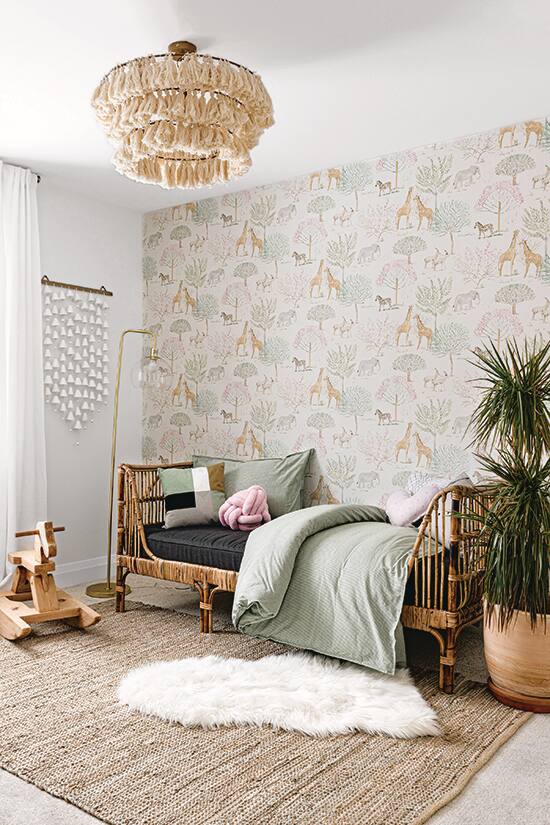
Photography: Justin Thomason | WALLPAPER, CHANDELIER, PLANTER, AREA RUG, West of Main. MACRAMÉ WALL HANGING, KNOT PILLOW, Etsy. RATTAN DAYBED, Article. BED LINENS, SHEEPSKIN THROW, IKEA. PILLOWS, H&M Home.
“We wanted something a little more subtle in the little girl’s room, so that we don’t have to make major changes as she gets older,” says Sascha. The giraffe and lion wallpaper is easy to update because it’s only on one wall.


Comments