Before and After
Before & After: A family home gets a modern facelift

Image: Donna Griffith / Styling: Stacy Begg & Karen Bruce
Before and After
Before & After: A family home gets a modern facelift
A young couple tackles the renovation of their new home with confidence.
With a growing family to consider, designer Christen Irwin and her husband, Dave, sought to upsize from their tiny semi in Toronto’s west end. They were hoping to find a teardown in a great neighbourhood where they could build their dream home. “But then my husband went rogue and insisted I look at this house in nearby Mississauga,” Christen recalls with a laugh. “I knew the hunt was over from the moment I walked in. I could picture us living there. It instantly felt like home.” The couple also fell in love with the 2,500-square-foot 1917 home’s original features, from its mouldings to its built-in cabinetry. “It felt cozy and comfortable,” says Christen.
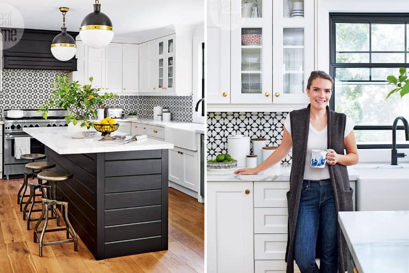
Although the house was in great living condition, Christen put her design skills to work in making it functional for her family, which includes son Luke, 4, and daughter Daragh, 1. Many aspects of the renovations were daunting, especially when the couple moved in late November 2016 with a toddler and an infant, and had no kitchen. They tore down a wall between the kitchen and the dining room, creating a larger and more open space. And where a mix of different flooring made the interior feel chopped up, new wide-plank oak flooring throughout now unifies all the rooms. “We married the new materials with the home’s existing details,” explains Christen.
A high-low mix was also important to the designer, who balanced splurges with inexpensive choices. She kept the kitchen budget in check by reusing, for instance, large sections of the original cabinetry in the new design, allowing her to spend more on marble countertops and a professional gas range.
Once the renovations were complete, Christen incorporated traditional and contemporary furnishings, combined with plenty of heirloom pieces, to give the refreshed interior a youthful vibe that also nods to the home’s age. “It was important to me to use natural authentic materials to honour the house,” says Christen. “I chose leather, wood, marble and other organic accents that will acquire a patina over time, just like the house itself.” Although it wasn’t from the ground up, it looks as though the couple built their dream home after all.
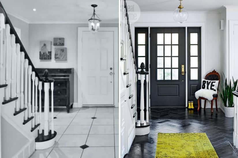
New slate floor tiles laid in a herringbone pattern are a stylish yet durable choice for the entryway. The space is well-lit thanks to a new front door with a window, as well as a widened opening that allows for sidelights.
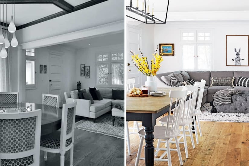
White paint and a new light fixture freshen up the open concept dining area. Moving into this larger home allowed Christen to spring for a bigger table and regularly host family gatherings.
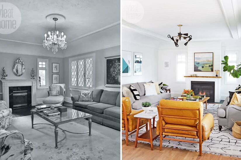
When the living room got a new coffered ceiling, shiplap details and pot lights, the original cove mouldings were carefully preserved. Christen had the fireplace “beefed up” with a live edge-wood mantel to give it more presence in the 15-by-23-foot space. A pair of rolled arm sofas mingle with contemporary leather armchairs and mod lighting to create a warm yet dynamic mix.
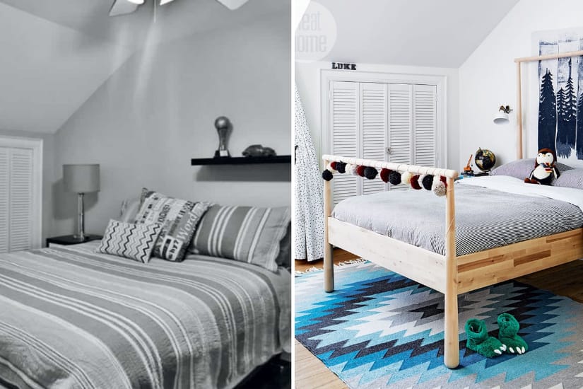
Christen was careful not to choose overly juvenile furnishings for her son’s bedroom. A simple wooden bed frame will suit him at any age, and playful boyish accessories are just plain fun.
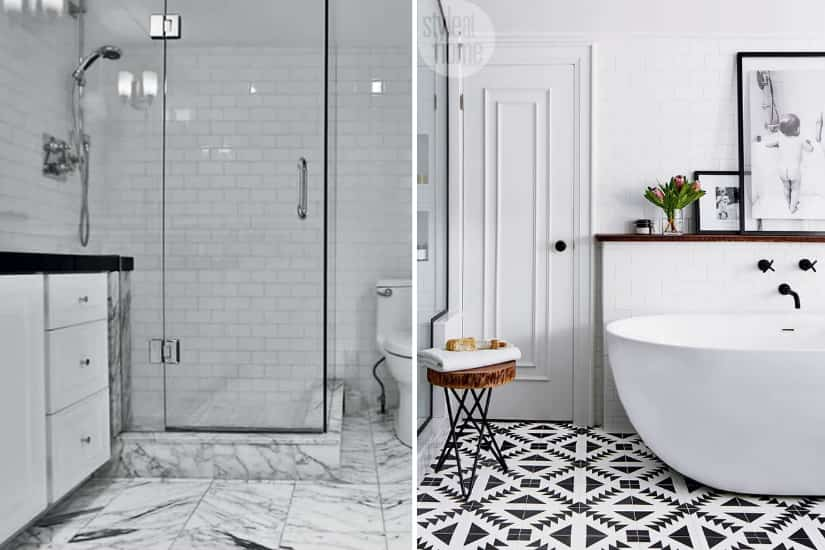
The large bathroom was created by taking floor space from a walk-in closet. The patterned cement floor tiles continue the graphic black and white scheme seen throughout the home. The deep free-standing tub has a sculptural modern form.
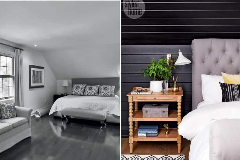
The focal wall in the primary bedroom is clad in black-painted shiplap and, combined with the upholstered bed frame, makes the room a cozy retreat.
Top Canadian Stores To Shop For Your Home


Comments