House Tours
Designer Louis Duncan-He helps a once classical-style Calgary home sing with personality while retaining its traditional beat

Photography, Eymeric Widling
House Tours
Designer Louis Duncan-He helps a once classical-style Calgary home sing with personality while retaining its traditional beat
Designer Louis Duncan-He helps a once classical-style Calgary home sing with personality while retaining its traditional beat.

Photography, Eymeric Widling
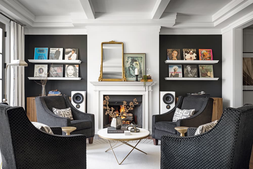
“The original living room was dark beige,” says Calgary-based designer Louis Duncan-He. “The owners and I wanted to add some drama.” Black paint did the trick, invigorating the walls that flank the fireplace. White floating shelves punctuate the black, offer a cool foil to the more formal coffered ceiling, and display some of the couple’s vinyl collection. A grouping of chairs replaces a traditional sofa and gives the space, which is beside the dining room, an after-dinner cocktail lounge kind of vibe.
DESIGN, Louis Duncan-He Designs. WALL PAINT, Black Panther 2125-10, Benjamin Moore. MILLWORK, PAINTING (throughout), Parsa Painting. MIRROR, West Mirrors. Burke Decor SIDE TABLE, Moe’s COFFEE TABLE, CF Interiors. SIDEBOARDS, Structube. Breakwater Bay FLOOR LAMP, Wayfair. Khroma WALLPAPER, Walls Alive. WALLPAPER INSTALLATION, Modern Wall Designs.

Photography, Eymeric Widling
“One of the owners wanted her home office to be a mix of Vogue-chic meets major-boss energy,” says Louis (shown above), who tracked down an original Vogue print and dialed up the energy with black cabinets and bold wallpaper. “I love the organic element of the florals played up against bold black – together they feel special and energetic.”
DESK, CHAIR, Crate and Barrel. RUG, Wayfair. Custom WINDOW COVERINGS (throughout), Calgary Window Fashions. WINDOW COVERING FABRICS (throughout), Maxwell Fabrics.

Photography, Eymeric Widling
Designer Louis Duncan-He firmly believes that a home should reflect the people who live there. “My clients, Steven and Lara, present as elegant, sophisticated and poised, yet as I got to know them, I discovered lots of fun nuggets about these two,” he says. Namely: they own a wicked record collection they weren’t averse to showing off; they were open to black paint and murals; and they liked a mash-up of styles. In response, Louis, who worked with designer Christina Anderson on the project, incorporated playful quirks while respecting the 3,100-square-foot heritage home’s traditional style (think: coffered ceilings, moulding and symmetry). He refreshed with new furniture and lighting, as well as paint, wallpaper and murals, then leaned on millwork details and panelling in the primary bedroom to hit a more classic note. Says Louis: “The result is a home that’s highly personalized and whimsical but also stylish and chic. It’s a pretty special combination that’s in tune with the owners’ style and taste.”
“This was such a fun project. The owners wanted a mix of traditional, Parisian and midcentury styles with just a little bit of Mad Men thrown in.”
“This dining room is a perfect demonstration of the tension I was looking for,” says Louis, who paired the couple’s original antique dining table with midcentury-inspired chairs for a fresh feel. “I found this beautiful mural with a dreamy sort of landscape and juxtaposed it with a very sculptural, modern light fixture. Throw in the combination of the exposed brick and coffered ceiling, and it all plays together so beautifully.”
Four Hands CHANDELIER, CF Interiors. Khroma WALLPAPER, Walls Alive. WALLPAPER INSTALLATION, Modern Wall Designs. Black CHAIRS, CB2.

Photography, Eymeric Widling

Photography, Eymeric Widling
“There is a lot of personal history reflected in the decor. I had original black-and-white photos of the parents of both owners framed and installed in the breakfast nook.”
The breakfast nook off the kitchen offers a more informal place to enjoy meals, and although seemingly simple in its composition, it brims with thoughtful details. “I mixed a streamlined round table with French-caned chairs for a Parisian vibe that’s nicely complemented by the custom pinstriped Roman blinds,” says Louis. The pendant light anchors the small space without overpowering it.
Moe’s TABLE, CHAIRS; Generation Lighting Morrison PENDANT LIGHT; CF Interiors.

Photography, Eymeric Widling
“The primary bedroom honours the traditional nature of the home, and I didn’t change a thing about the beautiful marble bathroom, but I did add an eclectic gallery wall for a lived-in effect.”
A soft, neutral palette ensures that the primary bedroom is relaxing. The addition of panelling imparts depth while effectively framing the bed. Contemporary suspended lights play nicely with the more formal elements of the room, such as the drapes. “It was impossible to find the right cover for the round window, so I opted for beautiful ripple-fold drapes to balance out the room,” says Louis. “And you can’t go wrong with black and white stripes.”

Photography, Eymeric Widling

Photography, Eymeric Widling
The bedroom features a gas fireplace (a cozy perk during Calgary winters) that needed little embellishment. “A chaise seemed perfect here – great for stretching out with a book, yet it’s also poised with a bit of Parisian glam,” says Louis. Its neutral tone speaks to the relaxing character of the room. “There’s no boldness here, just a beautiful, calm space.”
DAYBED, EQ3. RUG, Wayfair. Custom MOULDING, Destination Art. BED, Rove Concepts. Matteo PENDANTS, Huppe NIGHTSTANDS, CF Interiors.
FOR SOURCES, SEE OUR WORKBOOK


Comments