House Tours
Designer Luke Havekes turns a heritage triplex in Montreal’s Mile End neighbourhood into a bright, airy home where old meets new

Photography, Maxime Desbiens
House Tours
Designer Luke Havekes turns a heritage triplex in Montreal’s Mile End neighbourhood into a bright, airy home where old meets new
Set in an early 1900s-constructed heritage building, this 1,300-square-foot triplex had charming original bones – hardwood floors, six-inch baseboards and wooden windows – that were keepers. But other elements, such as a lack of storage, no work-from-home spaces, a dated kitchen and no guest room, were less appealing for the young couple who live here. “I renovated the space to address these issues and accommodate their needs,” says designer Luke Havekes. When it came to decorating the space, the designer did anything but default to complacent neutrals. His paint box of tricks was jam-packed with bold ideas, including ribbed glass panels, flecked terrazzo and printed ’80s wallpaper. Says Luke, “This is now a quirky, modern home that feels adequately vintage at the same time.”

Photography, Maxime Desbiens
Light House
Designer Luke Havekes installed a panel of ribbed glass with contemporary black framing by the front door to demarcate the entryway. “I added a built-in bench beneath the panel [on the entryway side] to create a proper place to sit and take off shoes – something that typical Montreal apartments lack,” says Luke. Vintage and contemporary artwork lend lively colour that’s furthered by the sectional. “It pops with colour but remains widely neutral thanks to its subtle, textured wool fabric. The metal legs keep it light and airy.”

Photography, Maxime Desbiens
DESIGN, Luke Havekes, Interior Design LHD. WALL PAINT, Cloud White OC-130, Benjamin Moore. Besta CONSOLE, IKEA. LAMPS, SIDE TABLES, Renwil. CHAIR, Structube. RUG, Ecarpetgallery. SECTIONAL, Biltmore Domicile. ART (in hallway), Ronda Diamond.
From the Ground Up
The living room’s rug sets the stage for a mix of materials, and weaves the room together with ease. “The graphic pattern of its high-low pile is a grounding element, but the grid imparts visual interest and structure to the room,” says Luke. The high-low theme continues throughout with drapes and a console table from IKEA mingling happily with a coffee table covered in gold leaf, tropical art from Bali and contemporary lamps.

Photography, Maxime Desbiens
Beeline COFFEE TABLE, Montreal Lighting. RUG, Ecarpetgallery. DRAPES, CONSOLE, IKEA.
Room for Growth
For the dining area, Luke chose ’80s wallpaper to reference the home’s heritage status. “I think it links back to the vintage aesthetic nicely,” he says. White shelving creates an intentional more-on-more effect. “It makes a unique visual space where you can absolutely see functional and decorative storage collide,” he says. Clean-lined, angular furniture is juxtaposed with a nubby, woven rug, while the greenery throughout feels fresh. Says Luke, “Plants add life to any room and will grow and change the look of the space over time.”
“A dining room should be so much more than a table, chairs and a place to eat.”

Photography, Maxime Desbiens
SHELVING, CB2. CEILING LIGHT, MIRROR, Renwil. DINING CHAIRS, Ligne Roset. Sunpan CONSOLE, Interior Design LHD. RUG, Wayfair.
On the Surface
Small-scale hexagonal faux terracotta tiles have a playful presence and visual interest that’s amped up by the pattern of the terrazzo countertops and backsplash. “Terrazzo is a timeless material that’s been around forever, yet it still feels young and fresh,” says Luke. “Rather than something neutral or boring, it gives the space personality and a spark.”

Photography, Maxime Desbiens
CABINETRY, Gaetano and Joseph Cecere. BACKSPLASH, COUNTERTOPs, FAUCET, Ciot. PENDANT LIGHTS, Amazon.
Softer Side
To counter all the linear aspects of the new kitchen, Luke sourced rounded pendant lights and vintage island stools. “Like the other elements, these have personality, but their silhouettes really help soften the room,” he says. The island provides the custom workspace that the owners wanted, and a vintage vase and fresh greenery reference the lively and organic look of the dining area.
Balancing Act
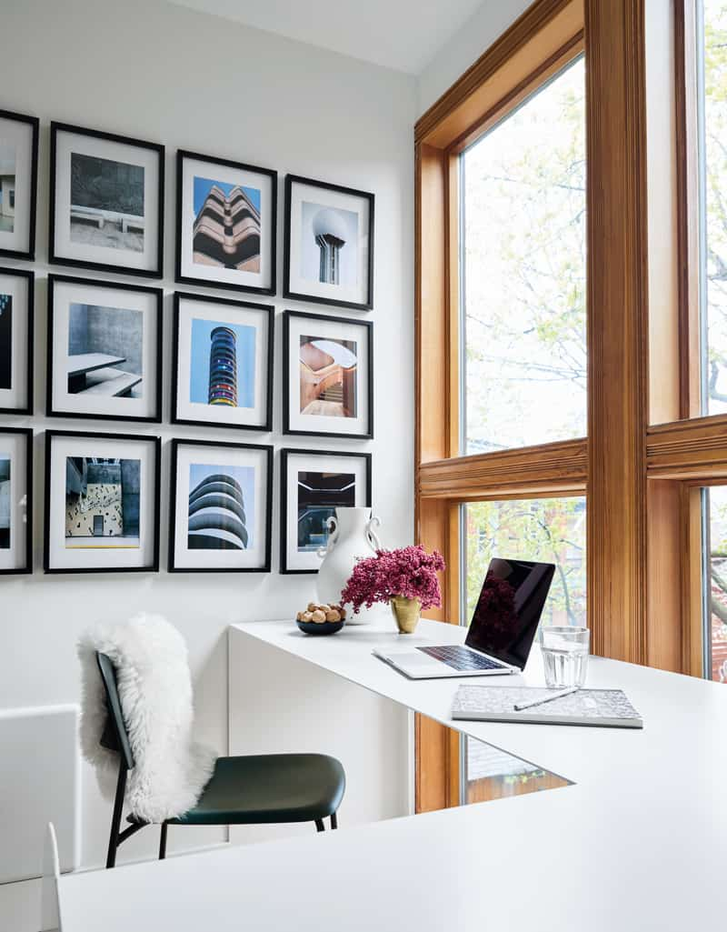
“I chose a paler shade of wood cabinetry to keep the kitchen light and airy,” says Luke. “I think it’s a nice contrast to the other elements and a good balance with the refinished light wood floors throughout the house.” The sleek door purposely repeats the panelling in the front hall. “The continuity it creates in relation to the entryway gives effortless flow from one room to the other.” A grid of travel photos by a local photographer defines an office space just beyond and pumps up the flow. Says Luke: “The dark frames link back to the metal door, the island frame and the black kitchen faucet – all intentional balancing elements!”

Photography, Maxime Desbiens

Photography, Maxime Desbiens
FLOOR TILE, La Tuilerie. RUNNER, Ecarpetgallery. PHOTOGRAPHy, Ben Leach.
Working Design
This workspace, one of two, is off the kitchen and fitted with a custom built-in desk. “I like to make offices where people can work in a zone that isn’t necessarily a closed room,” says Luke. “Although sometimes
privacy is necessary when working, having a designated office space isn’t always a reality when it comes to square footage restrictions.” Luke’s penchant for personalization is evident in the dynamic display of photos and soft touches, such as the vase and flowers.

Photography, Maxime Desbiens
“A home office space needs a really nice backdrop so you can rely on something great behind you for video calls.”

Photography, Maxime Desbiens
PHOTOGRAPHY, Ben Leach. CHAIR, Hay. THROW, IKEA.
Great Job
In the home’s other workspace, Luke relied on vintage pieces, like the desk lamp and Thonet chair, as well as upcycled items, such as the desktop, which was made from a piece of countertop salvaged from the old kitchen. The panelling is original. “It was one of the elements that was always present in the house and it adds so much character,” says Luke. The entryway’s built-in bench is a practical addition that takes advantage of the lower elevation of the area, which is a few steps down from the main floor.

Photography, Maxime Desbiens

Photography, Maxime Desbiens

Photography, Maxime Desbiens
RUG, Ecarpetgallery.
Bright Stuff
The guest bedroom takes a cheerily colourful stance that’s undeniably inviting. “If you remove the bedding and fabric from the room, it’s really a very simple palette,” says Luke. “But I decided to punch it up with colours, as such a bright space can handle it.” The custom bench is topped in a tactile oxblood fabric, and the vintage side tables are sunshine yellow. The art is a vintage Japanese print of cranes. Says Luke, “I find it graphic, and it grounds the white wall.”

Photography, Maxime Desbiens

Photography, Maxime Desbiens

Photography, Maxime Desbiens

Photography, Maxime Desbiens
BED FRAME, Structube. BEDDING, THROW, The Boho Lab. Colourful QUILT, Slow Down Studio. RUG, Ecarpetgallery. PLANT, Marsolais.
Cozy Corner
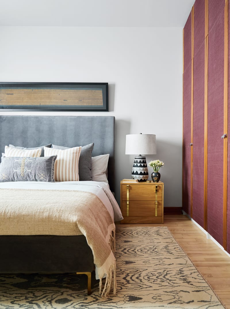
The primary bedroom has a soft-spoken palette. “I wanted it to be a bit moodier and cozier than the other rooms,” says Luke. There’s also a bit of a global beat happening thanks to the handwoven Turkish rug, bedding from Morocco, and a Chinese screen that Luke mounted on the wall above the chair. “It’s very rich and its darkness suits the room.”

Photography, Maxime Desbiens
“A bedroom should be a cocooning space with a cozy environment. Layers and textures are important – not so much that the room feels cluttered, but just enough for it to be calming.”

Photography, Maxime Desbiens

Photography, Maxime Desbiens
DRAPES, IKEA. CHAIR, Structube. THROW, CUSHIONS, The Boho Lab.
5 Bedroom Trends For 2024


Comments