House Tours
Revamp a Mid-century Ranch for Modern Family Life

Photography: Drew Hadley | Styling: Carolina Auz
House Tours
Revamp a Mid-century Ranch for Modern Family Life
Seeing the possibilities helps a Montreal-area realtor revamp her mid-century ranch for modern family life.
Who better than a realtor to see the potential of a property? “The house had been for sale for eight months when I decided to visit,” says its present owner, a real estate agent, about her 1950s ranch bungalow on Montreal’s South Shore. The previous owners had lived there for 60 years; it was pristine, but dated. “They had maintained it perfectly, had put all their love into it,” she says. “Everything was spotless, but nothing had ever been changed. It was a bit like a museum.” But her expert eye immediately saw the possibilities: “In my work, I often see how people have difficulty imagining what a place could become once renovated. I see it right away.” One look and she knew she could give it new life as a bright, modern home for herself and her four-year-old daughter.
Although the owner didn’t change the footprint of the 2,350-square-foot house, she completely reimagined how to use the space, switching up rooms to better reflect a modern lifestyle. A family room became a welcoming new kitchen; the former dining room became a family room; the old kitchen was turned into a bathroom, and one small bedroom became an office while another was transformed into a luxurious master bath. It was a sophisticated and complicated rethinking that resulted in a transformative improvement of flow between spaces.
That cohesion was reinforced by the owner’s natural talent for design, and she let her love of modern and mid-century lead the way. “I like this ’50s style of house, where everything is on one floor,” she says. She also preserved certain favourite original elements like the terrazzo floor in her office. Elsewhere, she opted for light-toned maple floors and shopped locally as much as possible. “I like natural materials, quality objects and I prefer local made-in-Quebec products,” she says.
The newly bright, open and modern spaces maximize comfort for her and her little girl, just as she’d originally envisioned. It’s a world away from what she had first encountered, but like the previous owners, she put all her love into it, and it shows.

Photography: Drew Hadley | Styling: Carolina Auz | Mobican SIDEBOARD and TABLE, Maison Corbeil. HOOKS, IKEA. MIRROR, Must Société. RUG, Simons.
A brass-trimmed floor mirror floods the entryway with reflected light and offers a spot for last-minute outfit checks before heading out; oversize brass hooks are handy and signal the intro of this golden touch that will appear throughout. A large console stores outerwear and, because it is also a part of the living room, serves as bar storage. Locally made, it combines mid-century-inspired lines with a contemporary base. Above it, a shapely modern abstract is a focal point.

Photography: Drew Hadley | Styling: Carolina Auz | SOFA, COFFEE TABLE, ARMCHAIRS, Must Société. RUG, Costco. CURTAINS, Bouclair. Umbra MIRROR, SCONCES, Wayfair. CUSHIONS, Simons and HomeSense.
The homeowner loves a modern look, but embraced select original features of the home, such as the fireplace. “I added the ceramic tiles [on the hearth], then stripped the wall to expose the brick and painted it and the fireplace mantel white,” she says. Her love of the seaside-inspired subtle references in elements like brass sconces, the porthole effect of the round mirror, and the intro of sandy tones in the drapery and poufs. She chose glass-topped tables that wouldn’t obscure the view of flames in the fireplace.

Photography: Drew Hadley | Styling: Carolina Auz | TABLE, CHAIRS, CHANDELIER.

Photography: Drew Hadley | Styling: Carolina Auz | TABLE, CHAIRS, CHANDELIER, SHELVES, Maison Corbeil. PAINTING, Nathalie Poirier.
The reno included switching the location of the dining room to be part of the living room, allowing the owner use its former space as a family room. “I fell in love with the table with its wood and brushed steel legs in ebony,” she says. “I find the rectangular shape lends itself well to the space.” The chairs are comfortable, practical and repeat the use of black as an accent. The striking original artwork was a birthday gift and adds subtle colour and beauty to the space, creating a wonderful conversation piece at dinner parties. The brass chandelier and shelving unit link the space to the rest of the home.

Photography: Drew Hadley | Styling: Carolina Auz | CABINET MAKER, Bélanger & Fils. Quartz COUNTERTOPS and BACKSPLASH, Granitaly. SINK, Costco. FAUCETS, Delta. Electrolux REFRIGERATOR and Bertazzoni STOVE, JC Perreault. Wall SCONCES and PENDANTS, Wayfair. BARSTOOLS, Must Société. ACCESSORIES, HomeSense.

Photography: Drew Hadley | Styling: Carolina Auz
The former residents had added two extensions onto the house in the 1990s, including a family room that the new owner transformed into a stunning kitchen. The blue-grey Shaker-style cabinets evoke a seaside palette and the brass hardware and accents are reminiscent of a yacht’s cabin. Thick wood shelves bring warmth to the mostly white room. The quartz countertop and backsplash give a modern touch, while black barstool legs and pendant lights add punch and reinforce the connection between rooms.

Photography: Drew Hadley | Styling: Carolina Auz | SOFA, COFFEE TABLE, FLOOR LAMP, Maison Corbeil. BASE CABINET, All Modern. CURTAINS, Bouclair. RUG, Costco. CUSHIONS AND THROWS, Simons and HomeSense.
Lots of cushions and cozy throws make the sofa – which has an unusual shape – a sink-into destination in the new family room. “It has an angle, and its configuration was well suited to the room,” says the owner. “I think a sectional would have been too bulky.” Sunny yellow accents warm the room visually and work well with the yellowy brass shade of the floor lamp, which acts as a great reading light and creates a soothing mood when the homeowner and her four-year-old daughter snuggle on the sofa while watching TV. The frosted doors of the TV cabinet provide a place to stow books, blankets and “whatever you don’t want to see,” says the owner.

Photography: Drew Hadley | Styling: Carolina Auz | DESK, OFFICE CHAIR, Structube. Black CHAIR, STORAGE FURNITURE, Maison Corbeil.
Even pre-pandemic, the homeowner worked from home a significant portion of the time, so she transformed a room that had been a bedroom into a highly functional and attractive office. She opted for mostly all-white practical furniture, but brought in a black desk chair to forge a connection to other rooms and to the stunning terrazzo floor, which is original to the house and, coincidentally, is also a hot trend. When clients visit, she pulls in chairs from the dining room. “They have armrests and are enveloping, a bit like armchairs,” she says.

Photography: Drew Hadley | Styling: Carolina Auz | Mobican bedside TABLES, Maison Corbeil. BENCH, Bouclair. Cabinet DOORS and BEDDING, IKEA. Grey BLANKET, Costco. BASKETS, Simons and Must Société. SCONCES, Déco Luminaire.
In the master bedroom, a whole section of wall is devoted to storage. Drawers, shelves and wardrobes are concealed by two sliding doors; one is white, while the other is mirrored to make the room appear bigger. A black bench balances the upholstered headboard, and bedding in white and shades of grey give a tailored feel. Natural woven elements add textural interest, and a touch of warm-toned wood is welcome with the addition of new nightstands from a local source. “I particularly like this material because it makes the atmosphere warm,” says the owner. Gold accents were introduced in small doses with the bedside sconces.

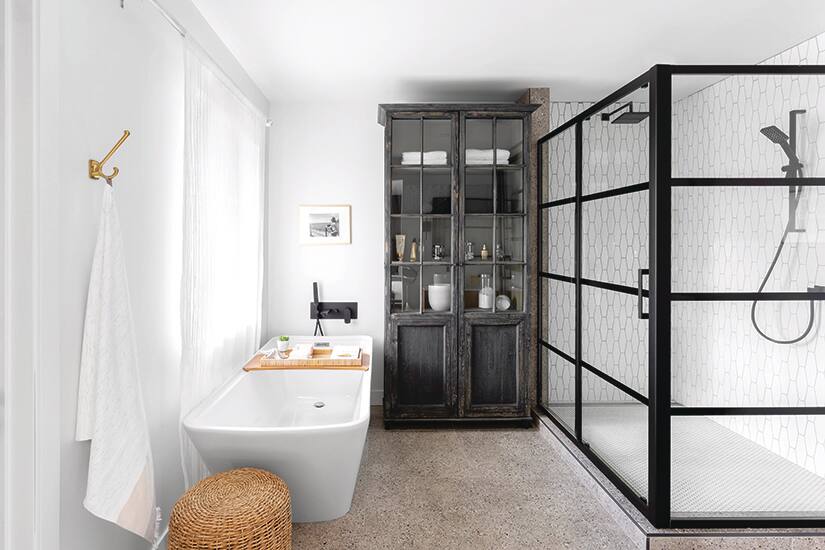
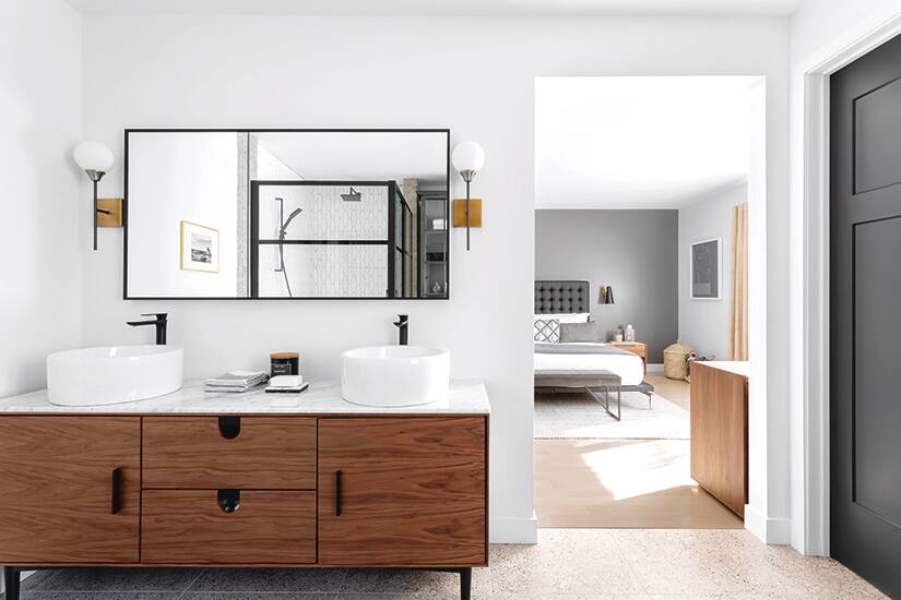
Photography: Drew Hadley | Styling: Carolina Auz | SINKS, VANITY with marble countertop, WALL SCONCES, Wayfair. MIRROR, Bath Depot. BATHTUB, SHOWER, SHOWER DOOR AND FAUCET, Jean Lépine Plumbing Centre. FLOOR AND SHOWER CERAMICS, Planchers Lanctôt. CABINET, Maison Corbeil.

Photography: Drew Hadley | Styling: Carolina Auz
The owner turned an extra bedroom into a master bath, leaving the plan open, except for a closed area for the toilet (behind the black door). Black faucets and fittings reflect her inclination toward current trends, as do the clean lines of the sinks and the bathtub. “The bathtub doesn’t take up too much space, but is deep,” says the owner. “Baths are often showcased in bathrooms. I preferred to put the emphasis on the glass cabinet, because it has a lot of character and it breaks the modern style.”


Comments