House Tours
Home Sweet Home

Photography: Virginia MacDonald
House Tours
Home Sweet Home
A couple who are serial renovators settle down in their dream home — for now.
Natasha Penzo absolutely loves her newly renovated midtown Toronto home. She loves its urbane Manhattan townhouse-inspired interior, which she artfully brought to life with the help of designer James M. Davie. She loves that it’s custom-designed for her young family, with its formal dining room that encourages them to eat together nightly. She loves its tranquil master bedroom and its playful but equally chic third-floor kids’ zone. It’s the perfect fit for Natasha and her husband, Graeme McIntosh, their children, Jack, 3, and Sofia, 1, and their yellow Lab, Auggie.
So, are they here for the long haul? Probably not. “It’s just the nature of my business,” she says with a laugh. “My whole family is in real estate.” Natasha and her brother, Luca Penzo, are partners in Urban Blueprint, a design-build company that specializes in architectural planning, construction project management and interior design. Graeme is a real-estate agent with top-drawer local firm Chestnut Park, as is Natasha’s mother, and her father is a real-estate developer and investor.
Renovating is in her blood, and she thoroughly appreciates the challenge of a new space. “I actually love the process and experience,” says Natasha. When she and Graeme bought this 2,000-square-foot house in 2017, it was their second home on the street, their third in this coveted neighbourhood, and their fourth place in eight years.
Unlike most house-hunting couples, Natasha and Graeme chose this home precisely for its unsuitability. “We wanted something we could totally transform from top to bottom, and this was ripe for renovation,” says Natasha, of the 1980s row house. “It was very ’80s. Corner bathtub, corner fireplace, linoleum floors,” she says. “Glass blocks,” James adds. “It was a 1980s nightmare!”
Aesthetics aside, it had a lot going for it. “It’s the end of a row of townhouses, so it’s slightly more spacious and feels a bit like a detached,” says Natasha. “And it has parking! We’ve never had it before, so that was monumental. When you have children, you accumulate all this gear.”
Natasha and Graeme embarked on a year-long renovation to make the house feel elegant, layered and serene. “We wanted it to feel fresh and new, but also have elements that felt historical to keep in line with the 100-year-old Victorians on the street,” she says. That’s where James came in. “He has such an innate ability to make a new reno feel historical and authentic, to give it this old-world pedigree,” she says. “He’s a traditionalist, but very colourful, too. His ability to combine colour is next level!”
Asked how he goes about conjuring a luxe, historically layered interior in a frumpy, stuck-in-the-’80s townhouse, James says: “It’s an element of contemporary sophistication with bold statements of colour and architecture where they can be made. And it’s about not being shy!” If that sounds too esoteric to put into practice, he shares a simpler method. “We started by choosing one thing per room that we loved – a marble, a wallpaper, a piece of fabric – and we used that to tell us what direction to go in,” he says. “For me, it’s about listening to the materials you love and then pulling from those punches of colours in unexpected ways.”
In the kitchen, that starting point was the marble for the countertops. “It has pinkish hues in it, so I said, let’s jump on that band- wagon and do pink for the cabinetry and backsplash. Then I sug- gested we do this deep, almost fuchsia colour for the cabinetry instead, and Graeme put the brakes on that!” says James.
“It was a Farrow & Ball colour called Radicchio,” Natasha explains. “It’s a deep purply-pink like the vegetable. With a back-painted glass backsplash in blush and the dark cabinetry, the kitchen would have been way more powerful. It’s actually one of the biggest regrets I have. But Graeme said, ‘We’ll never be able to sell our house if we do this – ever!’”
Natasha takes it all in stride. After all, there’s so much to love about the house. “Things don’t always go perfectly, and you learn for next time,” she says. “Maybe in our next house, we’ll have a Radicchio kitchen.” With this family’s penchant for renovating, that just might happen!

Photography: Virginia MacDonald | INTERIOR DESIGN, James M. Davie; MARBLE, Crystal Marble & Tile; MANTELPIECE, Parsiena Design.
The fireplace’s dramatically veined marble inspired the restrained blues, greys and gold that wash the living room in colour. “I like to pull colours out of materiality,” explains designer James Davie, who worked with homeowner Natasha Penzo to inject genteel architectural character into the dated 1980s townhouse. He added elements like handsome new built-ins, an elegant but understated mantel and deep baseboards. “For the built-ins, we chose the marble, which has all these wonderful tones of grey and vibrant yellow in it, and piggybacked off that for the paint colours, textiles and even lamps.”

Photography: Virginia MacDonald
“When Natasha and Graeme bought the house, it was a 1980s nightmare, complete with glass blocks and a corner fireplace,” says James. Shifting the fireplace to the centre of a side wall brought a pleasing symmetry to the overhauled living room. “Because this is a row house, Natasha wanted to give it a New York townhouse feel, a very urban, posh, upscale Manhattan townhouse,” he explains. James has a soft spot for repeating geometric shapes: note the phalanx of obelisks on the mantel and the circular lines of the mirror and club chairs. Working with James was a joy for Natasha. “It was a great collaboration,” she says. “It still feels like my house, which is important, but James very much led the vision for the project.”

Photography: Virginia MacDonald | Pink club CHAIRS, RUG, Elte; SOFA, OTTOMAN, built-in design, Sofa upholstery FABRIC, Kelly Wearstler; white and gold LAMP, Elte; WALL COLOUR, Purbeck Stone (275), Farrow & Ball, James M. Davie Design; TRAY, VASE (on ottoman), HomeSense; drapery FABRIC, Threadcount; MIRROR, OBELISKS, Decorum Decorative Finds; BUILT-IN FABRICATION, Altima Kitchens + Interiors; dark grey built-in COLOUR, mantel COLOUR, Plummett (272), light grey built-in COLOUR, Manor House Grey, gold accent COLOUR, India Yellow, Farrow & Ball.
An ethereal photograph of flamingos by Mark Brodkin adds a playful note to balance the traditional mood and sets off the living room’s blue and gold tones. Fabric from Hermès is a nod to Natasha’s days in fashion marketing. “Even though we only purchased an off-cut of marble for the fireplace, we had enough left over to remove the glass tops from the side tables by the sofa and have the fabricator cut the stone to match,” she says.

Photography: Virginia MacDonald | Grasscloth WALLPAPER by Phillip Jeffries (cut and installed to look like stone bricks), Threadcount; CONSOLE by Mitchell Gold + Bob Williams, Elte; vintage MIRROR, Residential Lighting.
With its contrasting curves and right angles, the entryway feels like an artful still life. Luxe finishes and textures – from warm, burled wood to bright chrome to nubbly grasscloth – herald the elegant spaces to come in the rest of the house. “I thought we should take a break from paint, so we used grasscloth wallpaper to mimic masonry,” says James. “It gives a really textural experience and adds a great deal of interest.”

Photography: Virginia MacDonald | WALLPAPER, Phillip Jeffries; custom TABLE, Nobleton Custom Wood Work; leather-covered CHAIRS, Palazzetti Home; WALLPAPER, Threadcount; MIRROR, tall CANDLESTICKS, Boo Boo & Lefty; Ralph Lauren CHANDELIER, Union Lighting; Hermès Home BLIND FABRIC, Theo Decor; BLIND FABRICATION, Wesley Seto; white oak hardwood FLOORING (throughout), Rosewood Flooring.
Savvy design moves like cutting the grasscloth wallpaper into pieces and installing it in a brick pattern over a wall painted the colour of mortar amp up architectural character in a home that had none. (If the wallpaper gets dinged or marked, replacing a square or two is a snap – an unexpected benefit for a family with young kids!) Leather dining chairs and a strappy leather and brass chandelier inject equestrian flair. “As our kids are growing up, I wanted to make dinner, not super formal, but an activity where we all sit at the table together,” says Natasha.

Photography: Virginia MacDonald | SOFA, PILLOW FABRICS (green stripe and leaf pattern) by Designers Guild, Elte; orange VELVET PILLOW, HomeSense; SIDE TABLE, MARBLE TABLE LAMP, FLOOR LAMP, Boo Boo & Lefty; COFFEE TABLE, RUG, Elte Mkt; TRAY, Hermès; chartreuse VELVET DRAPERY FABRIC, Threadcount; DRAPERY FABRICATION, Wesley Seto.
In the second-floor family room, a velvet-clad sofa by Mitchell Gold + Bob Williams is both elegant and inviting. Orange pops amidst a sea of blues and greens. “We wanted the entire second level to be a master retreat, with the family room at the front and our master suite at the back,” Natasha explains. Having an inviting basement-level playroom makes it easier to maintain a grown-up aesthetic in the family room and on the main floor, too.

Photography: Virginia MacDonald | VANITY FABRICATION, Altima Kitchens + Interiors; VANITY COLOUR, Van Buren Brown (HC- 70), Benjamin Moore; Eramosa marble COUNTERTOP, Crystal Marble & Tile; Henry FAUCET in unlacquered brass by Waterworks, TOILET by DXV Studio, Ginger’s; malachite and brass PULLS by Matthew Studios, ADH Hardware; Equateur WALLPAPER by Hermès, Theo Decor; vintage MIRROR, Residential Lighting; mahogany TOILET SEAT, Amazon; Pill sconce by Kelly Wearstler, Elte; crown MOULDING COLOUR, Ocean Tropic (2052-10), Benjamin Moore.
Natasha and James went a little wild – literally! – in the powder room. “We chose this funky, whimsical wallpaper with monkeys and parrots on it,” says James. The pair felt too much green would overwhelm the small room, so they opted for a brown vanity and used green only on the trim and the amazing malachite cabinet pulls. “It’s very jungle and fun,” Natasha says.

Photography: Virginia MacDonald
A subtle approach proved best in the kitchen, which is open to the living room. Decorative flourishes include ribbons of brass trim on the vent hood and the lilac hue of the back-painted glass-subway-tile backsplash. Panelling the fridge maintained visual flow in the small space.

Photography: Virginia MacDonald | CABINET and HOOD DESIGN, James M. Davie Design; CABINET and HOOD FABRICATION, Altima Kitchens + Interiors; CABINET COLOUR, Skimming Stone, Farrow & Ball; CABINET PULLS by Sutton, Ginger’s; back-painted glass subway TILE in blush pink, Surfaces & Co.; deck-mount bridge FAUCET by Perrin & Rowe, Taps; Superiore STOVE by Technogas, Appliance Love; NESTOS MARBLE COUNTERTOP, Crystal Marble & Tile; wood CUTTING BOARD, Nobleton Custom Woodwork; white oak hardwood FLOORING (throughout), Rosewood Flooring.
A simple peninsula divides the kitchen and living room (beyond), and a tiny island delineates the kitchen’s workspace and hides garbage and recycling bins. New wide-plank white oak flooring installed throughout the house underpins the home’s elegant transformation.

Photography: Virginia MacDonald | SINK, Ginger’s; travertine COUNTERTOP, Olympia Tile; custom MIRROR, E&B Glass Enclosures; Venetian plaster WALL FINISH, Paul Reinke Design; PLASTER COLOUR, Clunch (2009), Farrow & Ball.
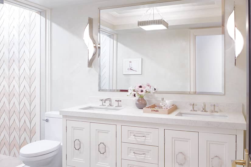
“The idea of shapes repeating in interesting ways is one of my main design focuses,” says James. “In the master bath, the Kelly Wearstler sconces with the S-curve that echoes the geometry of the shower tile really makes that tile work.”

Photography: Virginia MacDonald | Belle Chassee in Bianca Perlino and Rosa Perlino D’Lusso TILE (shower walls), Surfaces & Co.; rain SHOWER HEAD, Ginger’s; LIMESTONE FOR SHOWER FLOOR, Stone Tile; custom GLASS WALLS and MIRROR, E&B Glass Enclosures; travertine slab for SHOWER BENCH, Olympia Tile; SHOWER CONTROLS, fixtures by Waterworks, Ginger’s.
The period look is enhanced by walls done in a Venetian plaster finish and nickel-finish taps and mirror. Dramatic pink and white marble tile – Natasha fell in love with it at Surfaces & Co. – sets a demure old-world tone in the luxe master bath, where other fixtures and finishes were kept simple and quiet, save for the ladylike chair from Palazzetti.

Photography: Virginia MacDonald | BUILT-IN DESIGN, James M. Davie Design; BUILT-IN CONSTRUCTION, Altima Kitchens + Interiors; FABRIC IN BUILT-INS by Missoni Home, John Paul + Co.; PULLS ON BUILT-INS by Emtek, ADH Hardware.
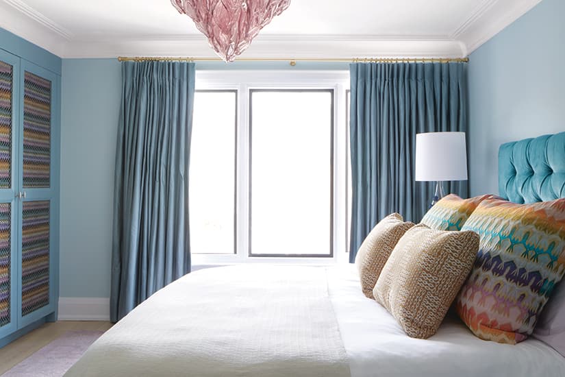
Wall-to-wall built-ins boost function in the master bedroom and helped define the look of the space. “We started with this wonderful Missoni fabric that has every colour of the rainbow in it, then we asked, ‘How do we use this fabric and not go too hog wild in the room?’” says James. The solution was to temper it by tucking fabric panels behind bronze meshwork grilles in the closet doors.

Photography: Virginia MacDonald | BED, Helix Sleep; DUVET COVER, Hill House Home; DRAPERY FABRIC, Threadcount; DRAPERY FABRICATION, Wesley Seto Design; vintage Murano GLASS CHANDELIER, Residential Lighting Studio; THROW (on bed) by Gluckstein Home, Hudson’s Bay.
Fabric by Missoni, the Italian fashion house famous for its uber-colourful no-holds-barred knitwear, inspired the look of the master bedroom. “That’s our big statement, our real splash of colour and fun. Then we chose a much more subtle, subdued palette for the rest of the room,” says James. “The great pink light fixture was another chance to add a little bit of life.”

Photography: Virginia MacDonald | CHEST OF DRAWERS, LAMP, Elte; FRONT PILLOW fabric by Hermès, Theo Decor; COLOURFUL PILLOW fabric by Missoni, John Paul + Co.; white SHEETS, PILLOW SLIPS, Hill House Home; HEADBOARD design, James M. Davie Design; velvet headboard upholstery FABRIC, Threadcount.
Pulling cool teal from the Missoni fabric to act as the dominant hue sets a serene tone in the master bedroom. Layering deeper versions of the blue in the headboard and draperies instills a quiet sophistication that balances the vibrant feature fabric.

Photography: Virginia MacDonald | Crib, papier-mâché ANIMAL BUSTS (on wall), Restoration Hardware; QUILTS (in crib and on crib rail), Pehr Designs; WALL COLOUR, Purbeck Stone (275), Farrow & Ball; TRIM COLOUR, Oxford White (CC-30), Benjamin Moore.
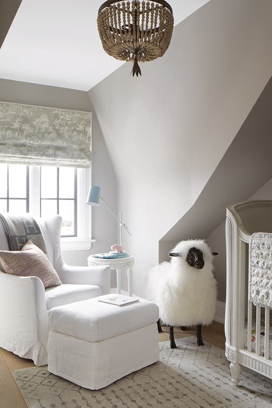
In Sofia’s third-floor bedroom, serene grey walls create the feeling of sleeping in the clouds, and a crib tucked under a sloping attic roofline feels extra snug. All-white furniture looks bright and crisp, while quietly whimsical animal “busts” and figurines add personality and fun. While Sofia is still wee (she turned one in December 2019), her books and toys can be artfully corralled in shadow-box-style shelves mounted over her dresser. Two black elephant figurines pop in the pale space.

Photography: Virginia MacDonald | CHAIR in Belgian linen upholstery, OTTOMAN, Restoration Hardware; THROW (on chair), Hermès; BLIND FABRIC, Threadcount; BLIND FABRICATION, Wesley Seto Design; SHEEP FIGURINE, Artifacts Emporium; SHELVES, Restoration Hardware; ELEPHANT FIGURINES, Advice from a Caterpillar.
James and Natasha transformed the dormer window in Sofia’s room into a bright nook for reading and rocking. Furniture with traditional styling and textiles in understated patterns and colours give the decor staying power.


Comments