House Tours
Home Tour: A lakeside new-build with an airy country charm

Photography by Patrick Biller
House Tours
Home Tour: A lakeside new-build with an airy country charm
Designer Jenny Belanger relied on natural materials, light colours and a few design tweaks to imbue this lakeside new-build with an airy country charm.
John and Michelle Hemeon’s vision for their 2,700-square-foot home bordering Lake Erie in Kingsville, Ont., was modern farmhouse; designer Jenny Belanger had a different idea. “I wanted to take from the area’s rich history of traditional farmhouses and historical lakeside cottages,” she says. A few tweaks to the home’s standard book-plan design (including removing ceiling joists to expose the dormer windows and let in even more light) gave the space an open, casual feel. Decorative elements, such as creamy walls, white oak floors and custom millwork amplified the airy effect. “All of these features create the character you see in homes of decades past,” says Jenny. “Forget modern farmhouse…this feels like it has always been here.”

DESIGN, Jenny Belanger, JAE Form Studio. CONTRACTOR, J. Rauti Custom Homes. LANDSCAPING, Lakeshore Landscaping. MILLWORK, Joe’s Woodcraft. OUTDOOR FURNITURE, RH. DOOR PAINT, Homburg Gray SW 7622, Sherwin-Williams. Window coverings, Duda Custom Drapery.
To add interest to the home’s black and white exterior, designer Jenny Belanger focused on finishes. “The porch’s new pavers were laid in a herringbone pattern and then given a reclaimed finish so they don’t look new,” she says. The silver metal roof is characteristic of a more traditional farmhouse, while the rich door colour and large-scale lanterns cultivate a casually grand effect.
Farmhouse Kitchen

The kitchen’s cream-coloured cast-iron apron-front sink is in keeping with the farmhouse look. A simple
off-white textured linen blind softens the hard finishes.

CABINETRY PULLS (throughout), Miller’s Millwork. LIGHT fixtures, The Lighting Boutique & Appliance Shoppe. SINK, Emco plumbing fixtures, Ensuite Bath & Kitchen Showroom. APPLIANCES, Reis Appliance.
The kitchen brims with design details, including the unique range hood. “I wanted something that added texture, but I didn’t want another material, so we came up with this louvre treatment,” says Jenny. The venting ductwork is behind a chimney stack that was carefully clad. “I used shiplap, something commonly seen in old homes, so it would look intentional and not like an afterthought.” Glass-fronted cabinets break up the wood and afford a view of pretty dishes.
“The kitchen had to be spectacular but not distract too much from the gorgeous view of the lake.”

Dreamy Dining
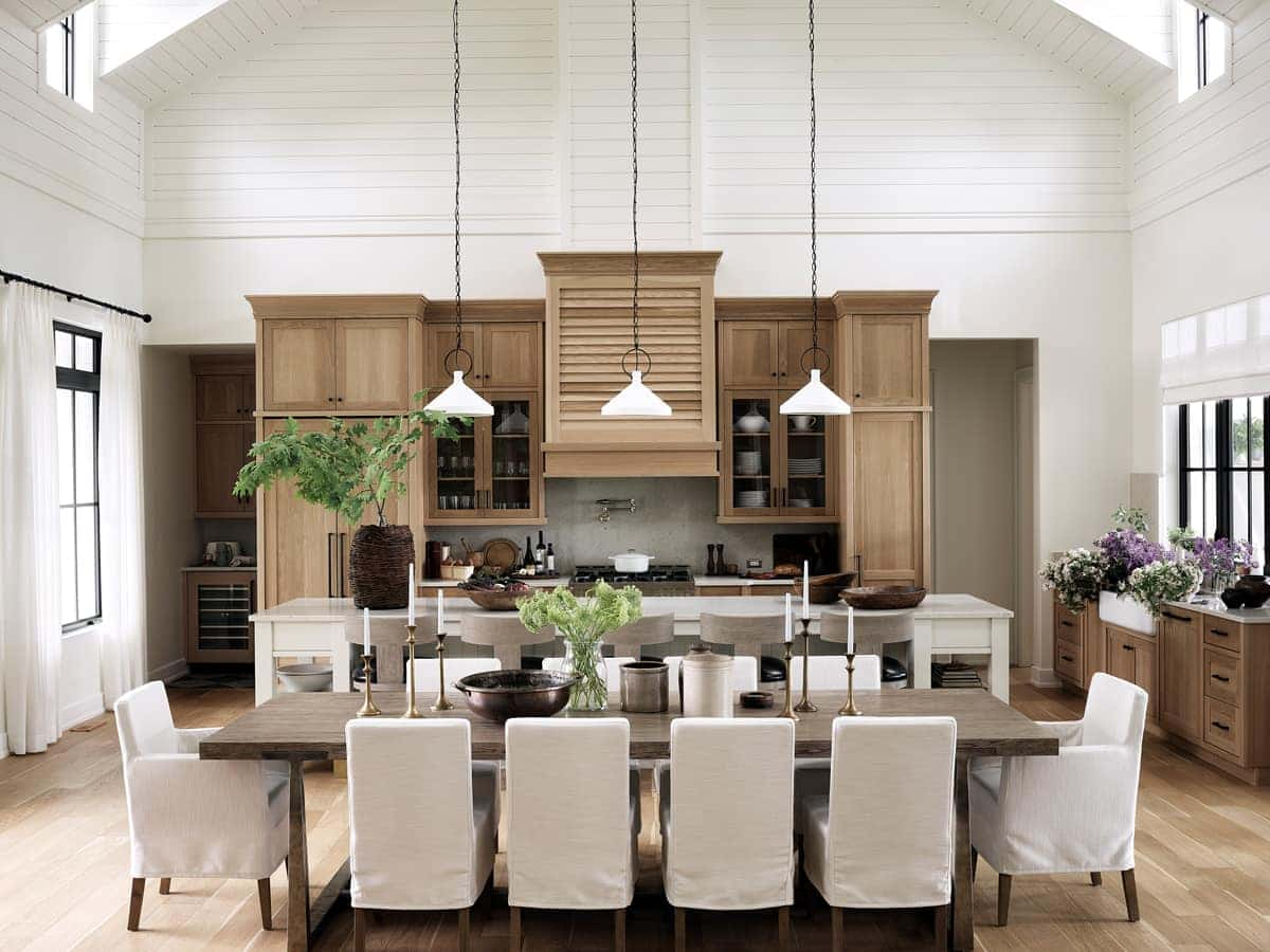
CHAIRS, STOOLS, DINING TABLE, RH.
“The ceiling was opened to allow light to filter in through the dormers above,” says Jenny. “It gives the space a loft effect like you see in converted barns.” Jokingly called “the aircraft carrier,” the extra-long 14-foot island has ample storage drawers on the kitchen side and stylish stools on the open side. “I wanted them to blend into the island,” says the designer. “These hit the nail on the head with the pale colour, wood grain texture, and the black leather that complements the matte-black cabinet hardware.” Linen slipcovers on the dining chairs layer in softness and are a subtle foil to the wood.
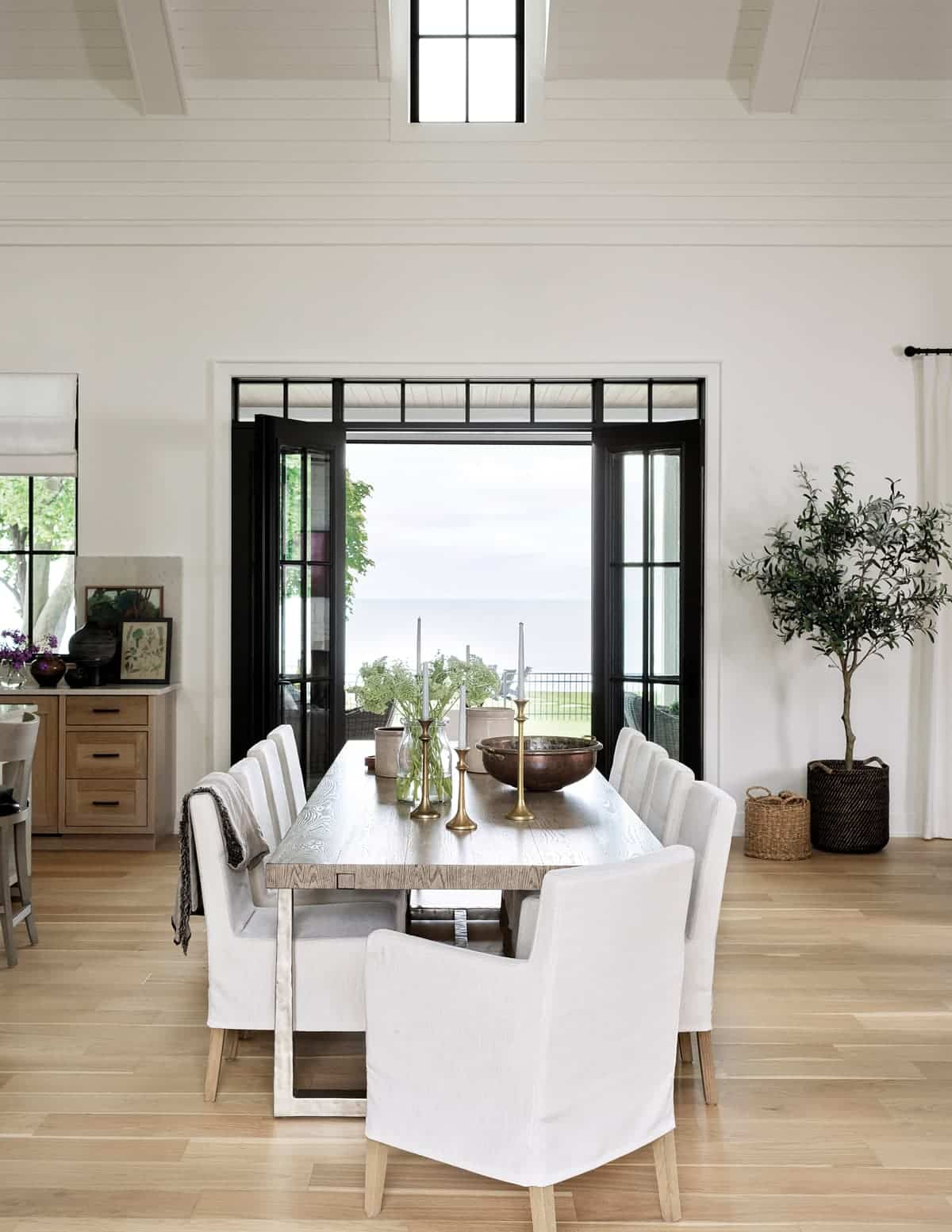
Simple but elegant
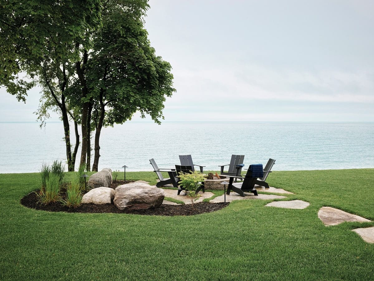
The landscaping is an exercise in restraint. Pavers add pattern, let the grass dominate, and lead the way to a garden bed that demarcates the firepit area. Classic chairs are all that’s needed. Jenny took a similarly pared back approach to the design of the back porch. “It was important to keep things simple and to keep the endless lake views the focal point,” she says.
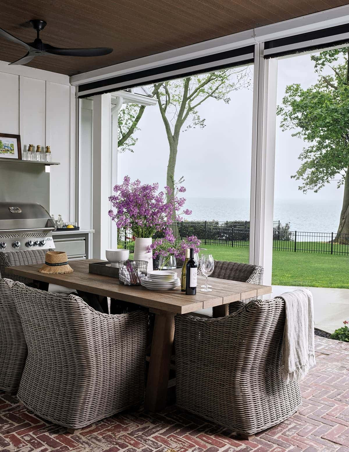
“It was important that the outdoor area feel like a seamless extension of the interior living space, so I kept the exterior colours and finishes essentially the same.”
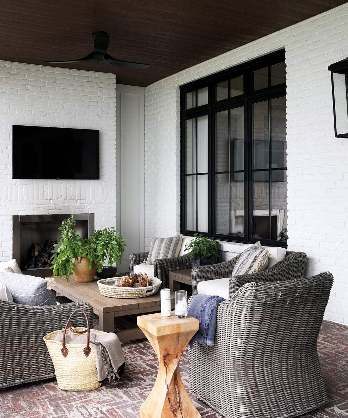
LANDSCAPING Lakeshore Landscaping. FURNITURE, RH. PILLOWS, THROWS, Nomad. TRAY, Elte.
Jenny cranked up the cozy on the covered back porch by adding a gas fireplace and motorized screens that allow the space to be enjoyed day and night. The fireplace was faced with painted reclaimed bricks to mirror the one in the family room, and the owners’ rough-hewn tables and chairs are a natural fit.
“The homeowners love symmetry, so this was at the forefront of the family room design. The custom built-in oak wall units achieve the desired effect and are the same finish as the kitchen millwork for continuity.”
Living in style

FURNITURE, CUSHIONS, RUG, Nomad.
The kitchen range hood’s louvre finish is repeated in the family room’s door panels (a thoughtful detail), but leather pulls were added to differentiate it slightly. The homeowners worked with a local furniture supplier to furnish this space and Jenny guided them through the process. “We kept the colour palette to earth tones, something that works for every season,” she says. The low-profile silhouettes ensure the fireplace and custom woodwork are the focus.
Sweet Dreams

FURNITURE, RUG, Nomad. BEDDING, CUSHIONS, Crate & Barrel. WALLPAPER, (in ensuite, above) Sandberg Wallpaper.
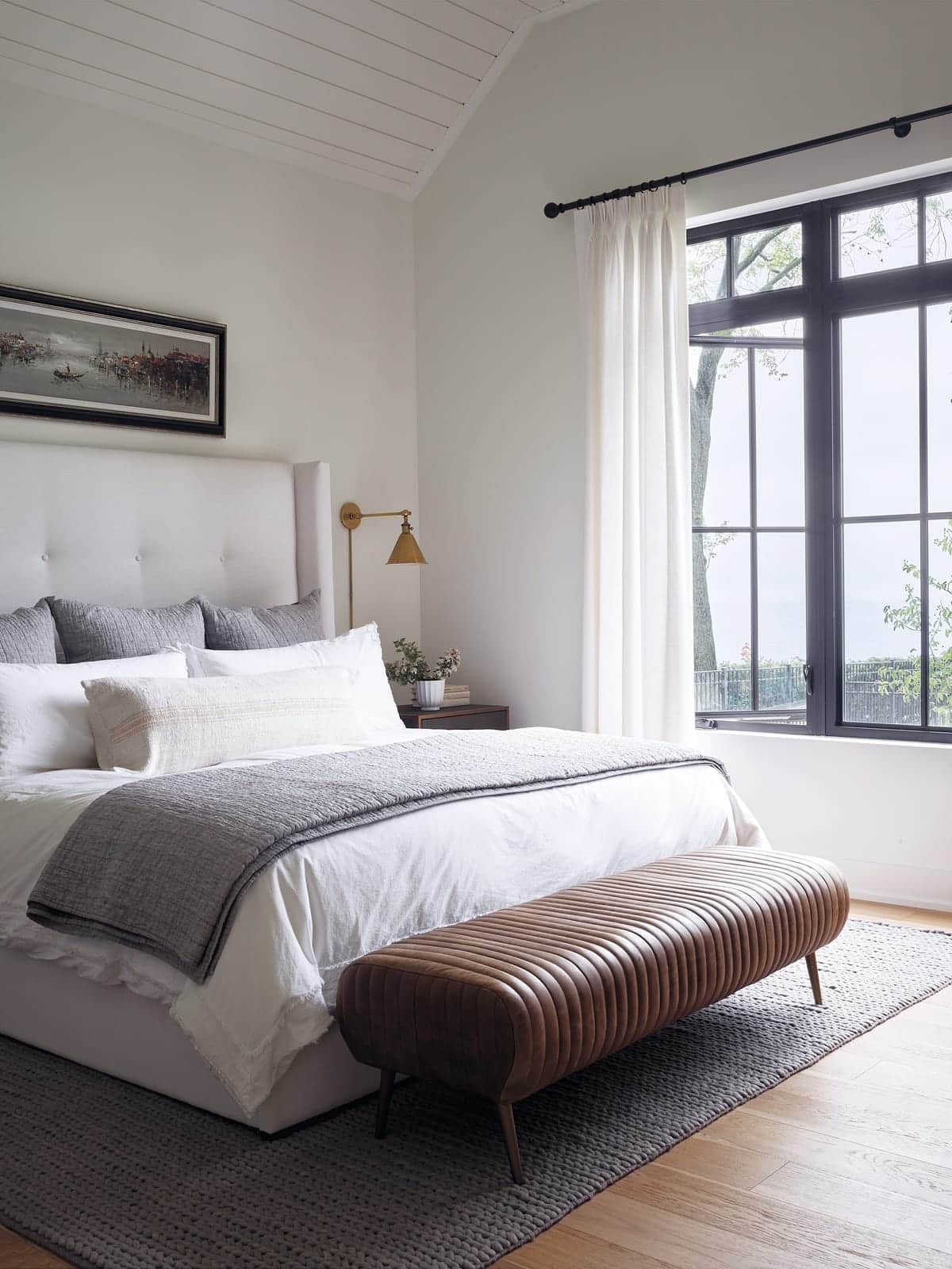
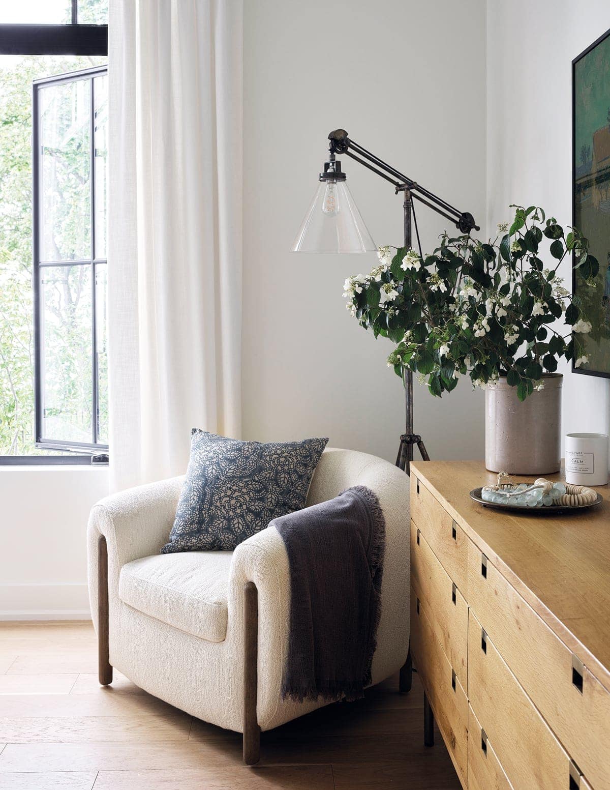
“It was important that Michelle had a comfortable chair in her bedroom,” says Jenny. “A place where she could read and relax while still having a view of the lake.” The room’s neutral palette has earthy heft, and there’s a balance of hard wood and soft elements. The artwork over the bed was purchased by the owners in Italy.
Peace & Quiet

TUB, PLUMBING FIXTURES, Ensuite Bath & Kitchen Showroom. RUG, TOWELS, Nomad. MIRRORS, Wayfair. ACCENT TABLE, Elte.
The ensuite’s millwork was designed to look like freestanding furniture rather than a single built-in unit. “I started with the actual vanities themselves and then added the divider, which looks like a wood version of a traditional pharmacy cabinet. The mirror front helps reflect light and breaks up all the wood,” says Jenny. The black iron of the sconces imparts a classic country look, while the linen shades add a simple elegance.

“This guest room’s metal bed frames have a casual farmhouse vibe that’s elevated with artwork and a faux skin rug.”
Guests are welcome
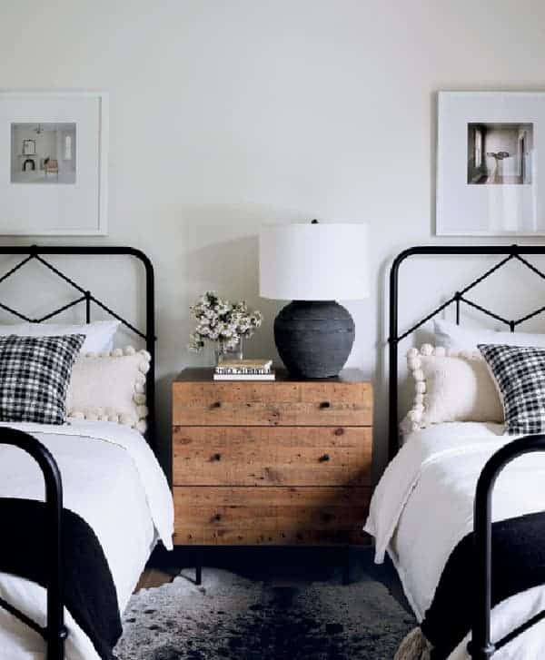
BEDS, DRESSER, Nomad. CUSHIONS, RUG, Pottery Barn.
In this guest room, the homeowners’ love of symmetry is indulged again in the pair of metal beds. The black and white scheme gets a bit of warmth thanks to the natural wooden dresser. “The effect is simple and uncomplicated,” says Jenny. “It’s a welcoming room, and twin beds provide more options for guest sleeping arrangements.”

MIRROR, Wayfair.
This guest bathroom is a definite departure from the rest of the home’s colour scheme. “I always feel like there needs to be at least one element that throws things off a bit, and this bathroom was it,” says Jenny. “I like how dark wood combines well with light finishes. I knew from the start I wanted to somehow incorporate this look.”

Beyond the dark wood, there is also design continuity in the beadboard wall treatment – it’s the same finish that’s on the kitchen island. Brass is a warm contrast to the darker tones and adds a bit of sheen. “One of my favourite things in this bathroom is the wall sconces,” says Jenny. “That double black stripe on the milk glass is such a simple, country touch.”
Escape To The Bed
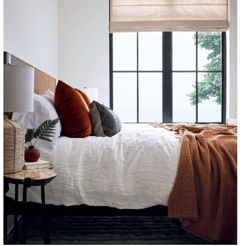
BED, RUG, Nomad. CUSHIONS, BEDDING, Rug & Weave. WALLPAPER, Sandberg Wallpaper.
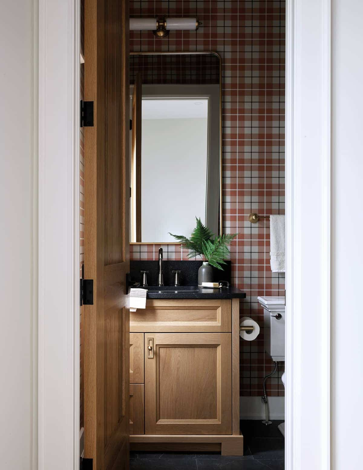
This guest bedroom was designed with the owners’ grown children in mind. The burnt-orange accessories feel a touch sophisticated, while the ensuite bathroom charms. “I layered plaid wallpaper with natural wood grain to give the bathroom that kind of old-school country vibe like you’d see in grandma’s house or the old cottage your parents would take you to as kids for the summer,” says Jenny.
Two-in-one

The home’s original plan separated the mud room from the laundry room, but by combining them, Jenny maximized space: “I was able to incorporate millwork that covered all the homeowners’ storage needs – a place for shoes, hooks for hanging items, and niches for hats, scarves and towels.” A classic cage pendant light illuminates the pretty and practical space, while channelling the farmhouse vibe that influenced the home’s design.

“The brick-style floor in herringbone pattern repeats the look of the outdoor pavers and gives this room a nice inside-out flow. Not to mention, it’s a beautiful space to do laundry in.”
Jenny also netted counter space for folding laundry, along with a hanging rod for overhead drying. The two-tone colour palette accents the handsome custom trim and millwork, and metal hardware makes it pop.
7 stylish Airbnbs we love


Comments