House Tours
It's a Family Affair

Photography: Janis Nicolay | Styling: Kristine Lee
House Tours
It's a Family Affair
A new-build disguised as a French country house is the breezy backdrop for this family’s memories-in-the-making.
There may not be better candidates for building a family abode than the Lee couple. Cory develops real estate, Kristine is the force behind the lifestyle blog, cozyandkin.com, and they’re parents to daughters Lauren (10), Taylor (7) and four-month-old Georgia. When the duo, on the hunt for a larger home, saw an estate-sale tear-down in Victoria’s charming South Oak Bay neighbourhood, they immediately made an offer. “Our dream was to build a roomy house for our growing family,” says Kristine. Two-and-a-half years later, their four-bedroom, 5,300-square-foot dream was a reality that – both charmingly and intentionally – looks as if it has always been there.

Photography: Janis Nicolay | Styling: Kristine Lee
Alfresco Ease

Photography: Janis Nicolay | Styling: Kristine Lee | ARCHITECT, Zebra Design, zebragroup.ca. DESIGN, Jenny Martin and Julia Estey, Jenny Martin Design. TABLESCAPES, Barb Walker and Shara Zimmerman Jawl, The Proper Table. WINDOWS, Loewen. BRICK PAINT, Gray Mist OC-27, Benjamin Moore. LANDSCAPE DESIGN, Rob Spytz Design.
The home of Cory and Kristine Lee in Victoria has its design roots in Gallic architecture. “We opted for a brick exterior, which is common in French countryside homes, but modernized it with creamy white paint,” says Kristine. “We added archways inside and out for visual interest, and spent a lot of time with our designers to get the narrow casement-style windows – which are typical to most French homes – just right.” The Lees love to eat alfresco and fresh veggies are always on the menu. “My Greek father, who has a passion for his vegetable garden, instilled in me at a young age the habit of eating fresh, homemade food.”
Kitchen Party

Photography: Janis Nicolay | Styling: Kristine Lee | WALL PAINT, White Dove OC-17, Benjamin Moore. Custom CABINETRY, Thomas Philips Woodworking. Brass PULLS, Colonial Bronze. Island PENDANTS, Visual Comfort. European oak Hakwood FLOORING, Island Floor Centre. RUNNER, Rugs USA. Ironica BARSTOOLS, Ton Chairs.
The couple relied on carefully considered elements like exposed beams to impart lived-in character to the new kitchen. “We also opted for more narrow, richly coloured floor planks not commonly seen in newer builds,” says Kristine. “Our cabinet-maker distressed the oak in the kitchen and living area to give it an old-world feel, and we chose hardware and lighting with matte finishes that have a worn-in look.” A mix of Shaker and face-framed cabinetry share the space with glass fronted-uppers; a copper pantry adds warmth to the white palette. The open shelves, a decor favourite of Kristine’s, were stained the same colour as the beams, and assorted brass accents were meticulously matched to feel cohesive. The stunning Lacanche range was a worthy splurge (the couple tried one at the company’s headquarters while on holiday in France). “It’s our favourite element in the kitchen. The first meal we made on it was Julia Child’s coq au vin.” There’s even a little work station with a charging drawer for electronics.

Photography: Janis Nicolay | Styling: Kristine Lee
French Accent

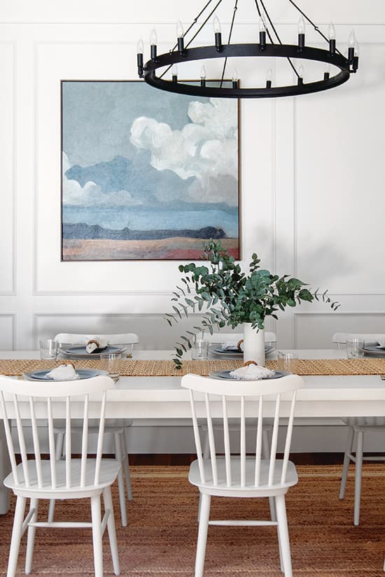
Photography: Janis Nicolay | Styling: Kristine Lee | PENDANT LIGHT, RH. RUG, Rugs USA. TABLESCAPE, The Proper Table. GRASSES, West Elm. Wooden BEADS, Nest & Nook Housewares. EUCALYPTUS, Rook & Rose. ART, McGee & Co.
The dining area’s custom hutch was inspired by one the couple saw while on vacation in Beaune, France; it provides display areas for pretty accessories and stores the family’s china and silverware. To fend off a formal air, Kristine opted for a rustic iron pendant light. The couple purchased the dining table more than 15 years ago and had its original dark shiny finish sprayed White Dove to match the walls and give it a casual air. “I want people to feel calm and relaxed in our home,” says Kristine. “Understated elegance and mixing old with new sums up my style.”

Photography: Janis Nicolay | Styling: Kristine Lee
Living's Easy

Photography: Janis Nicolay | Styling: Kristine Lee | Custom MANTEL, Blenard’s Décor Ltd. Gleaming Primrose MIRROR, Anthropologie. Hallway PENDANT, RH.
The great room’s custom-made limestone mantel feels both grand and welcoming, and is nicely softened by the airy drapes. “I wanted window coverings that were light and not too formal, so went with unlined white Belgian linen that still lets the light in when the drapes are closed,” says Kristine. “They have a relaxed feel and the iron rods match the window hardware and the other aged iron elements in our home.” Tactile finishes and natural colours polish the look. “I love sticking with a very neutral colour palette but adding in warmth and texture with different materials. Creating a calm space is important to me.” The hallway leading to the great room features herringbone floors and custom wall panelling that make the small space feel special.

Photography: Janis Nicolay | Styling: Kristine Lee
Bedroom Bliss

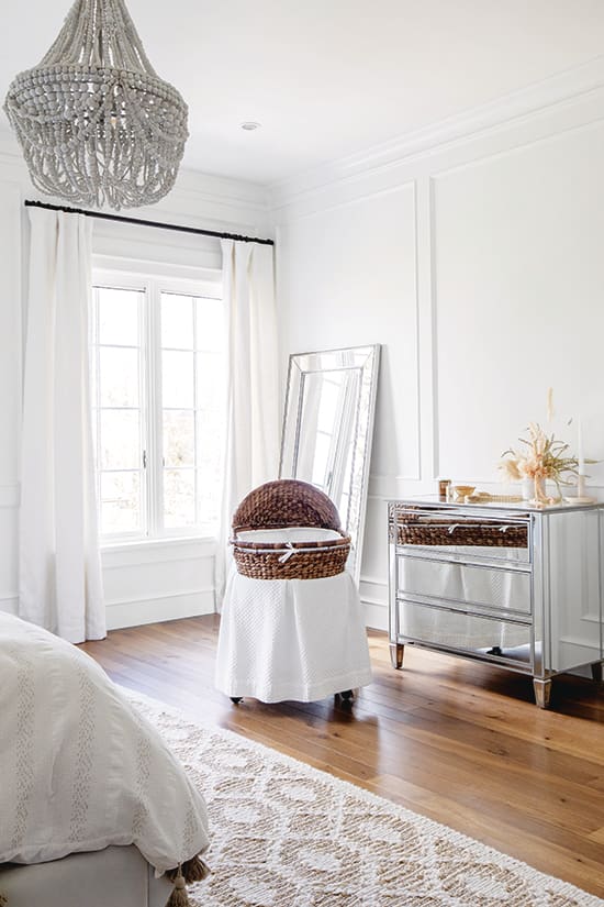
Photography: Janis Nicolay | Styling: Kristine Lee | BED, The Dream, The Cross Decor & Design. Francesca Beaded CHANDELIER, Pottery Barn. JUJU, Etsy. BASSINET, RH. RUG, Dash & Albert.
In the primary bedroom, a dynamic mix of textures plays against the serenity of the pale, light-filled space, while linen drapes with an iron rod continue the fresh and unfussy look of the grand room. The tufted, winged headboard is a dreamy focal point beneath the beaded, jewel-like chandelier and eye-catching Juju headdresses. Georgia’s bassinet is tucked in a corner at the foot of the bed. “We bought the bassinet 10 years ago for our first born, and it keeps getting passed down from baby to baby.”

Photography: Janis Nicolay | Styling: Kristine Lee
Serenity Now

Photography: Janis Nicolay | Styling: Kristine Lee | TUB, Victoria & Albert. FAUCETS, Newport Brass. STOOLS, at vanity, Wayfair; beside bath, Serena & Lily.
Distressed wood vanities temper the primary bathroom’s luxurious herringbone marble floor. “I wanted to add a rustic element here so it wasn’t overly traditional. I like how the dark, rich vanity colour contrasts the cool whites on the floor and walls,” says Kristine. She included a makeup table in the design and opted for three separate mirrors trimmed with wood to match the vanities. Brass shower fixtures exude warmth and an old-world charm that’s echoed by a classic clawfoot tub in bold black.
Nursery Cool

Photography: Janis Nicolay | Styling: Kristine Lee | Kalahari WALLPAPER, LIGHT, MIRROR, CRIB SKIRT, Serena & Lily. DRESSER, RH Kids. ROCKING CHAIR, Pottery Barn Kids. Rattan FOOT STOOLS, IKEA. Mini pebble wool jute RUG, West Elm. Closet storage BASKETS, Pottery Barn. Hanging wall BASKETS, Etsy. Stuffed GIRAFFE, Melissa and Doug.
Baby Georgia’s room is one of Kristine’s favourites in the house. Its elephant-print wallpaper was the inspiration for what she calls the “neutral safari nursery.” The calming colour palette is punctuated by natural accessories. “I love the warmth of wicker and rattan, and knew they’d work perfectly here, so I was so excited to add them every chance I got, from the laundry basket, mirror and light fixture to numerous hanging wall baskets,” says Kristine. Tactile luxuries like the brushed boucle rocking chair, furry throw and plush wool jute rug layer in a warm and cozy feel. Safari-style toys keep the mood playful.


Comments