House Tours
Modern furnishings and a pale purple palette give a home an au courant vibe

Image: Stephani Buchman
House Tours
Modern furnishings and a pale purple palette give a home an au courant vibe
Here’s how Toronto designer Shirley Meisels skirts tradition when creating a timeless look.
“Traditional” doesn’t have to mean safe. In Shirley Meisels’s world, subtly feisty flashes of colour and offbeat furnishings tie traditional rooms together. “My style is firmly modern with an eclectic twist,” says Shirley, the seasoned designer behind Toronto’s MHouse. “I tend to use black and white as neutrals, and then I add pops of colour.” Shirley brought that signature sass to a client’s 2,000-square-foot house in Toronto’s Allenby neighbourhood. The 1940s abode was not only dated (think dowdy taupe rooms), but strangely enough, there was a barrier plunked in the middle of the house: “The staircase to the basement was right in the centre of the kitchen, rendering the space useless,” says Shirley. So the stairs were moved out of the kitchen, the electrical was updated and worn walnut-stained floors were replaced with stunning white oak. Modern furnishings, white paint and an inviting palette of mauve, pale blue and white finished the look. “It now feels light and fresh, and there’s improved flow,” says Shirley. Here’s what lends this timeless look an au courant vibe that flirts with tradition.

For a unified bookended effect, a cascade of chic blush-toned drapery in the dining room at the rear of the house mirrors a similar set hanging in the living room at the front.

The entryway seems tight, but it’s filled with a trio of funky flourishes: a quirky mirror with a smoky band at the bottom, a glamorous stool to perch on when removing shoes and a sculptural piece for tossing coats onto. “There simply wasn’t room for the usual console here,” says designer Shirley Meisels, “but this works perfectly.”

In the long and narrow living room, Shirley created distinct seating zones, using muted base fabrics and added pattern for a little punch. As in the rest of the house, the architectural features are traditional, but the furniture has clean, modern lines that keep the space from feeling too serious.

With its grey-veined marble composite and clean-lined appeal, the kitchen is a sharp showstopper. It’s hard to believe a staircase once ran into the basement from where the new island is situated.

“When it came to redesigning the master bedroom, there was a change in plans: As we opened it up to do some HVAC work, we realized there was a cavity in the attic,” says Shirley of how the room came to sport its dramatic cathedral ceiling. The pink wool rug is a fun, atypical accent that plays off the drapery but doesn’t overwhelm the space.

A makeup station that’s separate from the sink area is a luxury for a lady who likes to primp.

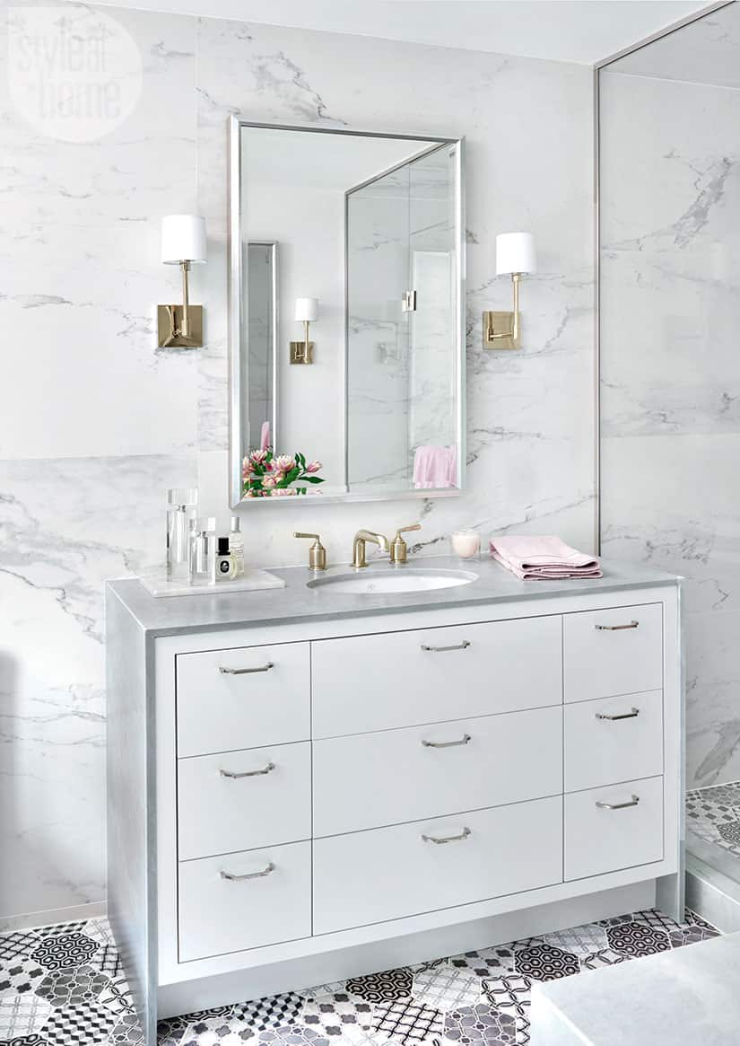
The porcelain wall and floor tiles in the master ensuite have a tasteful Old World feel that’s elevated by the mix of tiles and materials. “We fell in love with the floor tile!” says Shirley. “It’s a beautiful hexagon that has a raised detail. The random mix of patterns in the same colourway creates a patchwork-like texture.”


Comments