House Tours
Nature Nurtures

Photography: Drew Hadley | Styling: Julie Deslauriers
House Tours
Nature Nurtures
An interior courtyard garden, two rooftop terraces and walls of glass connect this custom home to the great outdoors.
Manon and Gaétan Bélanger love city life. But with their adult daughters, Gabrielle and Charlotte, out of the nest, their 3,500-square-foot custom home in Montreal’s popular Mont-Royal plateau area had outgrown them. “It had become too big,” says Manon, an interior designer. So they found a vacant but tiny 25-by-65-foot lot in Rosemont – the plateau’s next-door neighbour – and started from scratch, again. They called in Henri Cleinge, architect of the couple’s former house, to design the new home’s shell, and Manon created the interior. To take full advantage of the small lot, they opted for a three-storey duplex, selling off the main-floor unit and leaving them with a more manageable 2,200-square-foot apartment. “Here, unlike our previous home, we decided to occupy the second and third floors, so that we have more light in height,” says Manon.
That flood of light is in large part due to a standout feature of this modern space – a courtyard garden at the heart of Manon and Gaétan’s main living area. “We wanted to have a central garden,” says Manon, who loves seeing the seasons change in this open-air room. “As soon as you reach the top of the stairs [that lead to the apartment from the street level], it’s a wow effect.” It connects them – as do the two decks off the third floor – to the city they love. “Neighborhood life in the city really appeals to us and we are also lucky to have big trees in our street, to be near shops and parks,” she says. City life plus a connection to nature – for Manon and Gaétan, that’s the best of both worlds.
Green Scene

Photography: Drew Hadley | Styling: Julie Deslauriers | INTERIOR DESIGN, Manon Bélanger. ARCHITECT, Henri Cleinge. Wood and metal SHELF DESIGN, Sarah Eve Hébert. SHELF CONSTRUCTION, Atelier 13. Bronze SCULPTURE, Denise Larochelle. PLANTS, Atwater Market.
Adding practicality and making a strong aesthetic statement, the natural wood and white-painted bookcases serve as both banister and display space. “These are beautiful elements that energize the space and can be used to display plants, books or decorative objects,” says interior designer and homeowner Manon Bélanger.
Setting the Mood

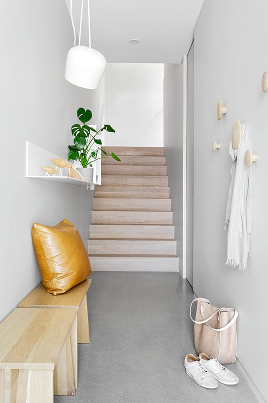
Photography: Drew Hadley | Styling: Julie Deslauriers | Painted steel SHELF DESIGN, Sarah Eve Hébert. DECORATIVE BIRDS, Jamais Assez. BENCHES, Coop Établi. PENDANT and leather CUSHION, HOOKS, through Manon Bélanger. WALL PAINT, Balboa OC-27, Benjamin Moore. BAG and SCARF, Anthropologie.
Manon wanted visitors to feel the spirit of the house at first glance, and her choice of colours and materials for the first-floor entry – white oak staircase, heated polished concrete floors and pale walls – reflects that. “Everything is painted in light greige,” she says. “I hesitated at first because I like all white, but this shade is really interesting because it is enveloping and warm.” Organically shaped hooks, natural wood benches and a modern steel shelf make the space work.
Down to Earth

Photography: Drew Hadley | Styling: Julie Deslauriers | SOFA, Latitude Nord. CARPET, THROW, EQ3. COFFEE TABLE DESIGN, Sarah Eve Hébert. END TABLES, Maison Corbeil and Jamais Assez. CUSHIONS, Vibia LAMP, through Manon Bélanger. ARTWORK, Dimension Plus. WALL SHELF, MINI-HAY CHAIR, Jamais Assez. VASES, Crate and Barrel. GREENERY, Abaca.
Manon kept the sofa, armchair, table and artwork from her old duplex, but switched to new cushion covers, rug and floor lamp to incorporate nature-inspired earth tones and a touch of black steel.
Holding Court

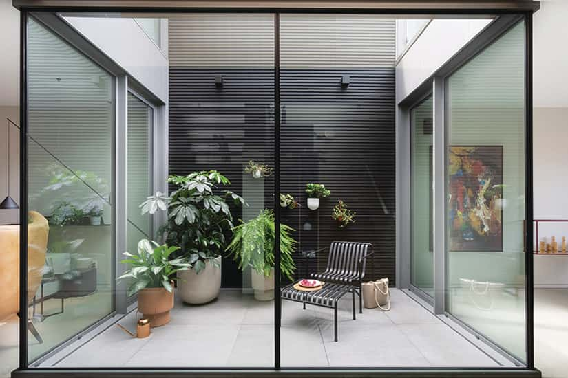
Photography: Drew Hadley | Styling: Julie Deslauriers | METAL CHAIR AND OTTOMAN, Jamais Assez. PLANTS AND PLANTERS, West Elm. Copper WATERING CAN, EQ3.
The courtyard space brings a view of the outdoors to the interior of the duplex. “It’s an amazing place because it’s open to the sky,” says Manon. “If it rains, we see the rain falling. In winter, it is full of snow, so I put a tree in it with lights. In spring and summer, I put plants there.” She and Gaétan created the modern black-slat wall from 90 pieces of wood that were cut, sanded and tinted on three sides, then assembled into four-by-11-foot panels. The wall brings texture to the space, and echoes the black framing of the windows. The horizontal slats let Manon hang even more plants. “Every time you go down the hall you walk past the glass room and it’s very calming,” she says.
Material Matters

Photography: Drew Hadley | Styling: Julie Deslauriers | KITCHEN DESIGN, Manon Bélanger. CABINET CONSTRUCTION, Atelier 13. COUNTERTOPS and BACKSPLASH, Moruzzi. Pol- ished concrete FLOOR, AtelierB. SINK and FAUCET, Ramacieri Soligo. APPLIANCES, Signature Bachand, FRAME (on wall), Dimension Plus. BARSTOOLS, BOTTLES of oil, CONTAINER, WHISK and TEAPOT, Jamais Assez. VASE and FLOWERS, Abaca.
Manon designed the kitchen to be sleek, with discreet but abundant storage. Below-counter storage in the island and along the wall keeps the feeling airy and open, like the rest of the home. The polished concrete floors and marble backsplash and countertop complement the dark island. “The whole island is made of Fénix, a super resistant and matte material,” says Manon. “I chose dark brown for the island and a beige lacquer for the cabinets to create some warmth.”
Dining In

Photography: Drew Hadley | Styling: Julie Deslauriers | TABLE, Cab Déco. CHAIRS, WOOD CANDLESTICKS, Jamais Assez. Vibia PENDANT LIGHT DESIGN, Manon Bélanger. ARTWORK, Dimension Plus. CROCKERY, GLASSES, CARAFE, EQ3.
Manon’s existing dining room furniture fit right in to the new space. “I just changed the upholstery of the pink chairs to a terracotta tone, but kept the yellow, black and beige chairs,” she says. “What I like about this room is that with the big window, it feels like you’re in a restaurant.” She opted for a custom chandelier with a half-globe at the centre that’s designed to hold a plant. “The little black spotlight illuminates the greenery,” says the designer. The different shades of the chairs echo the colours in the painting, as does the burgundy steel of the wall-mounted shelf, which was designed to delineate the dining room area.
Light & Bright

Photography: Drew Hadley | Styling: Julie Deslauriers | BED, Bonaldo. BEDDING, THROW, Maison Corbeil. BEDSIDE TABLE, DECORATIVE BIRDS, Jamais Assez. WALL LIGHTS, Homier Lighting. SHELF DESIGN, Manon Bélanger. Custom CURTAINS, Solis Store. GREENERY, Abaca.
The primary bedroom (one of the home’s three bedrooms) is the only
one on the third floor. Manon brought in steel here, too, in the angular bed frame and shelving unit. Coating them in white created a lighter, softer finish than the grey or coloured steel used elsewhere, and suits the airy light tones that dominate the space. The drapery filters the abundant natural light provided by the huge glass doors that lead to the front terrace.
Serene Suite

Photography: Drew Hadley | Styling: Julie Deslauriers | VANITY UNIT DESIGN, Manon Bélanger. VANITY CONSTRUCTION, Oval. MIRRORS, Atelier 13. FAUCETS, BASIN, BENCH, Batimat. Blu BATHTUB, Parva Fabrica. SOAP, Ramacieri Soligo. TILES, Stone Tile. Vibia PENDANT LAMP, through Manon Bélanger. FLOWERS, Abaca.
A serene atmosphere permeates the ensuite. Matte ceramic floor tiles coordinate with the wall tiles, but Manon alternated matte and glossy finishes on the latter, which creates interesting variation in the reflection of light. “Everything is tone on tone, but I played with the textures,” she says. “The vanity doors have rounded reliefs. Only the taps and the pendant contrast.” They opted for a single-sink, which left plenty of countertop to act as a hair and makeup vanity for Manon. “It also creates a very designer-like asymmetry,” she says.
Time-Out Terrace

Photography: Drew Hadley | Styling: Julie Deslauriers | RUGS, Canadian Tire. ARMCHAIRS, NESTING TABLES, Jardin de Ville. POUF, Crate and Barrel. WICKER BASKET DESIGN, Manon Bélanger.
Restrictions on the size of the third floor interior led to a creative solution. “The idea [was to] extend [the third-floor living space] with terraces,” says Manon. From the primary bedroom, glass doors lead to the back deck, which is a haven of peaceful serenity. In warm weather, inviting armchairs, a patterned rug and a palm tree offer a quiet corner to enjoy treetop views of the back alley and neighbouring rooftops. The steel cladding on the parapet is a cool tone that complements the warm-tone cedar decking.
Taking the Waters

Photography: Drew Hadley | Styling: Julie Deslauriers
The front terrace on the street side of the house is accessible from inside via the white oak walkway suspended above the second-floor landing. “It’s nice because guests can go to this second terrace without disturbing us, so we all have our privacy,” says Manon. “A Nordic spa is installed there, the mechanics of which are integrated into the cedar-covered podium. It’s important to plan this type of installation prior to construction because it requires reinforcing the floor,” advises Manon. Deck chairs complete this quiet corner – an oasis in the heart of Montreal.


Comments