House Tours
Pretty Modern

Photography: Tracey Ayton
House Tours
Pretty Modern
Designer Kelley McNamara is a master mixer of delicate details and smart, sophisticated design in this serene Fort Langley, B.C., home.
Warm Welcome

Photography: Tracey Ayton | CONSOLE TABLE, Wayfair; SCONCE, Joss & Main; GOLD VASE, Niche Boutique Florals; GOLD OBJET, WHITE VASES, The Cross; WALL COLOUR, Classic Gray OC-23, Benjamin Moore.
In decorating this five-bedroom home, designer Kelley McNamara’s goal was to bring warmth and livability to the modern farmhouse-style architecture. “We wanted things to feel soft and pretty,” she says of the home she designed for Sara and Dave Robles, who have a two-year-old daughter, Caymbria, two French bulldogs and a new baby on the way. Here in the front entry, lighthearted accents like a delicate neoclassical wreath, sculptural vases and a loose, casual arrangement of blooms instill a playful, timeless mood.
Bright Idea

Photography: Tracey Ayton | CABINETS, Attractive Kitchen Cabinetry; COUNTERTOPS, Stone Express; CABINET HARDWARE, Richelieu; BACKSPLASH TILES, Creekside Tile; QUATREFOIL CHANDELIER (in background room), Shades of Light; PINK GLASSES, PALE BLUE BOWLS, The Cross; VASE, FLORAL ARRANGEMENT, Niche Boutique Florals; WOOD CUTTING BOARD, Indigo.
In the low-key, light-filled kitchen and adjoining pantry (background), adornment is kept to a minimum to put the emphasis on food, family and friends. A Bianca Carrara marble backsplash, white oak flooring, quartz countertops and simple wood and glass serving pieces add subtle interest against the crisp white walls and Shaker cabinets.
On Repeat

Photography: Tracey Ayton
Groupings of matching glasses and bowls in delicate ice-cream hues bring a hint of colour to the white kitchen. “It’s fun to bring in pinks and yellows to make the room feel cheerful, and to offset the usually dreary winters we have here in B.C.,” Kelley says. “Sara loves fashion, so we tried to carry her elegant, feminine style throughout the home. And they love to entertain, so we needed beautiful serving dishes.”

Photography: Tracey Ayton
Group Therapy

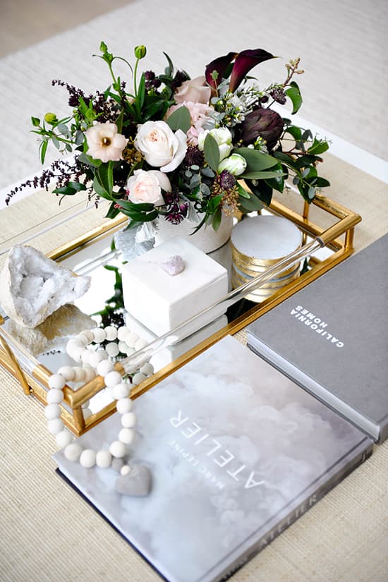
Photography: Tracey Ayton | TRAY, BEADED ACCESSORY, The Cross; FLORAL ARRANGEMENT, Niche Boutique Florals.
When the decor is this spare and minimal, filling surfaces like the coffee table and built-in cabinets with inviting collections and fresh blooms goes a long way toward warming up the look. For added detail, Kelley selected a coffee table by Serena & Lily that’s outfitted with charming Deco-style brass accents and finished in delicate woven raffia on its top and shelf. “Texture makes every space more interesting,” she says.
Open Minded

Photography: Tracey Ayton | FIREPLACE, Fireplaces Unlimited; CABINETS, Attractive Kitchen Cabinets; CHANDELIER, Restoration Hardware; MIRRORS, Rejuvenation; COFFEE TABLE, Serena & Lily; SHEEPSKIN (in front of fireplace), TRAY, BEADED ACCESSORY, The Cross; FLORAL ARRANGEMENT, Niche Boutique Florals.
With its serene palette and judicious vignettes, the living room embodies the home’s design ethos. “To create the clean, fresh, modern look that Dave and Sara wanted, I brought in layers of neutrals and textures with hints of femininity,” Kelley says. The furnishings play a key role in making the lofty room really sing. Wide custom cabinets flanking the fireplace and a low-slung sofa balance the vaulted ceiling and sky-high chimney breast. Towering mirrors break up the expansive wall, and the accessories alongside are boldly sized but suitably serene. “The chandelier had to be large and warm, but open enough not to obstruct sight lines from the second-floor catwalk that overlooks the living room,” Kelley adds.
Light & Airy

Photography: Tracey Ayton | SOFA, Stylus; OTTOMAN, HomeSense; WOVEN BAG, Serena & Lily; BLINDS, Beautiful Window Treatments; GOLD SCULPTURE, Indigo; PINK VESSELS, The Cross.
A minimalist furniture arrangement shouldn’t mean a space is unfriendly – so the huge living room sofa is pillowy perfection with its overstuffed cushions. A circular metal detail on the coffee table plays on the sculpture beside the fireplace. The sweet little boho footstool does double duty as a plaything for Caymbria and a perch for tired feet. The cabinets flanking the fireplace are panelled in perforated grilles for a light-as-air look. “The wire mesh was a perfect solution for adding a little femininity,” Kelley says.
Curves Ahead

Photography: Tracey Ayton
Circular pieces like these ethereal etched-glass and glazed-ceramic vessels and stately gilded rings sculpture help balance the living room’s right angles and expansive size. “Sara requested the pale pink to soften the space,” Kelley says. “The gold sculpture ties the aged brass light fixture above it with the gold booties on the coffee table,” Kelley says.

Photography: Tracey Ayton
Build Drama

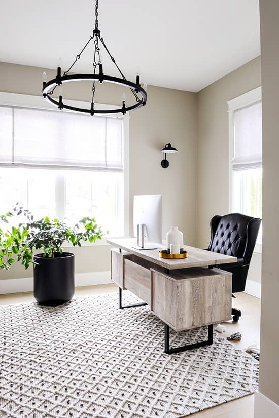
Photography: Tracey Ayton | DESK, Muse & Merchant; CHANDELIER, Joss & Main; CHAIR, Wayfair; PLANT, POT, Niche Boutique Florals; RUGS, Rugs USA; WALL SCONCE, Barn Light Electric; TRAY, (on desk), VESSELS (on desk), The Cross; WALL COLOUR, Revere Pewter HC-172, Benjamin Moore; DOORS, Richmond Building Supplies; Halifax HANDLES, Weiser; CHAIR, SIDE TABLE, Muse & Merchant; OBJET (on side table), Arteriors.
Unexpected details like the dynamic texture of the rug and the deconstructed design of the desk give Dave’s sunny, south-facing home office a surprisingly stylish look. Even here, Kelley chose the accessories with care. “I love the size and simplicity of the chandelier, and the interest of its attachment pieces,” she says. “With the rug, we were going for an organic and modern look. And we were so happy with how the muted wood tones of the desk add warmth to the space.”
Pattern Play

Photography: Tracey Ayton
In pale, neutral spaces like these, artful trim can add a level of finesse that makes a space feel polished. Kelley finished a feature wall in Dave’s main-floor home office with narrow mouldings set in a diamond pattern “for a more masculine design,” then echoed that on the barn doors leading into the room. “I often do this when adding barn doors; I’ll select a door style that’s consistent with the rest of the home, then create a unique pattern or inserts to make it one of a kind,” she says.
Repeat Performance

Photography: Tracey Ayton | WALLPAPER, SCONCE, Serena & Lily; VANITY, Global Views; MIRROR, TOWEL RING, Rejuvenation; WASTE BASKET, The Cross; FLOORING, Pravada; FLOWERS, Niche Boutique Florals; VASE, The Cross; Purist TAPS, FAUCET by Kohler, Emco.
“The monochromatic wallpaper is the perfect combination of feminine and bold,” Kelley says of the print she used in the powder room. The owners entertain, so Kelley opted for an eye-catching vanity with an open base to let the wallpaper take centre stage. A round mirror and towel ring are pleasing counterpoints to the room’s right angles. “I love using unexpected shapes to add visual interest,” Kelley adds.
Mixed Messages
While many spaces in the house feature cool-toned silver hardware, Kelley used judicious pops of aged-brass accents like the sconce, taps, faucet and mirror in the powder room to liven up the look. “The Carrara marble countertop is a great balance to the grey and white wallpaper, and the gold accessories bring warmth,” she says.
Flower Power

Photography: Tracey Ayton | FLOWERS, Niche Boutique Florals; VASE, The Cross.
Accessories like this vase with a geometric relief pattern add interest to the space while adhering to the tranquil palette. Similarly, Kelley loves the Carrara marble countertop because it introduces movement but still feels demure. “The anemone arrangement is by Sara’s cousin, Maria Schollen – she does the most beautiful arrangements,” Kelley says.


Comments