House Tours
Textures and fun extras give a home a family-friendly feel

Image: Janis Nicolay
House Tours
Textures and fun extras give a home a family-friendly feel
How global accents made this home the best destination in the world for its owners.
Fringes and tufts, tassels and puffs – all in a pretty palette – are everywhere in this North Vancouver house, and for the young family that lives here, the look is meant to say, “Welcome. This is a drop-by, plop-down, hang-out home,” says designer Joanna Vagelatos of the 4,000-square-foot abode.
“Whether it’s a bunch of kids or a group of adults, there are always lots of people here.” It’s one reason decorating with shaggy toss cushions, woven throws and jute rugs made sense. “All that texture really absorbs the kid impact,” says the designer. “Smudges, spills and dents blend in. On smooth surfaces, that wouldn’t be the case.”
Of course, the biggest advantage of all this texture is that it looks so inviting. What kid wouldn’t want to flop face down onto a fuzzy bed cover? What adult doesn’t want to be surrounded by plump toss cushions while sipping wine on the sofa? And who wouldn’t want to hang out in a kitchen where spices and dry goods from around the world are on display?
Joanna took her design cues from the family of four, which includes two kids, ages four and six. “The mom has edge, and she does things her own unique way,” says the designer, noting that the family are avid travellers. “So I didn’t want to deliver a typical four-bedroom suburban home.”
To achieve this interest and a sense of coziness, Joanna looked beyond Canada’s borders. Global accents became the theme. Some of the objects allude to trips the family has taken together; others simply impart a sense of being on vacation...all year long.
The house has a quiet palette to balance the animated energy of young family life. When colour appears, it does so in careful pops against neutral backgrounds, in bold stripes on woven toss cushions and in saturated artwork, such as the destination prints that seem like windows looking out to beach and desert.
“I decorate by impulse and intuition,” says Joanna. “For me, making decisions quickly often leads to great results.” One of those great results was the kitchen. At first, the plan was to use Shaker-style cabinetry in grey – a traditional choice that suits many aesthetics. But why? thought Joanna. After all, the house was filled with unexpected elements and natural materials, such as wool, fur and silk, so why not go for a kitchen with the same appeal?
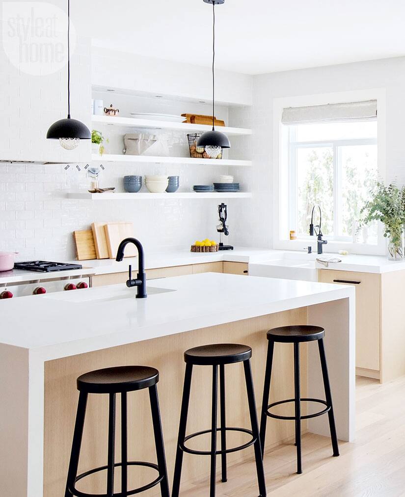
That’s how sleek pale oak cabinetry entered the picture and the range hood was atypically covered with the subway-tiled backsplash. The look is minimalist, utilitarian and modern – reminiscent of a sleek Nordic café, with light wood, clean lines and grounding black accents.

One of the homeowners of this North Vancouver abode loves to cook, so where better to indulge that hobby than in an airy clean-lined kitchen like this one? Basics prevail, but big-deal details, such as the sleek white oak cabinetry and subway-tile-clad range hood, add drama. Open shelving offers easy access to tableware, ensuring the heart of the home remains guest- and family-friendly.

Bowls, plates, cutting boards, baskets, spices and a lemon squeezer: Behold the tools of this family’s everyday culinary efforts. The items make a modern and stylish display thanks to an emphasis on muted colours and natural materials.

This is an easygoing household designed for hanging out anywhere. The eat-in area is where friends share coffee and kids do crafts – so the window seat is covered with plush toss cushions for comfort and features ample storage underneath to hide toys and supplies.


The living room is a globetrotter’s paradise, where a world of texture – from the fringed throws and beaded toss cushions to the tufted slipper chair and nubbly jute rug – invites comfort. The fireplace, which has a floor-to-ceiling surround of large rectangular marble tiles, is a cool counterpoint to the room’s cozy elements and echoes the Euro-chic look of the leather and chrome sidechairs.

Oversized wooden knobs serve as hooks for rain jackets and backpacks, while the small bench makes pulling shoes and boots off (and on) easy. The cowhide throw ensures even the most utilitarian of spaces retains a sense of luxury.

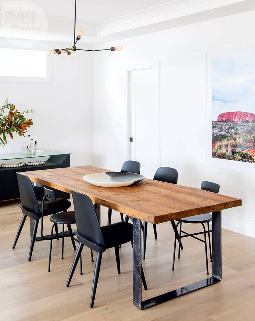
A live-edge wood table brings the forest into the dining room. The mismatched modern chairs keep the look eclectic and unfussy, while the desert print’s saturated colours catch the eye, the frame almost acting as a window to another land.

With its clean industrial lines, natural materials and global accents – the distressed leather pouffe looks like it has been plucked from a Moroccan souk, while the Mid-Century-style chair is a classic – the office’s unique mix is pared back and appealing.

The family room, which is open to the kitchen, boasts a mostly global appeal, while its cast-concrete fireplace has an earthy texture that suggests more modern urban architecture. Floor coverings, layered on top of each other, are reminiscent of a rug bazaar, and black, white and grey tribal-patterned toss cushions amplify the worldly feel. On the wall, a beach print featuring seaweed on the shore sets a relaxed tone for the room.

Okay, it’s no yurt, but with its vaulted ceiling, white walls and fur coverlet, the master bedroom calls Mongolia – not Vancouver – to mind. A handwoven bolster cushion in sunset hues adds eye-catching vibrancy that complements the pale rug, which has subtle yet colourful confetti knots.

In the master bath, modern lighting and veined marble tiles were selected for their simplicity. Meanwhile, a dark towel, luxurious to the touch and flirty with fringes, hangs from dark hardware, something designer Joanna Vagelatos used throughout the four- bedroom house.
If peeking into this unique home has you inspired, there are lots of ways to welcome the world into your own space. Fill your rooms with souvenirs from your travels. Seek out handmade housewares from other countries in your own city. And take design cues from other cultures, adding in shiny medallions, fuzzy fringes, woven pieces and tassels where they’re least expected. Hey, for most of us, home is our world! Why not decorate that way?


Comments