House Tours
This Schoolhouse Rocks

Photography: Patrick Biller
House Tours
This Schoolhouse Rocks
Trying to crack the modern country code? Designer Kahley DeVries reveals how she gave a 19th-century converted Ontario schoolhouse a 21st-century update that’s both transitional and timeless.
Colour Coded

Photography: Patrick Biller | DESIGN, Kahley DeVries, Ambiance Interiors. CONTRACTOR, Ian Fritz, Essex Renovations. Cus- tom CABINETRY, Heirlooms Custom Cabinetry. DRAPERY, Tonic Living. PENDANT LIGHT, LD Shoppe. ART, Jillian’s. BENCH, Aeonic Kitchens. SCONCES, Ambiance Interiors. RUG, BASKETS, Wills & Prior. BLIND, CUSHIONS, Tonic Living.
“A contemporary black and white backdrop needs to be softened with accents in warmer tones, such as cognac, oatmeal, taupe and brown. I chose a mix of brass finishes in the light fixtures and hooks to further the warm effect. Also, pick white paints with yellow – not blue – undertones. This one is Dove White by Benjamin Moore.”
Animal House

Photography: Patrick Biller
“I just love this sweet sheep artwork! The homeowner has a passion for animal photography so I knew it would be perfect for her, and personalized art is so important in any home. Animal art specifically, whether a painting or photography, is ideal for a modern country aesthetic – it’s a cool way to bring the outdoors in.”
Rough Stuff

Photography: Patrick Biller
“The rustic, vintage-look black bench was actually custom-made for the mudroom. Paired with cleaner finishes, like the painted white surfaces and crisp banquette upholstery, it brings balance to the space. Always incorporate a vintage item or at least one that appears old. Without this bench, the mudroom would have felt a pinch too perfect.”
Hey, Jute

Photography: Patrick Biller
“It’s important to layer in softness in a primarily ‘hard’ space like a country mudroom. I love adding a jute rug because jute hides everything and, again, has a natural, organic element that references the outdoors. Sisal works well, too, and you could opt for a large doormat instead of a runner.”
Country Storage

Photography: Patrick Biller
“Baskets not only introduce more interesting textures, they’re a great place to stash scarves, hats or other small accessories for creative mudroom storage. Make sure to stick to natural materials – I gravitate to wicker, rattan and worn leather, all in organic earthy hues – and look for tighter weaves that help hold and conceal contents.”
Material World

Photography: Patrick Biller | SOFA, OTTOMAN, Gresham House. ART, Minted. LAMP, Jillian’s. RUG, Ambiance Interiors.
“Balance streamlined furnishings with country-appropriate materials. The den’s sofa has square and modern lines but they’re tempered by the warm cognac leather, which will wear gorgeously and get a patina over time. The patterned cushions also move away from an ultra-modern aesthetic with their warm, country feel.”
Bargain Hunter

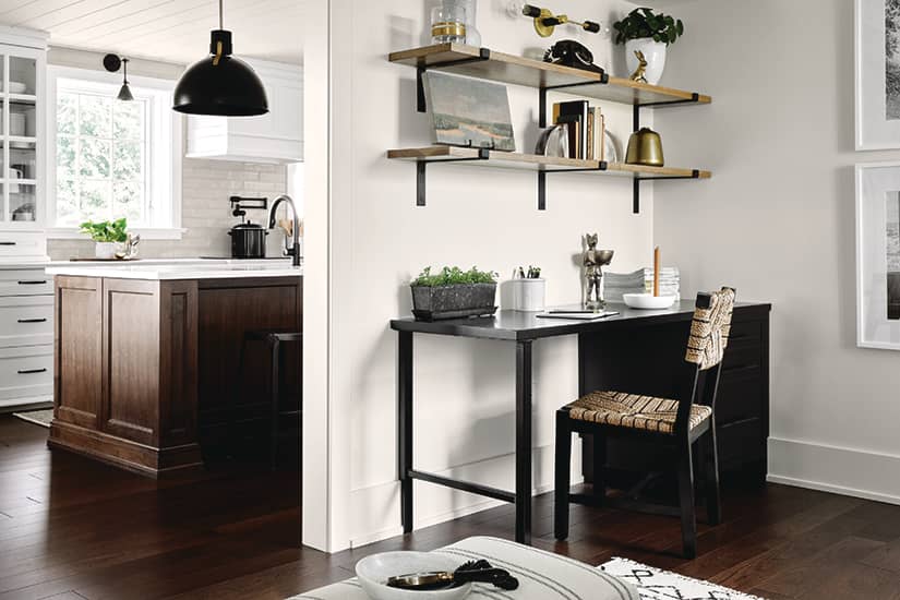
Photography: Patrick Biller | SCONCE (above shelves), LD Shoppe.
“Hunt for vintage accessories like books (preferably imperfect ones) at thrift shops and garage sales. I used old books, plants, an antique telephone, vases and small landscape art to give the den’s office shelves a rural feel.”
Easy Elegance

Photography: Patrick Biller | SOFA, linen CHAIRS, Gresham House. Leather CHAIRS, Accents for Living. Firewood HOLDER, RUG, Ambiance Interiors.
“Country living should still be stylish. Symmetrical furniture placement feels organized, and I like to lighten its perfect lines with a welcoming mix of materials, like the living room’s linen sofa and cushions, and leather chairs and ottoman. And never skip an area rug! It’s soft, warm and grounds the space to show that each item was chosen to be placed here for a reason.”
Double Duty

Photography: Patrick Biller
“The custom-designed wood rack is form and function at its finest. It continues the home’s black accents and looks like a piece of art, while providing practical, easy-access storage. Wood is in sync with a country vibe and shouldn’t be hidden or relegated solely to the outside.”
History Lesson

Photography: Patrick Biller
“In the kitchen, I wanted to reference the home’s history with something classic and timeless. I designed a traditional farmhouse table and mixed it with Shaker-style chairs crafted by local Mennonite furniture makers. The Shaker chair was found in almost every 19th-rural home. My spin just involved a lick of black paint!”

Photography: Patrick Biller | TABLE, Heirlooms Custom Cabinetry. CHAIRS, David Harms Chairs. BENCH, Urban Barn. Woven LIGHT FIXTURE, Turquoise Palace. SIDEBOARD, Accents for Living. MIRROR, Renwil. ISLAND PENDANTS, JD Lighting. SCONCES, Lucent Lightshop.
Black Magic

Photography: Patrick Biller
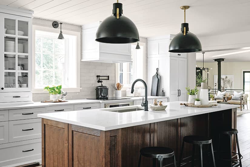
“While the modern country aesthetic doesn’t have to encompass black necessarily, black does work well in all design. Here it channels the desired contemporary edge without feeling cold or overpowering. Using it as an accent is key.”
Warm Ingredients

Photography: Patrick Biller
“Displaying smaller, natural wood items is one of my best tips for styling a black and white scheme. And there are so many interesting accessories in these tones, so don’t be afraid to layer them in, whether with cutting boards, wooden spoons, soap brushes or wooden beads.”
Signature Sink

Photography: Patrick Biller | PENDANT LIGHT, West Elm. SCONCE, Lucent Lightshop. Black and white ART, Great Big Canvas. RUG, VASES, Wills & Prior.
“Every modern country house needs an apron sink! They are designed to slightly extend beyond the counter so any water drips on to the floor instead of the cabinets below. They’re gorgeously sculptural, and this one is made of clay for a natural, artisanal quality.”
Gold Standard

Photography: Patrick Biller
“Don’t be afraid to use – and mix – gold finishes in the country! The laundry room cabinetry pulls are soft-brushed brass, the faucet is almost rose-gold and the light fixtures are yellowy brushed gold. Throw caution to the wind and you’ll see how it all comes together when you mix it up a little.”
Fine Finish

Photography: Patrick Biller
“I love Roman blinds in a country home, especially plaid or checked ones that feel really casual. In the laundry room, the blind is a nice, low-lustre contrast to the wall’s glossy subway tiles.”


Comments