House Tours
This Toronto Home Is A Modern Take On Traditional English Style

Photography, Patrick Biller.
House Tours
This Toronto Home Is A Modern Take On Traditional English Style
With its cozy, colourful and carefully considered spaces, this Toronto home takes traditional English style into the 21st century.
Step inside this newly renovated Toronto home and you might feel you’ve travelled back in time 100 years—and across the pond, to boot.

Photography, Patrick Biller. Visual Comfort lantern-style SCONCE, Union Lighting.
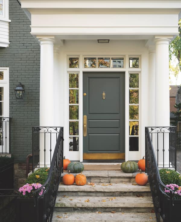
While the exterior already had handsome traditional features, Kate and her clients decided that painting the brick facade a grey green would unify elements and foreshadow the rich new palettes inside.
The home exudes a quiet charm more often found in old English country houses. “It’s the definition of ‘grandmillennial,’” says designer Kate Stuart of TOM Interior Design Studio. “The owners are a fun young couple with two small kids. Both have European roots, which gave them a love of traditional design and spaces that feel collected.” He loves to bake and make pasta, so a big kitchen was a must. “And she loves English design – rooms full of stuff, nooks and crannies, and mixes of colours and patterns, so that became a road map for our choices,” says Kate. However, while lavishing the home with new finishes and furniture, Kate was careful to pull back on pattern here or add a clean-lined piece there. And today, the interiors are a lesson in balance. Says Kate, “The story this house tells is that you can absolutely have traditional tastes and still have a home that feels youthful and energetic.”

Photography, Patrick Biller. DESIGN, Kate Stuart, TOM Interior Design Studio. CHAIR, Savoia Chair Frames. Lee Jofa CHAIR FABRIC, Kravet. FLOORING, Creekside Tile.
To introduce the home’s new history-steeped aesthetic, designer Kate Stuart wrapped the entryway in moody hues, including an autumnal-toned botanical wall- paper, a ceiling painted in a saturated blue green and rugged terrazzo flooring evocative of a stone country home. “We instantly knew this was our wall- paper when we found it – it had all the energy and drama we wanted, and all the colours we’d used throughout the house,” Kate says. The Chippendale-style bamboo chair, antique trumeau mirror and marble-topped demilune table bring elegance and pedigree but will also stand up to traffic in the busy household.

Photography, Patrick Biller. CHAIRS, Savoia Chair Frames. CABINETRY DESIGN, Kate Stuart, TOM Interior Design Studio. CABINETRY, Lavish Kitchens. Sub-Zero WINE FRIDGE, Tasco Appliances. Classic Brass HARDWARE, ADH Fine Hardware.
Face-framed cabinets with exposed hinges evoke an age-old look in the kitchen. Kate designed a long wall with cabinets, incorporating a wine fridge, panelled-in fridge and more. An oak breakfast table custom-made in England was paired with bentwood chairs finished in a rosy tone pulled from the drapes for a punch of colour. Says Kate, “We chose a deep coral, not like a fire-engine red, which might have looked Christmasy.” Leatherette seats wipe down nicely after meals with youngsters.

Photography, Patrick Biller. COUNTERS, Caesarstone. TILE, Creek- side Tile. Visual Comfort PENDANTS, Union Lighting. Kohler FAUCET, Taps.
Kate’s redesign for the house saw the kitchen opened up to the dining and family rooms. “So we needed the kitchen to be able to ‘hang out with’ the dining room,” Kate explains. “And one homeowner wanted a big working island where he could be cooking,” she adds. The cabinets’ moody green colour anchors the space. Its expanse is broken up by warm unlacquered brass hardware, Caesarstone counters, and crisp subway tile in the window nook. Low-key, clean-lined elements like the pulls, pendants, counters and tile also push the look in a contemporary direction, making it fresher and more youthful.

Photography, Patrick Biller.
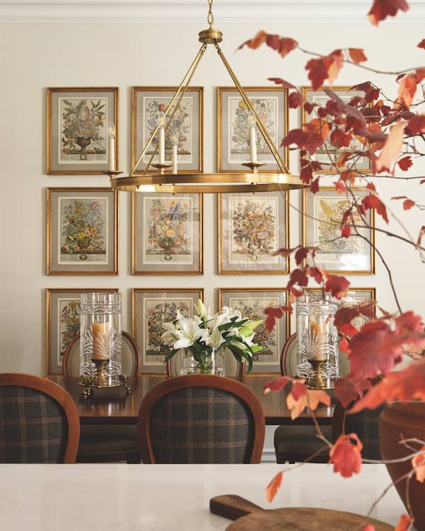
“The owner wanted the dining room to feel finished and refined but not fussy,” Kate says. Unpretentious elements like the trestle table and ring chandelier – with their almost medieval simplicity – tone down any formality. Kate saved a pretty wool plaid that the owner loved for the chair backs, where it fields less wear and tear. The framed botanicals – one for each month – were a lucky find at a vintage shop. “It’s a complete set, nicely framed and reasonably priced,” Kate recalls. “It can be tricky to dress a large wall.”

Photography, Patrick Biller. CHAIRS, Savoia Chair Frames. CHAIR BACK FABRIC, Kravet. CHANDELIER, Union Lighting. BOTANICALS, A Changing Nest.

Photography, Patrick Biller.
The opened-up family room was designed around the enchanting drapery fabric by Lewis & Wood. “She loved it, so it became our touchstone for this space,” Kate says. To give the room architectural distinction, Kate added a fireplace flanked by trim built-ins. The pastoral painting over the fireplace is by a favourite artist of the owner. “She found this artist in the U.K., and her husband had the piece commissioned as a birthday gift,” Kate says. New four-inch quartersawn oak flooring was installed throughout, then sanded and finished on-site.


Comments