House Tours
Toasty tones and textural treatments create a warm, elevated look in a family home

Photography, Lauren Miller
House Tours
Toasty tones and textural treatments create a warm, elevated look in a family home
Toasty tones and textural treatments create a warm, elevated look for a family that likes to entertain.
Second time’s the charm! Jessica McGouran, the principal designer behind Jessica Leigh Interiors in Toronto, had great success renovating this couple’s previous house. The financial professionals – Megan Deeks and Simon Paabor – have a toddler and two English Bulldogs and often entertain friends and family. They crave warm, relaxing, dynamic interiors. But when they bought this Victorian in the city’s east end, it was obvious the 2,300-square-foot abode needed an uplift. “They missed their old house and the personalization we had given them,” says Jessica. But the structure was sound and the layout had good flow. And, she says, “It had charming Victorian details, such as the beautiful front porch.” That said, the kitchen’s white and chrome scheme felt frosty. “They wanted something warmer, with more bronze and gold.” During the three-month cosmetic revamp, the designer layered in moody hues and modern furnishings, refinished the floors from orange tinged to a pale neutral, and installed bespoke millwork. Says Jessica: “The result is a finished home that better reflects them.”
Reeded poplar panelling and an elegant stair runner patterned after a fawn invite warmth and depth in the home’s entryway, while a comfy custom bench is a practical place to put on shoes.

Photography, Lauren Miller
DESIGN, custom BENCH, Jessica McGouran, Jessica Leigh Interiors. WALL PRODUCT, Brenlo. RUNNER, Elte. PILLOWS, Caroline Cecil.
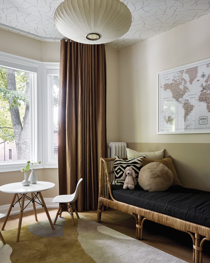
Brown tones, piles of pillows and a boho vibe are friendly features of the playroom. The earthy palette soothes throughout the home. “The playroom is a favourite family hangout,” says designer Jessica McGouran, who creatively jazzed up the walls by colour-blocking them in contrasting clay and taupe paint. Abstract wallpaper on the ceiling adds a fun surprise.
Photography, Lauren Miller
DAYBED, Article. Juju Papers WALLPAPER (on ceiling), Y&Co. MAP, Conquest Maps. RUG, EQ3. PILLOWS, CB2. WALL PAINT, Dimity 2008 (top), Oxford Stone 264 (bottom), Farrow & Ball.
A custom cover hides the once-unsightly radiator in the foyer and doubles as an entry table for keys
and mail. “It’s made from solid oak with a perforated metal front,” says Jessica. Another design move was to paint all of the interior doors black for punch, including the reeded-glass barn door (on the right) that leads to the revived powder room.

Photography, Lauren Miller
CEILING LIGHT, Elte.
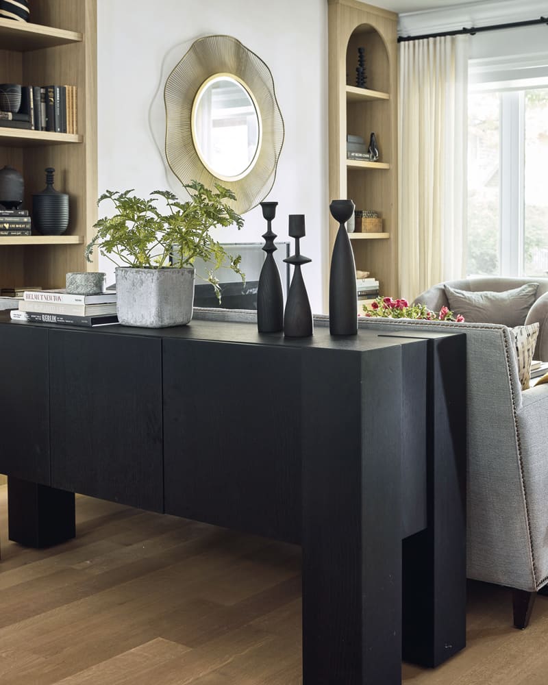
“There was no opportunity to display decorative objects and family photos before,” says Jessica. Cavities that flank the fireplace are now fitted with arched white oak shelves, lending pleasing symmetry and style. “The centre wall is painted in a limewash to give the space softness,” says the designer.
Photography, Lauren Miller

Photography, Lauren Miller
CHAIR, MIRROR, LD Shoppe. SOFA, CANDLES, Elte Mkt. Custom leather COFFEE TABLE, Jessica Leigh Interiors. RUG, CB2. CONSOLE, Crate and Barrel.
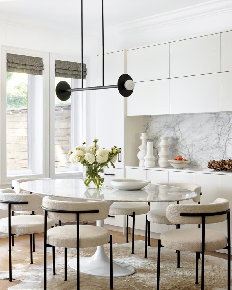
“You can pull many chairs into a classic marble tulip table because of the base; there are no legs to contend with,” says Jessica. Bouclé upholstered dining chairs instantly cozify, and the compelling barbell-like light fixture is sculptural.
Photography, Lauren Miller
TABLE, Rove Concepts. CHAIRS, CB2. White VASES, West Elm.
“When designing an open-concept space, it’s important to repeat finishes or elements to create continuity. In this project, hints of black in each space pull it together.”
Jessica amped up the existing white built-ins in the dining area with a gorgeous milky grey Calacatta Vagli marble backsplash. “We repeated the stone we used on the kitchen island for cohesion,” she says. The pretty area is for overflow kitchen storage and acts as a bar and serving spot when the couple entertain. The cabinets also handily hide office supplies.

Photography, Lauren Miller
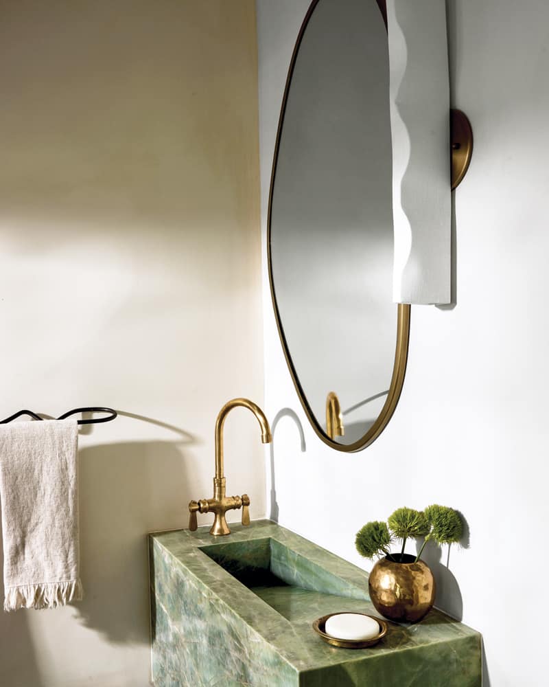
A wavy mirror and squiggly sconce and towel bar are delightfully offbeat in the powder room, where a floating green onyx sink beguiles. Creamy pink limewash walls add soothing dimension. “I love doing powder rooms. They’re jewel boxes you can pack with personality,” says Jessica.
Photography, Lauren Miller
MIRROR, Renwil. SCONCE, Human Home. TOWEL BAR, The Modern Shop. FAUCET, Etsy.
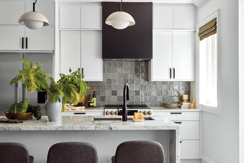
“The beautiful new marble waterfall island replaced one made of walnut and made a huge difference,” says Jessica. “You see it when you walk in the front door. It’s such a statement piece.” Pendants above it sport crackled ceramic shades. “They have texture and depth as you get closer.”

Photography, Lauren Miller
STOOLS, CB2.
“Functionality and aesthetics should work hand in hand when designing a home. Mixing built-in cabinetry and nice furniture pieces gives ample storage and surfaces for entertaining.”
Jessica painted the uppers, once drab walnut, a crisp white and installed matte black hardware. “We also added a backsplash to inject colour and texture,” she says. “This Zellige ceramic Moroccan tile has a glazing that creates variations of grey, which is lovely.” Subtly ragged edges also impart a handmade, organic vibe.

Photography, Lauren Miller
PULLS, Rejuvenation. TILES, Céragrès.
The revamped kitchen has a dynamic mix of materials that’s visually compelling. Previously, chrome finishes and a clunky stainless-steel chimney-style vent made the space cold and unfriendly; ditto the dated dark upper cabinets. “We brought in the custom black canopy to add oomph and contrast,” says Jessica. “Otherwise, it would have felt too much like a white-on-white kitchen.”
Photography, Lauren Miller
RANGE HOOD, Hayes Woodworking. PENDANTS, Light House Co.
“Our goal is to always create a warm and inviting bedroom to unwind. This can be achieved by layering lots of textures, such as those in the wallpaper, headboard fabric and window treatments.”
Simon Paabor didn’t have a closet (Megan Deeks called dibs on the walk-in), so Jessica tucked this custom one into the attic’s angled nook. The cupboards are painted soft taupe to echo the warm tones in the room. “We did a tongue-and-groove reveal on the doors to add texture, and the handles are a combination of black and brass,” she says.

Photography, Lauren Miller
Custom BENCH, Jessica Leigh Interiors. CLOSET HARDWARE, Myoh. CHAIR, CB2. LIGHT, LD Shoppe.
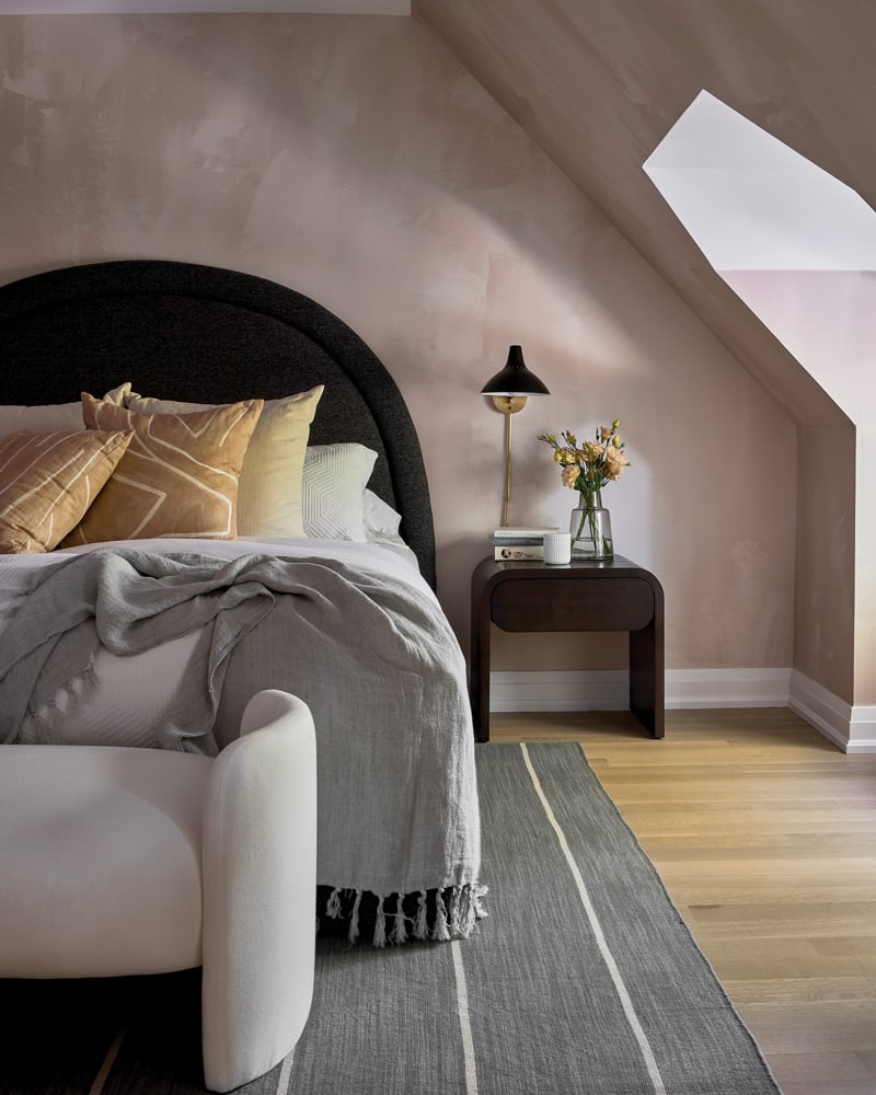
“Megan loves wallpaper and really wanted to do her bedroom,” says Jessica, but the designer felt that patterned paper would be too busy against the room’s odd angles. Instead, she opted for a stunning, moody neutral paper. Pale beige-pink tones mimic a limewash or plaster finish and impart richness and romance.
Photography, Lauren Miller
WALLPAPER, Drop It Modern. Custom HEADBOARD, Jessica Leigh Interiors. RUG, LD Shoppe. NIGHTSTAND, BENCH, Crate and Barrel. SCONCE, Elte. Patterned PILLOWS, Kelly Wearstler.
“The existing bathroom was a bit cold and sterile. We made the space more cozy by adding a warm wood vanity and gold fixtures.”
The principal ensuite lacked pizzazz. Says Jessica: “It felt very disjointed from the bedroom’s cozy wall treatment, but it didn’t need a full gut.” Leaving the tub and tiles as is, she layered in elements to enrich the space: a shaggy stool, unlacquered brass sconces and fresh window valances do the trick. “They add softness to the space and make it feel nice and cozy,” she says.

Photography, Lauren Miller
SCONCES, Cedar & Moss.
“The chrome vanity that was in the bathroom lacked storage and felt cold,” says Jessica. She replaced it with a wood version for added warmth. “We also changed out the faucet to a gold finish and added towel bars and robe hooks in gold.”

Photography, Lauren Miller
VANITY, The Vanity Store. FAUCET, Roman Bath Centre.


Comments