Kitchen
A graphic modern kitchen that's small yet functional for a family of four

Photography: Alex Lukey | Design: Shirley Meisels | Styling: Ann Marie Favot
Kitchen
A graphic modern kitchen that's small yet functional for a family of four
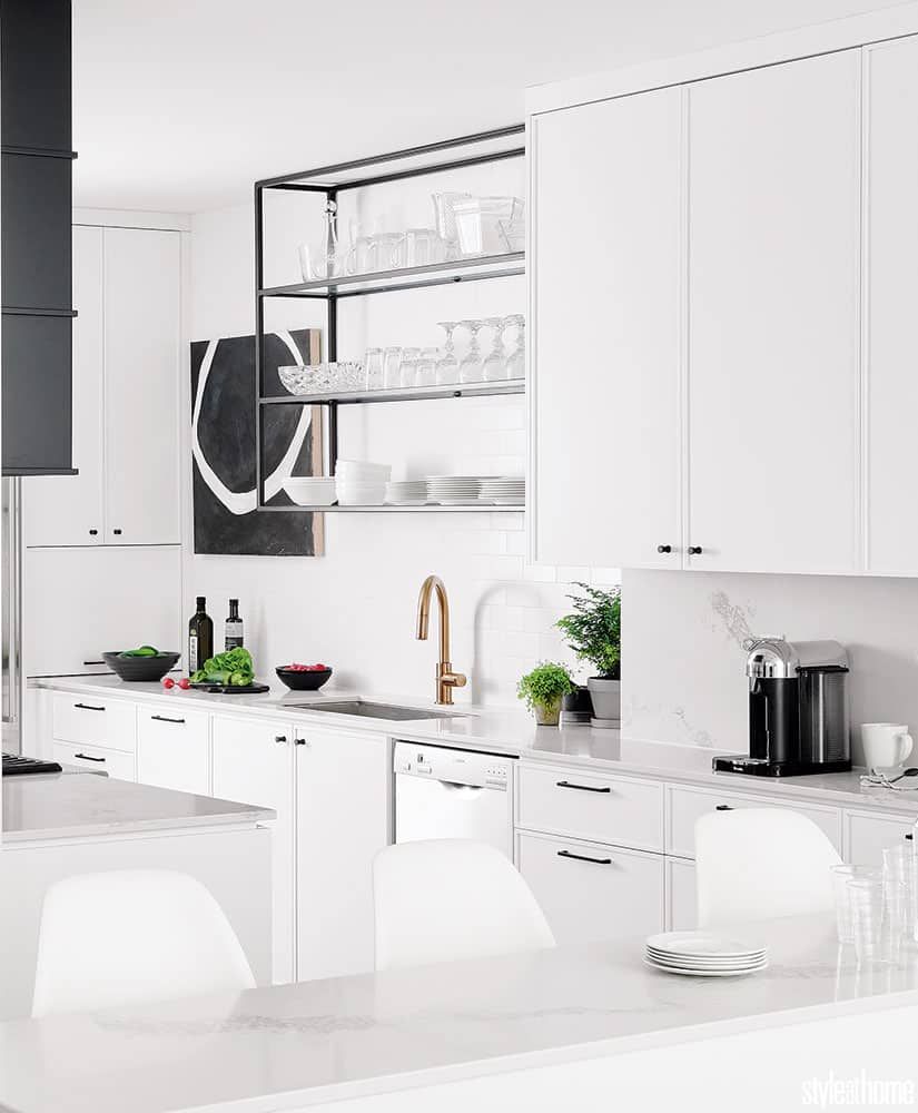
A kitchen in a family home is updated with sleek white cabinetry, black accents, a porcelain floor, geometric artwork and a practical layout.
You don’t need to be good at math to know that two adults, two tweens and a 110-square-foot kitchen equals family calamity. Especially when that square footage is outfitted with chunky tan cabinetry and thick travertine tiles. This space needed salvaging. Enter the often-daring, always-fresh Toronto-based designer Shirley Meisels of Hhouse. Inc. Rescuing the family from their “cave-like” space, she replaced it with a modern white kitchen with pops of graphic interest. Black cabinetry, Escher-like tile work and beautiful artwork deliver avant-garde edge to the sleek space, which can keep up with family life, too. The bar stools tuck away in seconds, the TV can be viewed from the breakfast bar, and every corner of the kitchen was designed to keep clutter at bay. Maximum storage plus minimal clutter equals eye-catching geometry: That’s the kind of math we love.

With the homeowners’ great cook-book collection in mind, designer Shirley Meisels capped the bank of solid white cabinetry with a narrow bookcase over the breakfast bar, which is illuminated with semi-flush light fixtures. “I’m not a big fan of dangling lights in a small space,” says the designer, who prefers minimal fixtures that hug the ceiling. “They’re still great as task lights, but they don’t obstruct the view to the family room and its TV.”

Abstract black and white artwork shares space with dishes and coffee mugs in this midtown Toronto home. The look is urbane; the feeling is open and modern. Slim bar stools were selected to maximize space, as was the streamlined breakfast bar. All of them wipe clean – a must for family living.

The tuxedo-like palette is classic, but to keep it from appearing stark, Shirley suggested a porcelain floor with subtle cream veining. “It adds a touch of coziness,” she explains. Brass fixtures were also chosen to warm up the room and add a bit of glam. shirley notes, too, that the feature wall behind the stove is stone, a material that’s warmer than the ceramic tiles elsewhere.

“Just because you’re renovating doesn’t mean you have to replace every single appliance,” says Shirley. By incorporating the family’s existing stainless steel pieces, she was able to cut costs and bring a little shine into the room.

“I had to talk them into it,” says Shirley with a laugh, “but the clients now love the black cabinets. they just pop!” Plus, they anchor the black linear hardware, shelf frame and bar stool legs as well. With their striking Escher-esque design that lends an optical illusion, the tiles behind the range double as artwork. the wool runner provides a charming antique counterpoint to all that is new and bright in the space.
Placed near the fridge, a cabinet door might have been awkward to open, so Shirley designed a “garage door” that slides up to reveal a cubby of small appliances. Nearby, a unit of open glass shelves keeps things from looking too bulky and showcases the subtle tile treatment on the wall.


Comments