Kitchen
A stylish kitchen update for a Toronto PR maven

Image by: Stacey Brandford | Styling: Morgan Lindsay & Stacy Begg
Kitchen
A stylish kitchen update for a Toronto PR maven
A PR maven updates her Toronto kitchen to create a chic space with staying power.
Christine Faulhaber is no stranger to trends. “It’s my job to be on the pulse of what’s new and now,” says the head of Faulhaber Communications, a PR and marketing firm in Toronto. When this in-the-know gal’s kitchen got an update last year, it was destined to have a covetable current look. But first, the 420-square-foot space – which hadn’t seen more than a coat of paint since the ’80s — needed to be brought into this decade.
Seeking help to gut the room and start over, the well-connected homeowner pulled out her loaded Rolodex and called in designer Amy Dillon of AyA Kitchens and Baths. “For the most part, we kept the layout pretty similar,” says Amy. “But we tweaked things to improve usability.” The upgrades included replacing cabinets with space-saving pullouts, swapping bulky appliances for sleek, well-integrated options and supplanting the old island with a longer narrower one that accommodates seating without impeding flow.
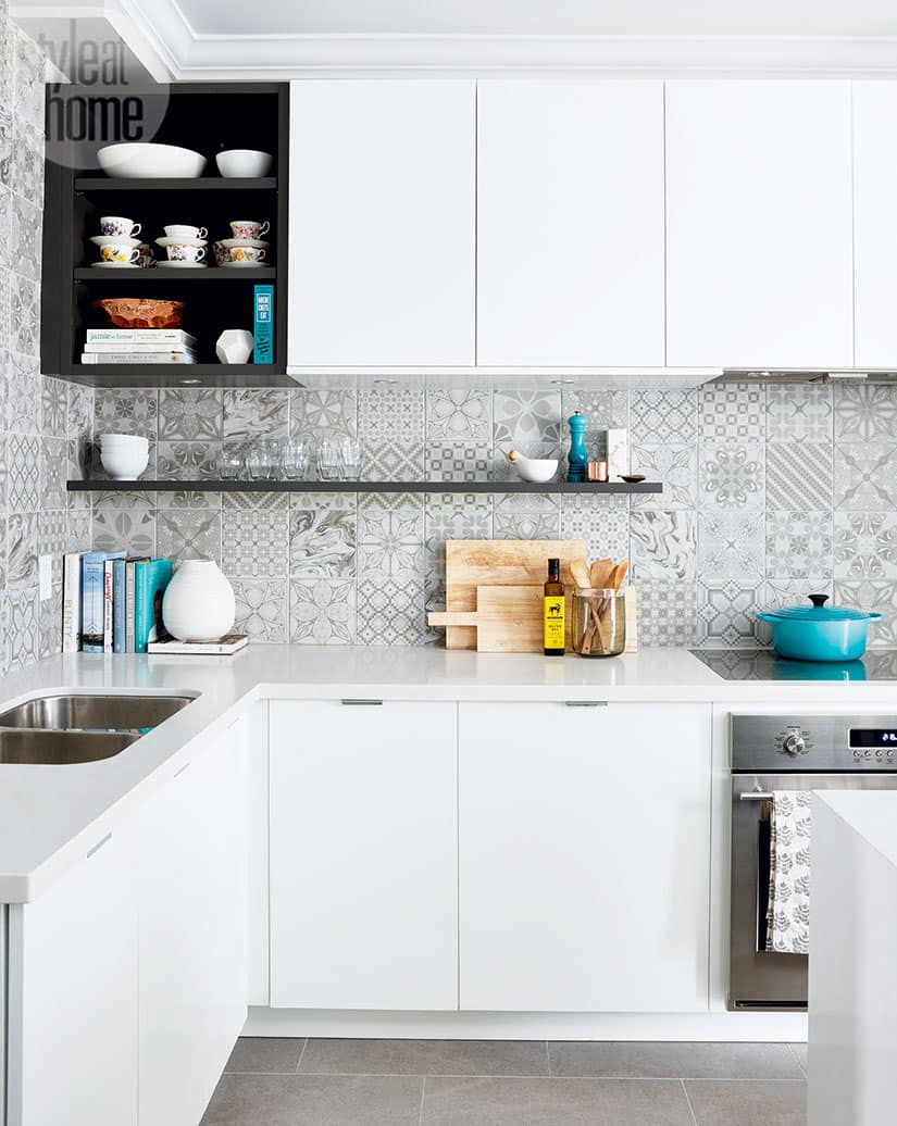
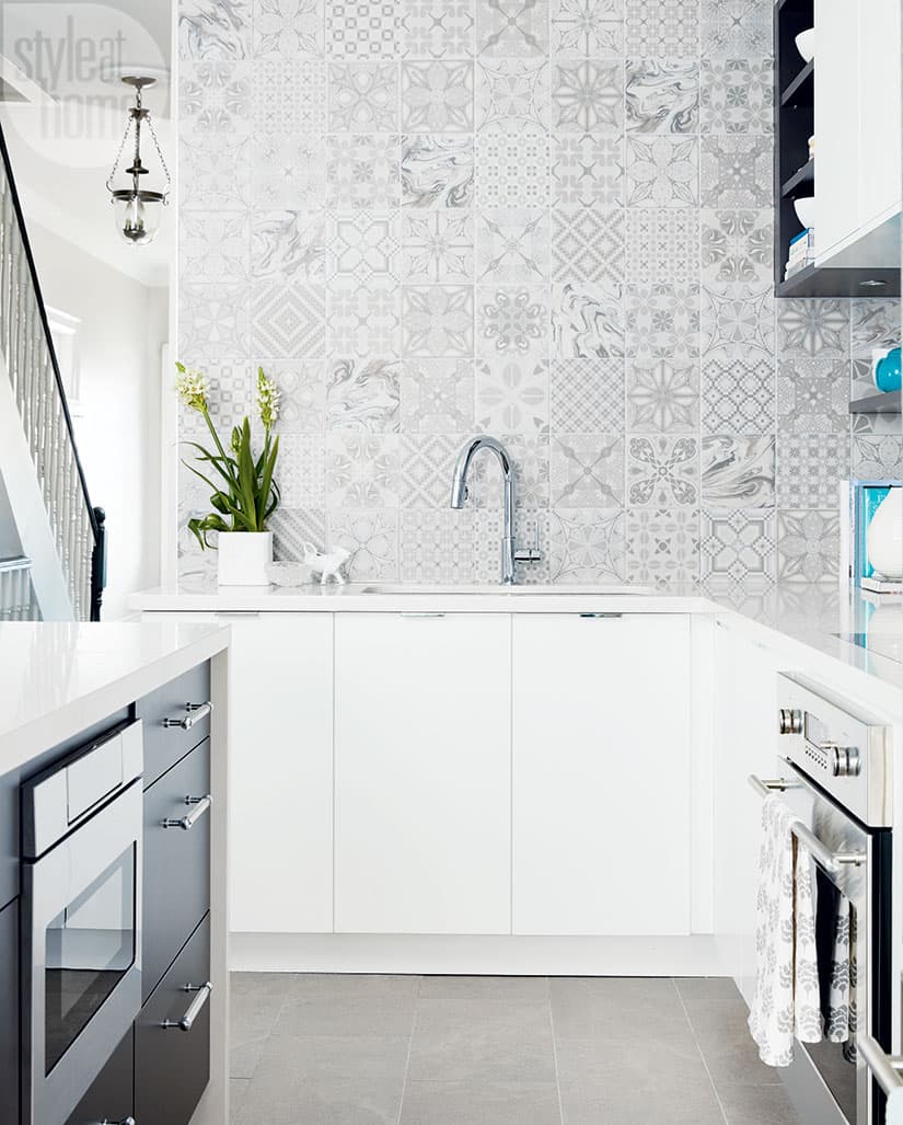
With function taken care of, Amy focused on the finishes, opting for elements befitting this fashion-forward professional. She cites the sleek two-tone cabinetry, open storage and a feature wall sans uppers as examples. “Trends can date themselves down the line,” says Amy, “so I incorporated them in a subtle way, using a neutral palette.” The über-popular encaustic-look backsplash tiles are case in point. “The slew of prints is a bit aggressive,” admits Christine. “But they’re monotone, so it’s a safe choice.” Time-tested additions, such as Mid-Century Modern-style seating, grasscloth accent wallpaper and copper accessories round out the room, cementing its staying power.

Designer Amy Dillon grounded the white cabinetry with dark grey accents — but only a few. “I wanted the space to age gracefully, not look like that typical two-tone kitchen you see so much,” she says. Marble-look Caesarstone countertops, which flow into a waterfall edge on the island, help achieve that goal.

For the dining area, Christine went with one of the hottest trends — Mid-Century Modern furniture — and chose chairs in a punchy shade of blue.

Though Amy chose minimal modern flat-panelled cabinetry, she varied the look by incorporating some open storage. “Display space is important to me,” says Christine, who showcases cookbooks and collectibles, such as her grandmother’s porcelain teacups. “These types of pieces give the space character and make it feel more like the rest of the rooms in the house.”

Christine fell for the bold encaustic-look backsplash tiles immediately. “The prints — there are 33 in total — are mostly traditional, so they have long legs,” she says. For a slightly more current effect, she had her contractor double up on the watery pattern, the only contemporary motif in the bunch. “The backsplash is a safe place to try a trend,” she advises. “Worst-case scenario, I tire of it in 10 years. I’d probably want to change my kitchen by then anyway!”

Christine incorporated touches of copper, the metal du jour, starting with a Tom Dixon pendant light in the eat-in area. The zone received the same space-smart treatment as the rest of the kitchen with dual-tone built-ins.

The whimsical artwork printed on Plexiglas is actually an image from a photo shoot Christine produced five years ago to mark the 10th anniversary of her PR and marketing agency, Faulhaber Communications. She used classic grass-cloth wallpaper as a backdrop to amplify the piece.


Comments