Kitchen
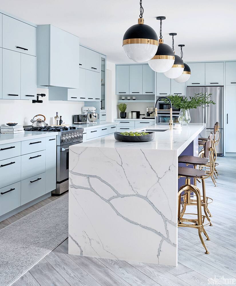
Icy blue cabinetry and a marble-look island give this kitchen a retro chic look

Image: Stacey Brandford | Design: Cynthia Soda
Kitchen
Icy blue cabinetry and a marble-look island give this kitchen a retro chic look
Defined by a mix of cabinetry in unique icy blue and rich violet, this trendy contemporary kitchen is ahead of its time.
In most cases, a designer brings a trendy element into a space because of its popularity. But sometimes, in a stroke of luck, she chooses something because she loves it only to have it become the thing du jour moments later. That kind of happy fortuity is exactly what happened when Cynthia Soda, interior designer and owner of Soda Pop Design, redid the Stouffville, Ont., kitchen of her parents, construction managers Ida and Tony.
The dated cooking zone desperately needed a layout that would flow better with the adjoining rooms, and more storage and counter space to suit the pair’s love of entertaining. Cynthia dreamt up a bold scheme that speaks to Ida’s eclectic-meets-modern style through mixed metals, marble-look quartz and cool tones.
When it came time to choose colours for the cabinetry, Mom and Dad proved the perfect clients, letting Cynthia go for something a bit daring. “I chose Benjamin Moore’s aubergine-toned Shadow for the island cabinets and pale blue Iceberg for the rest – I loved them both and thought they would look striking together,” says the interior designer.
“Shortly after, the company named Shadow its colour of the year. And Iceberg was on the trend list, too!” While that was purely coincidental, the overall design of the kitchen most certainly was not. Cynthia’s thoughtful planning and stellar taste resulted in a space that feels cool, contemporary and curated.

Interior designer Cynthia Soda conceived this sleek 16-foot island with her parents’ love of entertaining in mind. “They still manage to completely fill it with people during their huge gatherings!” she says. To give the long room some movement and connect it to adjoining spaces, Cynthia ran the grey-toned brushed oak flooring at an angle.

While the marble look of the countertop is striking in its modern form, its quartz construction is practical, since homeowner Ida Soda wanted something that would be easy to clean after dinner parties. The rich purple cabinetry is in distinct contrast. “I love how the waterfall overhang partially hides the bold colour of the island,” says Cynthia. “It’s such a nice surprise when you come around the corner and see it all.”

Nothing in the kitchen feels busy thanks to clean-lined cabinetry in an unexpected icy blue tone. The flat-panelled doors won’t collect dust and are easy to wipe clean. “Is it obvious that my mom doesn’t like high-maintenance spaces?” says Cynthia with a laugh.

“I’ve always loved mixing metals. I think the contrast is so arresting,” says the interior designer, who incorporated both black and gold hardware. She echoed the eye-catching pairing in accessories and fixtures, from the pendant lights to the faucet to the dishware on display.


Comments