Living Room & Dining Room
1 room, 2 ways: how a dining room went from soft to bold

Image: Robin Stubbert / Design: Christine Hanlon
Living Room & Dining Room
1 room, 2 ways: how a dining room went from soft to bold
In a low-budget makeover, homeowner and contributing design editor Christine Hanlon swapped a soft traditional aesthetic for a bolder one, but both are worth recreating.
Whether you favour light and romantic decor or prefer dark and modern, your living quarters can take on any style you please—as illustrated by this dining room makeover. With the simple change of wall colour and a few accessories, a space gets a whole new look.

Image: Stacey van Berkel (left), Robin Stubbert (right) / Design: Christine Hanlon
How Christine Hanlon transformed the room:
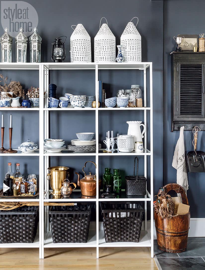
The shelf: To lend contrast and character to her display, Christine traded in simple white ceramics for an offbeat collection of smaller items, such as an enamelware jug and tinted stemware.
The wall colour: While keeping much of the furniture the same, the stylist took her dining room from light and cozy to dark and dreamy by forgoing her neutral palette and adding bold hits of black, introduced through the chairs and wall colour.
The table: Simple additions like a striped tablecloth and trendy serving pieces give the faux bamboo dining table a fresh look. The stylish set-up also underscores the room’s black and white palette and imparts a casual feel.
The balance: A space enveloped in a dark moody hue runs the risk of looking too severe. Keeping this in mind, Christine tempered the new, daring scheme with warm rustic accents, from a vintage photograph set in a gold frame to her existing textured jute rug.
Look 1: Soft & Traditional

While a hutch often serves as a place to exhibit statement accessories, there’s something to be said for paring back the look with understated pieces. In this case, an all-white grouping highlights the various shapes and textures at play.
Look 2: Bold & Contemporary

In styling the area’s open shelving unit, Christine opted for a collected look, strategically stacking varied dishware instead of creating regimented rows. The unit’s white frame also makes it a focal point in the space, drawing the eye toward the many vintage finds on display.


Comments