Living Room & Dining Room
A Scandinavian-inspired living room with a light neutral palette

Image: Barry Calhoun / Styling: Ann Marie Favot
Living Room & Dining Room
A Scandinavian-inspired living room with a light neutral palette
How a Calgary homeowner won her way to the comfy and collected living room she always wanted.
Decorating from scratch right after moving into a new home can be a daunting task. That’s what Calgary homeowner Stacey Bresnahan was facing before Style at Home and IKEA came to the rescue. “I was nervous just trying to figure out what to do with the living room,” says Stacey, a winner of the Style at Home Makeover Contest presented by IKEA Canada.
After purchasing this 1,100-square-foot home in northwest Calgary, Stacey temporarily furnished the living room with two club chairs, a sideboard and a few plants – but she knew the space’s high ceiling, white-painted brick fireplace, huge windows and hardwood floor merited a more stylish set-up. Open to both the kitchen and the dining area, the living room cried out for family-friendly coziness and functionality. Stacey, who works for WestJet and shares the house with her three children (twins Ben and Andrew, 11, and Keira, 8), sought something chic and comfy. “I wanted the space to be relaxed enough for the family to lounge in but stylish enough to host company,” she says, noting she also had her heart set on including a sectional. “It was important to have a place for people to just sit and chat.”
While Stacey was planning the design, a friend told her about the makeover contest. “Just a few weeks after moving into the house last fall, I won!” she says. “I couldn’t believe the timing.” Given the opportunity to get what she wanted with professional guidance, Stacey requested a clean-lined Scandinavian look with a light neutral palette and lots of storage.
Style at Home’s home and style director, Ann Marie Favot, agreed the bones of the house best suited an unfussy aesthetic. “A Mid-Century Modern-inspired interior really complements the architecture,” she says. Ann Marie also approved the use of a sectional for the 16-by-17-foot space, selecting a modular version that’s both comfortable and practical. “The chaise part of the sofa is actually an ottoman, so it can be moved around,” she explains. “And the sofa seats lift up to reveal a spot to stow things underneath.” Essential storage was also incorporated via sleek wall-mounted cabinets, arranged to resemble a custom sideboard.
While a calm neutral colour scheme of grey, brown and white complements the room’s Scandinavian vibe, hits of pattern and a friendly mustard hue add interest alongside a combination of textural elements, such as the rattan chairs, jute rug and airy bamboo light fixture. Oversized accessories offer character without adding clutter, and a gallery wall serves as a focal point with personality.
The overall look is sophisticated, but it’s not too formal for this young family of four. “I didn’t want the space to feel too fussy,” says Ann Marie. “Stacey and her kids should be comfortable here and use the room often.”

The living room’s existing envelope – the brick fireplace, vaulted ceilings, expansive windows and hardwood floors – inspired clean-lined decor that evokes a mix of Scandinavian and Mid-Century Modern style.

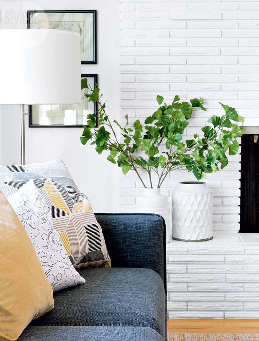
A combination of new prints and a few pieces of the kids’ artwork offers the open-concept living room personality and depth, while faux greenery creates a natural feel all year-round.

The slim profile of the rattan sidechairs counterbalances the plush sectional but doesn’t compromise on comfort. “They’re also durable,” says Style at Home’s home and style director Ann Marie Favot. The top of the petite yellow side table is actually a removable tray for carrying drinks from the kitchen to the living room with ease.

Felt storage bins help the family stay organized, add softness and underscore the room’s colour palette.

From the painted-brick fireplace surround to the large white vases and jute rug, texture keeps the streamlined space from falling flat.

Wall-to-wall storage units mounted six inches off the floor look like a custom built-in sideboard. While most of the room was painted a warm white to match the fireplace, the gallery wall was done in a light grey. “I wanted the white frames and the artwork to stand out,” says Ann Marie.

Set in a glass bowl, Bosc pears serve as both an accent that suits the colour scheme and a healthy treat within arm’s reach of company and the kids.

Woven bowls add interesting texture and provide a spot to corral coffee table clutter.

Boasting a unique sculptural vibe, the oversized bamboo pendant light takes advantage of the room’s high ceilings. Incorporating extra-large accessories adds drama, while mixing solid and patterned toss cushions and rugs of various sizes enhances coziness. Layering the rugs also solved a common decor problem: “I couldn’t find a rug big enough for the room, so I placed two jute rugs side by side and then put a smaller patterned rug overtop, disguising the seam,” says Ann Marie.

A walnut-veneered cabinet offers handy storage between the living room and adjacent dining area and kitchen. “I make cakes as a hobby,” says Stacey, who doesn’t need all the tools in regular rotation, “so I store my decorating items in there.”

Still in disbelief about the lucky timing of it all, Stacey is thrilled with the results. And so are her kids, Andrew (on the floor), Ben and Keira. “They actually didn’t spend a lot of time in the living room before,” she says. “They were always in the basement – but now they’re here all the time.”


Comments