House Tours
A cozy and modern family home punctuated with earth-tone accents

Image: Stephani Buchman
House Tours
A cozy and modern family home punctuated with earth-tone accents
How a random Internet connection resulted in a cozy and luxuriously layered design for one family’s dream home.
Sometimes the perfect match comes at the most serendipitous time. Years ago, homeowners Peter Riggin and Alex Luby were searching for a sectional for their family room. They visited a store in Whitby, Ont., where Orsi Panos happened to be working as a designer, and she effortlessly connected them with exactly what they needed. Fast-forward a few years, and the homeowners were now ready to overhaul their whole home. Orsi’s name popped up on a friend’s social media profile; she now had her own design firm. It felt like fate.
The couple’s 2,800-square-foot home in Toronto’s Beaches neighbourhood had served the family (which includes daughters Mackenzie, 20, and Cassandra, 17) well for the past 16 years, but they were tired of the impractical design and outdated builder-basic finishes. So, with a function-focused wish list in hand, Peter and Alex tasked Orsi with creating a fresh interior vision.
On the top of the to-do list was the cramped, storage-challenged kitchen. While they initially debated removing the peninsula to open up the space, Orsi and the home owners ultimately decided to maintain the layout, providing more dining space so the couple can host company. Ductwork was strategically hidden behind panelling made to look like cabinetry and the cabinets were reconfigured to make it easy to access hidden space.
Another priority was addressing the living room’s functionality. A fireplace taking up most of one wall meant a lack of seating options. By removing the fireplace and instead adding one in the upstairs family room (not shown), Orsi could incorporate a slim sofa, a loveseat, arm chairs and stools, creating the perfect place for larger gatherings and book club meetings (Alex is an avid reader).
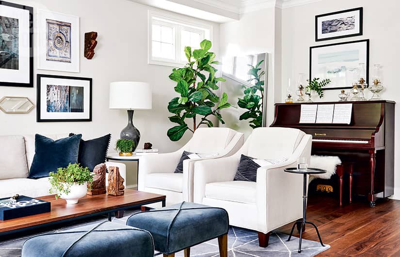
Choosing neutral furnishings meant cherished family items, such as the piano, oil lamp collection and artwork, could still take centre stage in the revamped space. “Mixing meaningful pieces with new ones creates the perfect balance for a soulful home,” says Orsi, who personalized even the colour palette.
Using a rich shade of blue (inspired by one of Alex’s purses) as a jumping-off point, Orsi worked her magic to imbue the entire home with a fresh and modern look that still feels warm, inviting and livable. Her effortless mix of recent purchases and old favourites, as well as her expert layering of textures, finishes and hues, add up to a functional and fashionable interior that’s big on character.
“When you’re redesigning a small house, plan carefully and personalize the process, and you’ll end up with your dream home,” says Orsi. It’s good advice, because it landed these homeowners in their perfect abode – and it’s all thanks to a random reconnection and being in the right place at the right time.

Removing the fireplace from this Toronto house’s living room allowed designer Orsi Panos to incorporate ample seating for the homeowners, who enjoy entertaining.

Wall panelling lends the entryway design prestige when little else would fit in the petite space save for a narrow console that serves as a drop-off spot for keys and mail.

The dining area adjacent to the kitchen provides maximum seating thanks to the bench and extendable dining table. An open-framed glass and metal shelving unit along the back wall provides not only a great spot to display decorative pieces but also plenty of storage for cookbooks and a mini-bar to serve guests.

The bright and eclectic living room is a lesson in layering done right. Crisp white walls are warmed by rich hits of blue, lush greenery and a whimsical collection of artwork and objets like homeowner Alex Luby’s exquisite vintage oil lamps. The family piano was a must-keep item for the homeowners – their daughters love to play.

With its crisp white cabinetry, warm walnut accents and quartz countertops, the chic kitchen now boasts a fresh look within the original layout. The bottom of the peninsula – painted rich blue – grounds the room and keeps it from feeling too uniform.

Because the family spends much of its time in the kitchen, Orsi decided to keep the pre-existing TV, but installed it in a dark-hued hutch to minimize its presence.

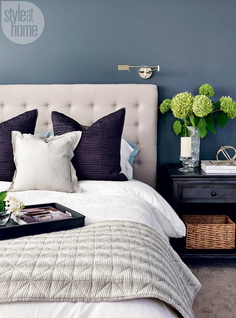
An inky blue accent wall draws attention to the luxurious upholstered bed frame. Articulating sconces installed above the bed in lieu of table lamps on the nightstands leave more room for personal items.

A bank of custom built-in closets was painted the same colour as the walls for a clean look. “We didn’t want them to attract much attention,” says Orsi.

Updated finishes give the ensuite bathroom a spa-like feel. Turquoise tiling in the shower echoes the touches of blue featured throughout the house.


Comments