Small Spaces
A Vancouver condo becomes a modern minimal haven

Photography: Tracey Ayton
Small Spaces
A Vancouver condo becomes a modern minimal haven
With a plan in hand and some professional guidance, these homeowners take the reins of the modern design of their spacious new home.
Wing Lau and Kevin Teo bought their first Vancouver condo because of its easy access to work and the downtown amenities – charming restaurants, chic boutiques, art galleries and more. The problem? The one-bedroom-plus-den was a tight fit for the young couple and their two dogs. “We were barely ever home because it was so cramped,” remembers Wing. Add the fact that they were recently married and planning to expand the family, and 600-square-feet wasn’t going to cut it. For these IT professionals, though, a house wasn’t the answer. “That’s too much maintenance,” says Wing.
The solution was moving to a larger condo – a new build with panoramic views and breathing room thanks to a second bedroom and bathroom, as well as a den. Being a blank slate, however, it lacked character. “We found someone to inject some flair into the place,” says Wing, referring to designer Jamie Deck of Shift Interiors.
After researching Jamie’s work online, Wing realized the company was a great fit – and not just because she liked her style. Wing is hands-on when it comes to her home. A decor enthusiast and avid DIYer, she needed a design partner, not a leader, and Jamie’s firm allows homeowners to buy blocks of time to customize the level of service, from light guidance to full execution. So Wing requested Jamie’s advice on layouts and furniture selection, and then chose her favourites. She did much of the shopping and implementation herself.
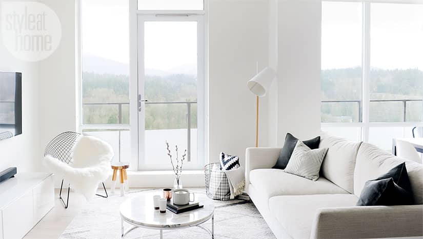
Central to the 24th-floor condo are the living-dining area’s floor-to-ceiling windows, which showcase mountain views. They’re what sold the couple on the home and naturally became a central focus for the open-concept main living area. The room’s muted colour scheme provides the perfect frame for the vista – and also reflects Wing’s personal palette. “I only ever wear black, white or grey,” she says. “So it was an easy choice.”
With its seamless modern scheme, the kitchen was another selling point for Wing and Kevin, and required no design updates. “We got lucky that this kitchen already had a look we both love,” says Wing. The cabinet fronts and island base boast a unique striated grain in warm grey and cool taupe that lends the space artistic interest and texture all on its own – no extra design flourishes required.
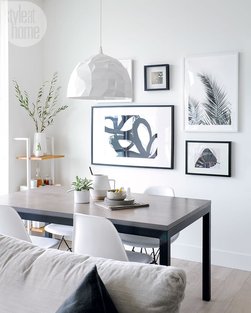
Though Wing had originally wanted a concrete-look accent wall in the dining area, they were concerned it would compete with the kitchen. So they settled on a dining room gallery wall – which Kevin took total ownership of – and created the feature wall in the master bedroom instead. Complementing the concrete-look surface, a custom fabric-covered headboard that stretches the entire length of one wall visually widens the space and offers a structured, unfussy vibe.
In their new space, the couple feels proud and happy. There's something gratifying about executing a flawless design as an amateur, even when it's with significant help from a professional. Though the idea of a forever home isn't something they can commit to right now, this will be their domain for at least five years. "Until we outgrow it," says Wing, "or my design bug bites again." Maybe next time she'll brave it on her own.

Homeowners Wing Lau and Kevin Teo didn’t need designer Jamie Deck’s help in designing their gallery wall. Wing has been pinning favourite pieces for years and opted for a combination of personal photos and low-cost prints. Kevin was in charge of installation. “We had painters’ tape all over the floor and outlining the gallery wall to make sure the configuration was right,” says Wing of organizing the graphic black and white pieces in the dining room.

Wing swapped the condo’s living and dining areas to create a larger and more functional living room. After all, it has to handle the couple’s two dogs and, at some point, kids. The carpet was chosen in part for its low, easy-to-clean pile (so the battle against dog hair isn’t too taxing).

For Wing, it was important to mix high and low pieces. The Parsons dining table, for example, was a total splurge. The couple saw the piece in Seattle, fell in love with it and returned to the city two months later to haul it home in the family van. It’s something Wing plans to hang on to for a long time: “My future kids will probably spill on the table,” says Wing with a laugh. “But we’re okay with that.”

Prior to purchasing any furniture, the couple brought home fabric swatches to ensure everything matched with the kitchen cabinetry. “With its interesting grain, it almost plays the role of a feature wall,” says Wing. So it dictated what she and Kevin did with the rest of the space. “We couldn’t choose anything that competed with that.”

The kitchen is the literal and figurative centre of the apartment: It overlooks the living and dining room, benefits from the stunning view out the floor-to-ceiling windows and is a place Wing and Kevin spend a lot of time, doing everything from cooking breakfast to entertaining company.

Jamie suggested multiple furniture configurations for the master bedroom, but they settled on a set-up that takes advantage of the mountain views. The space is a lesson in how to create a successful high-low mix: The head-board was custom-made by Shift Interiors, but Kevin painted the concrete-look feature wall himself. The bedding and toss cushions are big-box-store finds.

With its simple mirror, metal console and wooden stool, the entryway announces the muted palette present throughout the space. Floating circular hooks offer a functional yet chic place to hang coats.

The bathroom echoes the kitchen with the same seamless cabinetry, but the countertop adds another layer of pattern that the kitchen lacks, proving it’s easy to be more daring with design in closed-off spaces. His and hers sinks allow for stress-free mornings.


Comments