House Tours
It's all fun and games at this 1960s cottage

Photography, Mike Chajecki.
House Tours
It's all fun and games at this 1960s cottage
Splashes of on-trend colour and loads of unexpected retro touches bring a happy nostalgia to a 1960s cottage.
Designer Michelle Berwick threw out the rule book when she and her husband, Gary, a builder, renovated this ’60s-era cottage in Ontario’s Kawarthas region. Structurally, their goals for the 1,300-square-foot cottage were straightforward: capitalize on the views, maximize the living space and over- haul any elements past their prime. On the decorative front, however, having fun was top of mind. “We wanted to create a cozy, cool, nostalgic space – something different from other cottages,” says Michelle. Cue the earthy palette of terracotta, forest greens, black and white, and enough playful throw- backs to get even a modernist longing for the good old days. Says Michelle, “It’s the type of place where, if you aren’t wear- ing flip-flops, you feel overdressed.”

PHOTOGRAPHY, Mike Chajecki. DESIGN, Michelle Berwick Design. PAINT, Raccoon Fur 2126-20, Benjamin Moore. SOFA, Article. RUG, PILLOWS, custom COFFEE TABLE AND BENCH, MBD Shop.
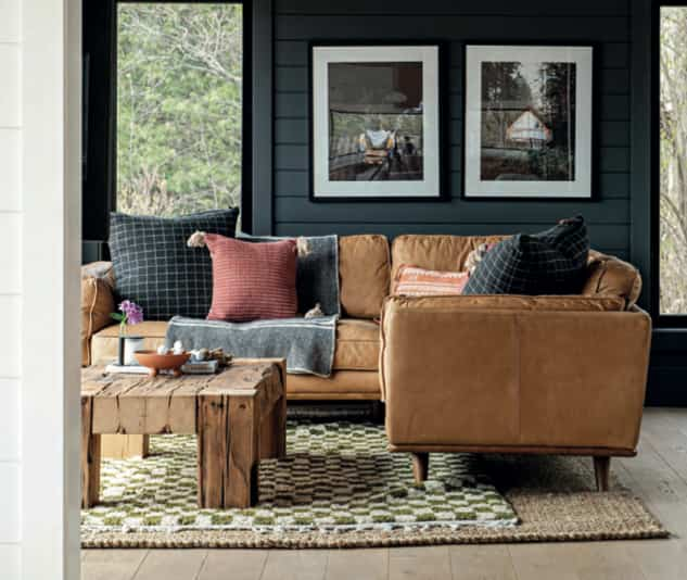
By wrapping the family room in an inky hue, designer Michelle Berwick instilled a “moody, cozy-cavern vibe” and put the emphasis on the stunning views of Upper Stony Lake. “It’s our favourite spot to have morning coffee, read a book midday, and settle in to watch the sunset,” she says. The big leather sectional can fit the whole family – Michelle, Gary, and their kids, Mia, 11, and Brody, 9 – and even a few friends. Michelle designed the coffee table and matching bench (oppo- site, top left), which sits along the room’s rear wall, beside the main entry.

PHOTOGRAPHY, Mike Chajecki. OTTOMANS, Niche Decor. COWHIDE, PILLOWS, MBD Shop. PAINT, Onyx 2133- 10, Benjamin Moore.

PHOTOGRAPHY, Mike Chajecki. OTTOMANS, Niche Decor. COWHIDE, PILLOWS, MBD Shop. PAINT, Onyx 2133- 10, Benjamin Moore.
A little sitting area by the fire is a spot to kick back and chat with the chef in the adjoining kitchen. Michelle employed the same ebony colour here to unify the stone fireplace and surround, offsetting the shade with tawny ottomans and a cow- hide rug. After a serious blackout the first weekend they spent here, Michelle keeps the mantel loaded up with candles! Stairs lead to the backsplit’s three bedrooms. Outside, the exteriors of the cottage and bunkie were finished in ultra-forgiving black. “The structures are built right into the hillside of the Canadian Shield, giving you a bird’s-eye viewpoint,” says Michelle.

PHOTOGRAPHY, Mike Chajecki. STOOLS, Bouclair. FAUCET, House of Rohl. PENDANTS, Matteo Lighting.
Terracotta-toned tile on the rounded kitchen island is a key element in driving home Michelle’s “nod to nostalgia” design theme – as are the rattan stool seats, the scalloped edging on the otherwise clean-lined range hood, and the island’s butcher-block top. During the year-long reno, a narrow wall was removed and the island was added to delineate the rooms. Michelle and Gary replaced win- dows throughout. “We enlarged most and took out the mullions so nothing detracts from the views,” she says. “In the kitchen, you can be watching life on the lake while flipping pancakes!”

PHOTOGRAPHY, Mike Chajecki. CABINETRY, Hartley Built. COUNTER- TOPS, HanStone. CABINETRY PAINT (terracotta), Bed and Breakfast CC-184, Benjamin Moore. BACKSPLASH TILE, SS Tile & Stone. APPLIANCES, Caplan’s Appliances.
Michelle’s pairing of white oak and terracotta kitchen cabi- nets feels fresh and unique. “I’ve proposed a terracotta kitchen to clients, but never had it approved. So, I thought, ‘This is my place — I’m doing it!’” she says. While the clay colour has a retro vibe, the functionality is contemporary: the counters are quartz, the cabinets have understated face-frame or Shaker-style doors, and there are plenty of storage solutions, including a pantry wall, appliance garage and Lazy Susan pullouts.

PHOTOGRAPHY, Mike Chajecki. TABLE, Article. CHAIRS, West Elm. PAINTINGS, Karen J. Combs. PAINT, Chantilly Lace OC-65, Benjamin Moore.
The dining room’s rainbow- splashed paintings remind Michelle of works by her artist aunt, and of the colourful family cottage of her childhood summers, which helped inspire the nostalgic looks here. “The colours are unique,” she says. “They don’t follow the nautical navy and white scheme you traditionally see in Canadian cottages.” As well, chairs in different finishes imbue a gath- ered-over-time allure. While the interiors have undeniable vintage charm, Michelle has balanced kitschy elements with expanses of crisp white shiplap and new white oak flooring, and used a surprisingly light hand when accessorizing.

PHOTOGRAPHY, Mike Chajecki. Kate Golding WALLPAPER, Wynil. PAINT, Saybrook Sage HC-114, Benjamin Moore.
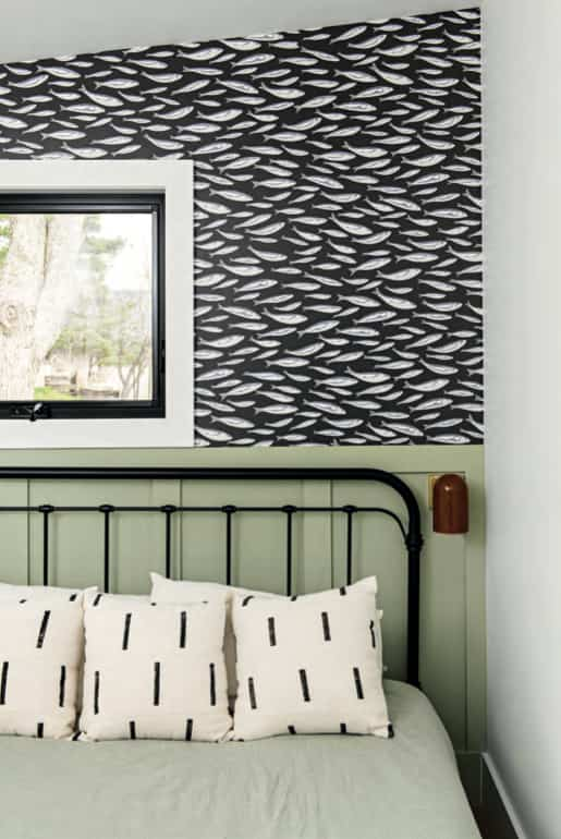
A+ geometry work went into wedging a third bed- room into the cottage’s upper level. “We eliminated an old entrance from the back of the cabin and rejigged the floor plan to use every nook and cranny we could find,” Michelle says. In the snug third bedroom, the traditional wainscotting – painted a tranquil green – and farmhouse bed are pulled in a contemporary direction by mod black-framed windows and Kate Golding’s eye-catching Sardines wallpaper.

PHOTOGRAPHY, Mike Chajecki. Kate Golding WALLPAPER, Wynil. PAINT, Jade Romanesque 476, Benjamin Moore.
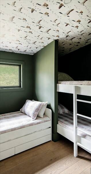
In the bunk room, Michelle bucked tradition, installing wall- paper on the ceiling “because you lie in bed and look up!” The throwback pattern calls to mind 1960s sleeping bags or flannel bedding. Throughout the home, Michelle wove in features evocative of iconic Ontario cottages. “I took elements from the original cabin and from all the cottages I’ve visited,” she explains. “The hits of green, for example, remind me of my uncle’s cottage growing up, where they painted their deck that green.”

PHOTOGRAPHY, Mike Chajecki. PAINT, Chantilly Lace OC-65, Benja- min Moore. TILES, Tilemaster.
Michelle and Gary bought the cottage as an investment property in 2022 – to rent and potentially resell – so they put money into features that make it more valuable. Case in point: the new three-piece primary ensuite, which doesn’t eat up much floor space but gives the owners their own bathroom away from kids and guests. Plain white walls and black lighting and hardware balance the star- patterned flooring and a trim vanity that recalls Midcentury Modern teak credenzas.
7 stylish Airbnbs we love


Comments